
Playwrite GB S
Designed By
TypeTogether, Veronika Burian, José Scaglione
8 Styles Handwriting
A little note,
before you go.
Playwrite GB S · Regular
Try a short note, a name or a line of your own to compare the strokes and spacing.
8 styles available. Compare the specimens below, or enter your own text.
Download Playwrite GB S ↓TTF · SIL Open Font License 1.1
Set Your Own Text
Change the style and size to compare the letterforms.
Dear Gran, thank you kindly
A Note On The Page
Playwrite GB S · Regular
A short letter, set in the family.
Thursday afternoon
Dear Alex,
I left the book by the window. There is a note on page twenty-three that I thought you would like. Bring it along on Thursday; we can finish the conversation over coffee.
See you there.
8 Styles,
One Family
Every available style is shown below in its own font file.
Thin100
Dear Gran, thank you kindly
Thin Italic100
Dear Gran, thank you kindly
Extra Light200
Dear Gran, thank you kindly
Extra Light Italic200
Dear Gran, thank you kindly
Light300
Dear Gran, thank you kindly
Light Italic300
Dear Gran, thank you kindly
Regular400
Dear Gran, thank you kindly
Italic400
Dear Gran, thank you kindly
Alfred Fairbank, who lived from 1895 to 1982, wanted children to write faster and with less fuss, and he proposed a modern italic hand based on chancery models to get there. That idea, part of the Italic Handwriting Revival of the early 20th century, still runs through English classrooms. When the National Handwriting Association surveyed teaching methods in 2013, 13 of the 23 it described were fully joined or semi-joined modern cursives, Nelson, Jarman, Marion Richardson, Tom Gourdie’s Modern Hand and the Sassoon-Williams model among them.
Semi-joined, in practice
Playwrite GB S is TypeTogether’s version of the semi-joined kind, drawn by Veronika Burian and José Scaglione. Ascenders and descenders are short and loopless, and capitals are simplified to something close to print; the G is open with no crossbar and the M stands on plain legs. No letter starts with a curved entry stroke. Letters that finish with a right-to-left stroke, b, p, g and s, stay unjoined to the next one, which is what keeps it semi.
It comes upright and slanted, 8 styles from Thin to Regular, and the slanted version takes up exactly the same width as the upright, so you can switch between them on a worksheet without rewrapping a line.
For a thank-you card or a class handout, Light or Regular at 20 px and up.
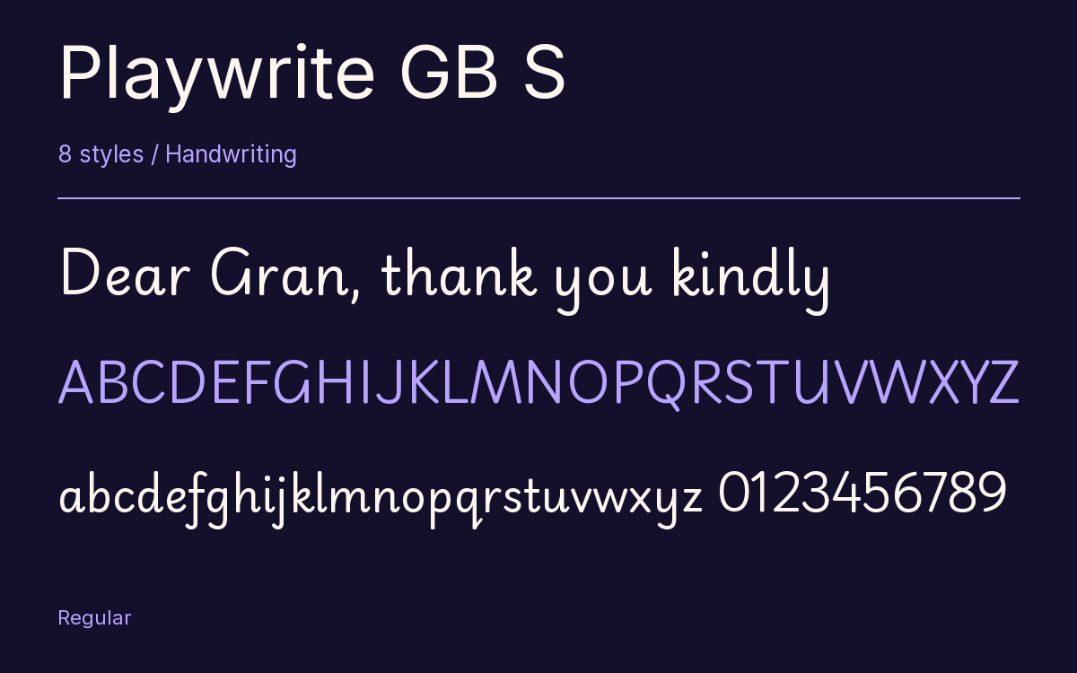
Characters & Figures
486 glyphs reported in the reference style. This selection shows 400 recorded characters.
ABCDEFGHIJKLMNOPQRSTUVWXYZ
abcdefghijklmnopqrstuvwxyz
0123456789 & @ ? !
View The Recorded Character Selection
The Font Files
Download
Playwrite GB S
8 TTF styles with the accompanying CSS, README and license information.
Download ZIP · 799 KB ↓- Version
- 1.003
- License
- SIL Open Font License 1.1
Install On Your Computer
Extract the ZIP first. On Windows, select the font files and choose Install from the context menu. On macOS, open the files in Font Book and choose Install.
Use On A Website
Keep the font files and the included stylesheet together. Update the stylesheet path to match your project.
<link rel="stylesheet"
  href="/fonts/playwrite-gb-s-2/playwrite-gb-s-2.css">

body {
  font-family: 'Playwrite GB S', cursive;
}
Keep the copyright and license notices with redistributed files.
Heading & Body
The family provides the heading; Inter carries the supporting text.
Playwrite GB S Heading · Inter Body
Thursday, Half Past Four
I left the book by the window. There is a note on page twenty-three that I thought you would like. Bring it along on Thursday; we can finish the conversation over coffee.