
Atkinson Hyperlegible
Designed By
Braille Institute, Applied Design Works, Elliott Scott, Megan Eiswerth, Linus Boman, Theodore Petrosky
4 Styles Sans Serif
Letters for
every day.
Atkinson Hyperlegible · Regular
Compare the family in headings, short labels and paragraph text.
4 styles available. Compare the specimens below, or enter your own text.
Download Atkinson Hyperlegible ↓TTF · SIL Open Font License 1.1
Set Your Own Text
Change the style and size to compare the letterforms.
Bus 18 stops at Elm Street
A Clear Hierarchy
Atkinson Hyperlegible · Regular
Headings, labels and running text.
Departures09:00 →
Before You Travel
The morning service leaves at nine. Tickets are available at the station, and the platform is listed on the departure board. Keep your ticket until the end of the journey.
4 Styles,
One Family
Every available style is shown below in its own font file.
Regular400
Bus 18 stops at Elm Street
Italic400
Bus 18 stops at Elm Street
Bold700
Bus 18 stops at Elm Street
Bold Italic700
Bus 18 stops at Elm Street
Braille Institute turned 100 in 2019, and the brand work for that anniversary is how this font came about. Applied Design Works, hired for the new identity, went looking for a typeface built for people with low vision, found nothing that met their goals for legibility, readability and branding together, and drew one. It carries the name of the Institute’s founder, J. Robert Atkinson. Elliott Scott, Megan Eiswerth, Linus Boman and Theodore Petrosky are the designers on the credits.
Underneath sits a traditional grotesque. On top of it the team built letters that are hard to mistake for one another, some in shapes you would not expect, all aimed at quicker character recognition. They were wary of going too far, though. Brad Scott and Elliott Scott worried that fonts where every letter and number looks wildly different from the next end up like an old ransom note, and might be harder for some people to read.
Circular shapes in the design nod to Braille dots.
The World Health Organization counts at least 2.2 billion people with a vision impairment, which gives a sense of who this is for. There are 4 styles, Regular and Bold with italics, and the italics take the same width as the uprights. Tabular and proportional figures and fractions are included. In 2019 the work picked up a Fast Company Innovation by Design Award.
Forms, signs, public service websites, anywhere a reader might struggle: we would start here.
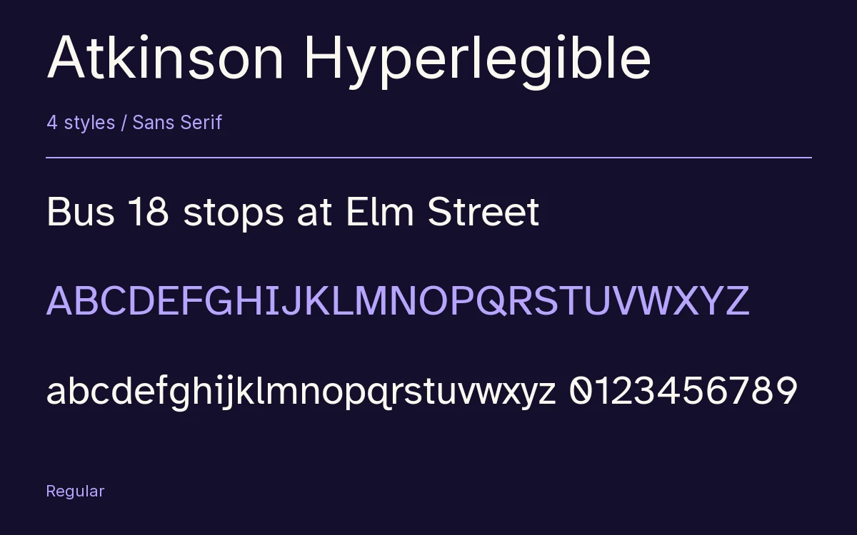
Characters & Figures
342 glyphs reported in the reference style. This selection shows 338 recorded characters.
ABCDEFGHIJKLMNOPQRSTUVWXYZ
abcdefghijklmnopqrstuvwxyz
0123456789 & @ ? !
View The Recorded Character Selection
The Font Files
Download
Atkinson Hyperlegible
4 TTF styles with the accompanying CSS, README and license information.
Download ZIP · 122 KB ↓- Version
- 1.006
- License
- SIL Open Font License 1.1
Install On Your Computer
Extract the ZIP first. On Windows, select the font files and choose Install from the context menu. On macOS, open the files in Font Book and choose Install.
Use On A Website
Keep the font files and the included stylesheet together. Update the stylesheet path to match your project.
<link rel="stylesheet"
  href="/fonts/atkinson-hyperlegible-2/atkinson-hyperlegible-2.css">

body {
  font-family: 'Atkinson Hyperlegible', sans-serif;
}
Keep the copyright and license notices with redistributed files.
Heading & Body
Compare a larger heading with the same family at reading size.
Atkinson Hyperlegible Heading · Atkinson Hyperlegible Body
Before You Travel
The morning service leaves at nine. Tickets are available at the station, and the platform is listed on the departure board. Keep your ticket until the end of the journey.