
National Park
Designed By
Andrea Herstowski, Ben Hoepner, Jeremy Shellhorn
7 Styles Sans Serif
Letters for
every day.
National Park · Regular
Compare the family in headings, short labels and paragraph text.
7 styles available. Compare the specimens below, or enter your own text.
Download National Park ↓TTF · SIL Open Font License 1.1
Set Your Own Text
Change the style and size to compare the letterforms.
Bear Lake trailhead, 2 miles
A Clear Hierarchy
National Park · Regular
Headings, labels and running text.
Departures09:00 →
Before You Travel
The morning service leaves at nine. Tickets are available at the station, and the platform is listed on the departure board. Keep your ticket until the end of the journey.
7 Styles,
One Family
Every available style is shown below in its own font file.
Extra Light200
Bear Lake trailhead, 2 miles
Light300
Bear Lake trailhead, 2 miles
Regular400
Bear Lake trailhead, 2 miles
Medium500
Bear Lake trailhead, 2 miles
Semi Bold600
Bear Lake trailhead, 2 miles
Bold700
Bear Lake trailhead, 2 miles
Extra Bold800
Bear Lake trailhead, 2 miles
Every letter started as a path for a router bit.
The wooden trail signs in Rocky Mountain National Park are carved by a machine that follows a line of points and curves, and the bit traveling along that line is what gives each letter its thickness. Andrea Herstowski, Ben Hoepner and Jeremy Shellhorn took those signs as the model. They drew each character first as a bare vector skeleton, a string of coordinates a router would read, then fattened it into 7 weights and corrected the spots where an analog router could never get a shape quite right. The quirks a router bit leaves behind were kept on purpose.
It went onto Google Fonts in March 2025 with Extra Light at 200 through Extra Bold at 800.
The feature list is longer than a signage face needs, which is good news for anyone making a map or a park leaflet: tabular and proportional figures, a slashed zero, fractions, case-sensitive punctuation for all caps lines, plus 1 stylistic set. Vietnamese is covered.
My pick would be Semi Bold and Bold in capitals for anything that has to read from a distance, and Regular for the small print on the back. By Extra Light the carved look has mostly gone.
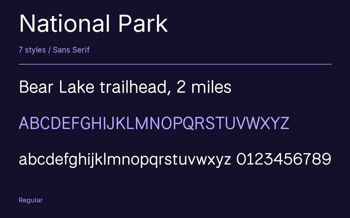
Characters & Figures
618 glyphs reported in the reference style. This selection shows 400 recorded characters.
ABCDEFGHIJKLMNOPQRSTUVWXYZ
abcdefghijklmnopqrstuvwxyz
0123456789 & @ ? !
View The Recorded Character Selection
The Font Files
Download
National Park
7 TTF styles with the accompanying CSS, README and license information.
Download ZIP · 270 KB ↓- Version
- 1.009
- License
- SIL Open Font License 1.1
Install On Your Computer
Extract the ZIP first. On Windows, select the font files and choose Install from the context menu. On macOS, open the files in Font Book and choose Install.
Use On A Website
Keep the font files and the included stylesheet together. Update the stylesheet path to match your project.
<link rel="stylesheet"
  href="/fonts/national-park/national-park.css">

body {
  font-family: 'National Park', sans-serif;
}
Keep the copyright and license notices with redistributed files.
Heading & Body
Compare a larger heading with the same family at reading size.
National Park Heading · National Park Body
Before You Travel
The morning service leaves at nine. Tickets are available at the station, and the platform is listed on the departure board. Keep your ticket until the end of the journey.