
Atkinson Hyperlegible Mono
Designed By
Braille Institute, Applied Design Works, Elliott Scott, Megan Eiswerth, Letters From Sweden
14 Styles Sans Serif
Letters for
every day.
Atkinson Hyperlegible Mono · Regular
Compare the family in headings, short labels and paragraph text.
14 styles available. Compare the specimens below, or enter your own text.
Download Atkinson Hyperlegible Mono ↓TTF · SIL Open Font License 1.1
Set Your Own Text
Change the style and size to compare the letterforms.
if (x == 0) return il1
A Clear Hierarchy
Atkinson Hyperlegible Mono · Regular
Headings, labels and running text.
Departures09:00 →
Before You Travel
The morning service leaves at nine. Tickets are available at the station, and the platform is listed on the departure board. Keep your ticket until the end of the journey.
14 Styles,
One Family
Every available style is shown below in its own font file.
Extra Light200
if (x == 0) return il1
Extra Light Italic200
if (x == 0) return il1
Light300
if (x == 0) return il1
Light Italic300
if (x == 0) return il1
Regular400
if (x == 0) return il1
Italic400
if (x == 0) return il1
Medium500
if (x == 0) return il1
Medium Italic500
if (x == 0) return il1
Semi Bold600
if (x == 0) return il1
Semi Bold Italic600
if (x == 0) return il1
Bold700
if (x == 0) return il1
Bold Italic700
if (x == 0) return il1
Extra Bold800
if (x == 0) return il1
Extra Bold Italic800
if (x == 0) return il1
Is that a zero or a capital O, a lowercase l or the numeral 1? A programmer with low vision asks that over and over in an ordinary code font, and Atkinson Hyperlegible Mono is built to stop the question. The zero is slashed, and each easily confused letter is pushed toward a shape of its own.
Behind it stands the proportional Atkinson Hyperlegible, which Applied Design Works drew for the Braille Institute’s 2019 centennial and named after the founder, J. Robert Atkinson. It is a grotesque at heart, with unambiguous and sometimes unexpected forms put in wherever 1 letter could be taken for another.
The mono
This version brings the same thinking to a fixed-width grid, with new weights, refined curves, more symbols and extra language support. Megan Eiswerth and Letters from Sweden are credited alongside Elliott Scott. There are 14 styles, Extra Light to Extra Bold with an italic for each, and every italic holds the same cell width as its roman. It sets wide, as a monospace does next to proportional text.
For a code editor, start at Regular. The Extra Light is better saved for large display use than for 13 px code on a dark theme.
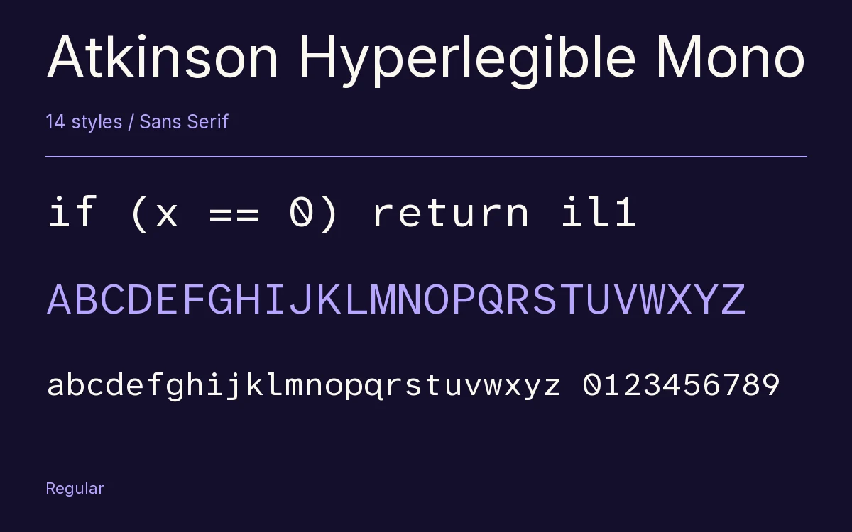
Characters & Figures
359 glyphs reported in the reference style. This selection shows 356 recorded characters.
ABCDEFGHIJKLMNOPQRSTUVWXYZ
abcdefghijklmnopqrstuvwxyz
0123456789 & @ ? !
View The Recorded Character Selection
The Font Files
Download
Atkinson Hyperlegible Mono
14 TTF styles with the accompanying CSS, README and license information.
Download ZIP · 278 KB ↓- Version
- 2.001
- License
- SIL Open Font License 1.1
Install On Your Computer
Extract the ZIP first. On Windows, select the font files and choose Install from the context menu. On macOS, open the files in Font Book and choose Install.
Use On A Website
Keep the font files and the included stylesheet together. Update the stylesheet path to match your project.
<link rel="stylesheet"
  href="/fonts/atkinson-hyperlegible-mono/atkinson-hyperlegible-mono.css">

body {
  font-family: 'Atkinson Hyperlegible Mono', sans-serif;
}
Keep the copyright and license notices with redistributed files.
Heading & Body
Compare a larger heading with the same family at reading size.
Atkinson Hyperlegible Mono Heading · Atkinson Hyperlegible Mono Body
Before You Travel
The morning service leaves at nine. Tickets are available at the station, and the platform is listed on the departure board. Keep your ticket until the end of the journey.