
Bitcount Prop Double
Designed By
Petr van Blokland
9 Styles Display
The evening
edition.
Bitcount Prop Double · Regular
Try a short headline and compare the letterforms at a larger scale.
9 styles available. Compare the specimens below, or enter your own text.
Download Bitcount Prop Double ↓TTF · SIL Open Font License 1.1
Set Your Own Text
Change the style and size to compare the letterforms.
Next bus in 4 minutes
A Headline In Place
Bitcount Prop Double · Regular
A poster setting with supporting text.
Theatre / Music / Conversation
An Evening
In Good
Company.
Friday · 7:30 pm
The Assembly Rooms
9 Styles,
One Family
Every available style is shown below in its own font file.
Thin100
Next bus in 4 minutes
Extra Light200
Next bus in 4 minutes
Light300
Next bus in 4 minutes
Regular400
Next bus in 4 minutes
Medium500
Next bus in 4 minutes
Semi Bold600
Next bus in 4 minutes
Bold700
Next bus in 4 minutes
Extra Bold800
Next bus in 4 minutes
Black900
Next bus in 4 minutes
Petr van Blokland started Bitcount from a small sum. An a and an e need at least 5 pixels of x-height to be readable, and with a row each for ascenders and descenders the smallest grid that holds a whole alphabet comes to 5 pixels wide by 7 high. Everything in the Bitcount family is a variation on those 35-odd dots: round or square pixels, big or small ones, slanted or upright, condensed or not, and 1-pixel or 2-pixel stems.
This member is the Prop Double. Double means the stems are 2 pixels thick. Prop means each letter gets the width it needs, rounded to whole pixels, where the Grid and Mono cousins put every letter on a fixed 6-pixel width and patch the narrow i and l with serifs to fill it. Since the widths vary, Prop is also the only variant that can be kerned, and it is.
Each pixel is 100 units of a 1,000-unit em, so 1 pixel is a tenth of the font size. That makes the spacing easy to reason about: in InDesign every extra pixel between letters is a tracking value of 10.
Van Blokland’s own suggestions for it run from running LED signs and cheap low-resolution screens to stacking several copies in different colors, each copy shifted a little, for shadows and fake 3D. He also mentions building letters out of LEGO bricks or lit office windows. We would take the stacking idea first; it is where a 9-weight pixel face earns its keep, and the small caps, old style figures and 6 stylistic sets give each layer something different to do.
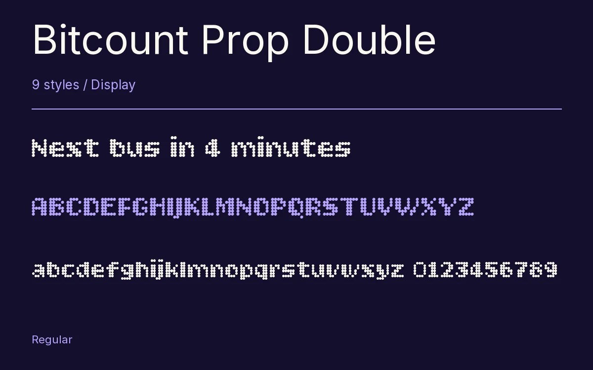
Characters & Figures
396 glyphs reported in the reference style. This selection shows 393 recorded characters.
ABCDEFGHIJKLMNOPQRSTUVWXYZ
abcdefghijklmnopqrstuvwxyz
0123456789 & @ ? !
View The Recorded Character Selection
The Font Files
Download
Bitcount Prop Double
9 TTF styles with the accompanying CSS, README and license information.
Download ZIP · 257 KB ↓- Version
- 1.0
- License
- SIL Open Font License 1.1
Install On Your Computer
Extract the ZIP first. On Windows, select the font files and choose Install from the context menu. On macOS, open the files in Font Book and choose Install.
Use On A Website
Keep the font files and the included stylesheet together. Update the stylesheet path to match your project.
<link rel="stylesheet"
  href="/fonts/bitcount-prop-double/bitcount-prop-double.css">

body {
  font-family: 'Bitcount Prop Double', sans-serif;
}
Keep the copyright and license notices with redistributed files.
Heading & Body
The family provides the heading; Inter carries the supporting text.
Bitcount Prop Double Heading · Inter Body
The Evening Performance
Doors open at seven. The performance begins at half past. Please take your seat before the lights go down.