
New Title
Designed By
Jérémie Hornus, Julie Soudanne
1 Style Sans Serif

New Title · Regular
View the family information below and visit the publisher for font files and usage terms.
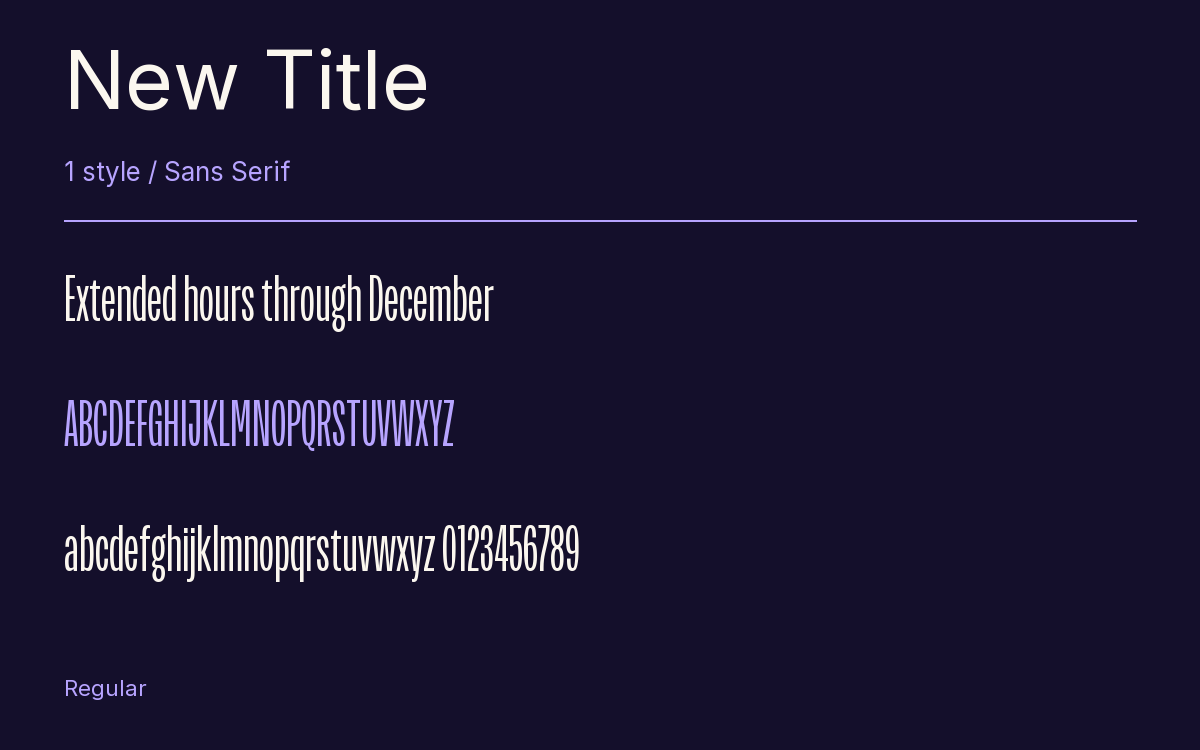
1 style available. The specimen image shows the family; live testing is available from its publisher.
Get New Title ↓TTF · ITF Free Font License
1 Style,
One Family
Style names from the catalog. Visit the publisher to test each style.
Regular400
Film credits roll past quickly and in narrow columns, and New Title was drawn for that work, the titles and credit sequences of movies. Julie Soudanne and Jérémie Hornus made it compressed and utilitarian, with strokes of almost even thickness, and the squeeze is extreme: a line needs less than half the width Arial would take.
Small things set it apart. The capital J does not drop below the baseline, and its out-stroke turns up again in the terminals of C, G, S and several numerals. There are 2 forms of the lowercase g, and the euro and yen signs have a gap cut into their main strokes.
The family has 5 weights. This is the Regular, engineered by Rahul Gajjar, and a tall poster or a cover line in a slim column would suit it.
The Font Files
Download
New Title
Obtain the original files from the publisher. Its terms govern download and use.
Visit The Publisher ↗Read The Font License ↗Download From The Publisher
This family is listed for reference. Font files are supplied by the publisher under its own terms.