
Nobile
Designed By
Vernon Adams
6 Styles Sans Serif
Letters for
every day.
Nobile · Regular
Compare the family in headings, short labels and paragraph text.
6 styles available. Compare the specimens below, or enter your own text.
Download Nobile ↓TTF · SIL Open Font License 1.1
Set Your Own Text
Change the style and size to compare the letterforms.
Useful things, beautiful things
A Clear Hierarchy
Nobile · Regular
Headings, labels and running text.
Departures09:00 →
Before You Travel
The morning service leaves at nine. Tickets are available at the station, and the platform is listed on the departure board. Keep your ticket until the end of the journey.
6 Styles,
One Family
Every available style is shown below in its own font file.
Regular400
Useful things, beautiful things
Italic400
Useful things, beautiful things
Medium500
Useful things, beautiful things
Medium Italic500
Useful things, beautiful things
Bold700
Useful things, beautiful things
Bold Italic700
Useful things, beautiful things
William Morris told people to have nothing in the house they did not know to be useful or believe to be beautiful, and Vernon Adams went back to that line when he started Nobile. He wanted a sans that would behave on digital screens and handheld devices and still have the character people expect from fonts made for print, at display sizes and all the way down to small text.
He released version 1.001 on 27 March 2010, drawing the sources in FontForge, and Google Fonts took it on that May, which puts it among the early families in the library. In 2012 he started a version 2, which stayed in an in-progress folder.
Adams had done an MA in Typeface Design at the University of Reading, finished in 2006, after studying fine art at Vestlandets Kunstakademi in Norway, and between 2007 and 2014 he worked as a type designer with a focus on type for mobile and cloud screens. His view was that fonts should be free to everyone. A scooter accident in 2014 left him badly injured. He also drew Oswald.
The family here is Regular, Medium and Bold, each with an italic, plus Cyrillic. The italics are noticeably narrower than the romans, close to 10% on a line of text. We would put Nobile on a blog or a news app, and use the italic for emphasis inside the paragraph, where its narrow fit saves room.
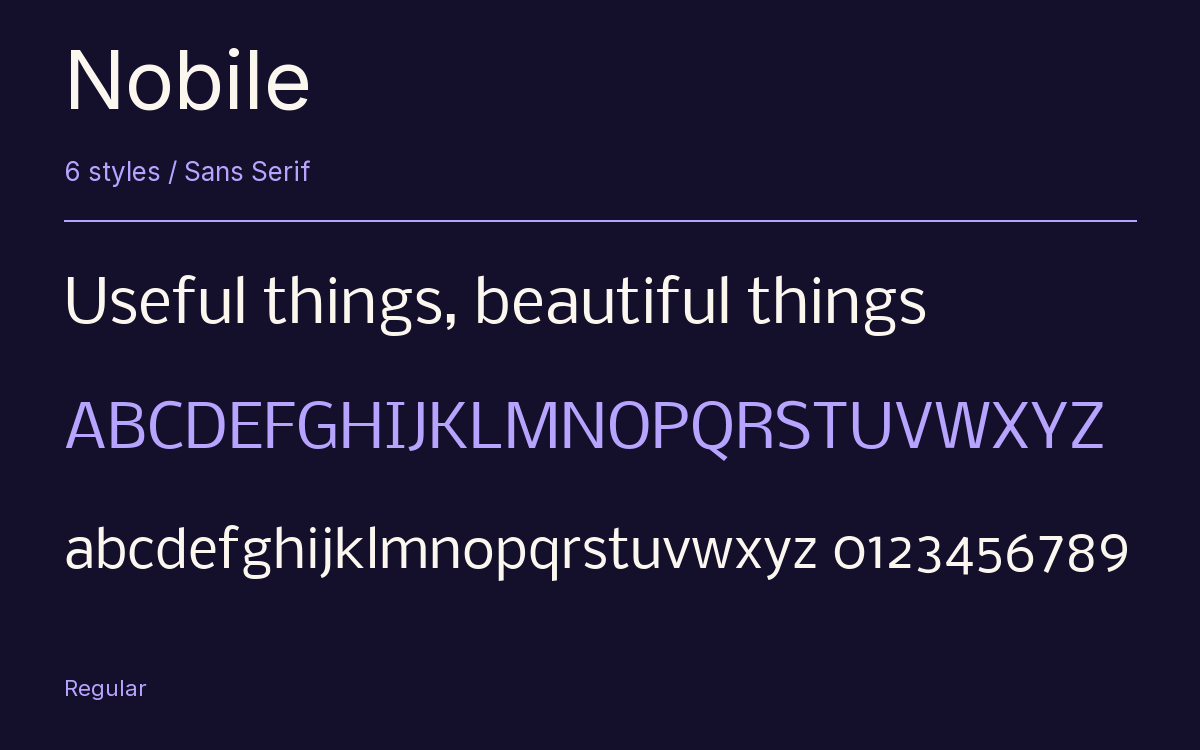
Characters & Figures
372 glyphs reported in the reference style. This selection shows 367 recorded characters.
ABCDEFGHIJKLMNOPQRSTUVWXYZ
abcdefghijklmnopqrstuvwxyz
0123456789 & @ ? !
View The Recorded Character Selection
The Font Files
Download
Nobile
6 TTF styles with the accompanying CSS, README and license information.
Download ZIP · 278 KB ↓- Version
- 001.001
- License
- SIL Open Font License 1.1
Install On Your Computer
Extract the ZIP first. On Windows, select the font files and choose Install from the context menu. On macOS, open the files in Font Book and choose Install.
Use On A Website
Keep the font files and the included stylesheet together. Update the stylesheet path to match your project.
<link rel="stylesheet"
  href="/fonts/nobile/nobile.css">

body {
  font-family: 'Nobile', sans-serif;
}
Keep the copyright and license notices with redistributed files.
Heading & Body
Compare a larger heading with the same family at reading size.
Nobile Heading · Nobile Body
Before You Travel
The morning service leaves at nine. Tickets are available at the station, and the platform is listed on the departure board. Keep your ticket until the end of the journey.