
Noto Sans TC
Designed By
9 Styles Sans Serif
Letters for
every day.
Noto Sans TC · Regular
Compare the family in headings, short labels and paragraph text.
9 styles available. Compare the specimens below, or enter your own text.
Download Noto Sans TC ↓TTF · SIL Open Font License 1.1
Set Your Own Text
Change the style and size to compare the letterforms.
Last train to Tamsui tonight
A Clear Hierarchy
Noto Sans TC · Regular
Headings, labels and running text.
Departures09:00 →
Before You Travel
The morning service leaves at nine. Tickets are available at the station, and the platform is listed on the departure board. Keep your ticket until the end of the journey.
9 Styles,
One Family
Every available style is shown below in its own font file.
Thin100
Preview Thin · 3.8 MB
Last train to Tamsui tonight
Extra Light200
Preview Extra Light · 4.0 MB
Last train to Tamsui tonight
Light300
Preview Light · 4.0 MB
Last train to Tamsui tonight
Regular400
Last train to Tamsui tonight
Medium500
Preview Medium · 4.1 MB
Last train to Tamsui tonight
Semi Bold600
Preview Semi Bold · 4.1 MB
Last train to Tamsui tonight
Bold700
Preview Bold · 4.1 MB
Last train to Tamsui tonight
Extra Bold800
Preview Extra Bold · 4.1 MB
Last train to Tamsui tonight
Black900
Preview Black · 4.0 MB
Last train to Tamsui tonight
Ryoko Nishizuka drew the ideographs, the kana and the Bopomofo in Noto Sans TC, and in a Chinese font that is nearly the whole job, since each file here carries 20,745 characters and only a small corner of them is Latin. Paul D. Hunt handled that corner, the Latin with Greek and Cyrillic. The Hangul came from Sandoll Communications, by Soo-young Jang and Joo-yeon Kang. Adobe produced the lot. Ken Lunde was project architect, which on a CJK font means he decided what the glyph set holds, and Masataka Hattori worked on production and the ideograph elements.
TC is Traditional Chinese, the form of the Han characters read in Taiwan and Macau, and that is who the family is for. It still keeps Hiragana, Katakana and Hangul inside, so a sentence that drifts into Japanese does not fall back to some other font halfway.
There are 9 weights, Thin at 100 through Black at 900, all upright.
Our take: the Thin and Extra Light look fine on a big poster and go to pieces in a dense paragraph, where a character crowded with strokes needs some ink to stay legible on a phone. Keep running text between Light and Medium and save the Black for a headline or a station sign. The Latin sits a little wide next to Arial, comfortable in a bilingual menu where English runs under the Chinese and both should read as 1 family.
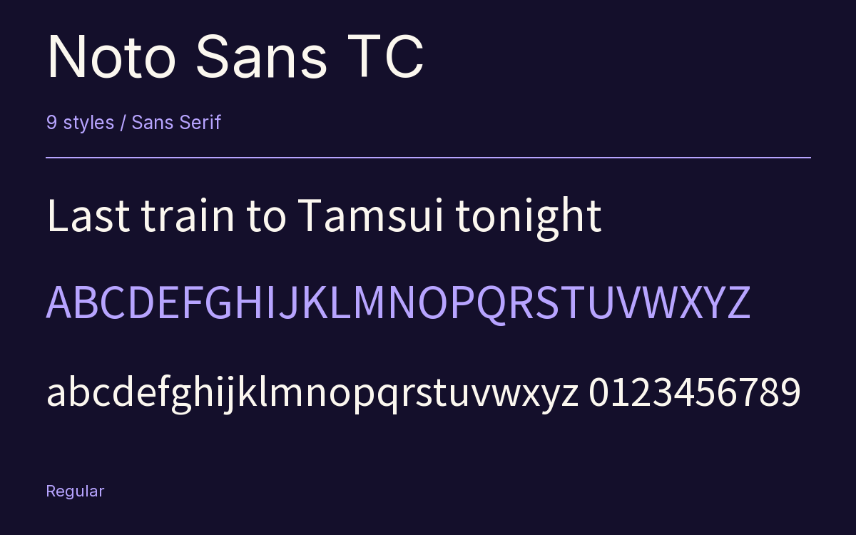
Characters & Figures
20,745 glyphs reported in the reference style. This selection shows 400 recorded characters.
ABCDEFGHIJKLMNOPQRSTUVWXYZ
abcdefghijklmnopqrstuvwxyz
0123456789 & @ ? !
View The Recorded Character Selection
The Font Files
Download
Noto Sans TC
9 TTF styles with the accompanying CSS, README and license information.
Download ZIP · 36.2 MB ↓- Version
- 2.004-H2
- License
- SIL Open Font License 1.1
Install On Your Computer
Extract the ZIP first. On Windows, select the font files and choose Install from the context menu. On macOS, open the files in Font Book and choose Install.
Use On A Website
Keep the font files and the included stylesheet together. Update the stylesheet path to match your project.
<link rel="stylesheet"
  href="/fonts/noto-sans-tc-2/noto-sans-tc-2.css">

body {
  font-family: 'Noto Sans TC', sans-serif;
}
Keep the copyright and license notices with redistributed files.
Heading & Body
Compare a larger heading with the same family at reading size.
Noto Sans TC Heading · Noto Sans TC Body
Before You Travel
The morning service leaves at nine. Tickets are available at the station, and the platform is listed on the departure board. Keep your ticket until the end of the journey.