
Pitagon Serif
Designed By
Travis Tran
18 Styles Serif
The pleasure
of a well-set
page.
Pitagon Serif · Regular
Compare this serif family in headings and a continuous reading sample.
18 styles available. Compare the specimens below, or enter your own text.
Download Pitagon Serif ↓TTF · SIL Open Font License 1.1
Set Your Own Text
Change the style and size to compare the letterforms.
Footnotes belong at the bottom
A Page In Pitagon Serif
Pitagon Serif · Regular
Headings, labels and running text.
Notes From The Reading Room
The reading room opens onto a quiet courtyard. Along the shelves, small handwritten labels mark the collections. A visitor leaves a book open beside the window, keeping a place for the next reader.
A heading marks the next chapter. The margins leave room for a note while the text continues across the page.
18 Styles,
One Family
Every available style is shown below in its own font file.
Thin100
Footnotes belong at the bottom
Thin Italic100
Footnotes belong at the bottom
Extra Light200
Footnotes belong at the bottom
Extra Light Italic200
Footnotes belong at the bottom
Light300
Footnotes belong at the bottom
Light Italic300
Footnotes belong at the bottom
Regular400
Footnotes belong at the bottom
Italic400
Footnotes belong at the bottom
Medium500
Footnotes belong at the bottom
Medium Italic500
Footnotes belong at the bottom
Semi Bold600
Footnotes belong at the bottom
Semi Bold Italic600
Footnotes belong at the bottom
Bold700
Footnotes belong at the bottom
Bold Italic700
Footnotes belong at the bottom
Extra Bold800
Footnotes belong at the bottom
Extra Bold Italic800
Footnotes belong at the bottom
Black900
Footnotes belong at the bottom
Black Italic900
Footnotes belong at the bottom
Among the design principles written into Pitagon Serif’s README is one you rarely meet in a type specification: keep triggers for trypophobia, the fear of holes, and aichmophobia, the fear of sharp objects, to a minimum. In the letters that means rounded outer corners on continuous strokes, while corners where 2 strokes meet stay sharp.
Travis Tran made it for Pitagon’s design system, the Pi Design System, taking cues from Source Serif, with heavy asymmetric serifs and arms cut at inverted angles, and from IBM Plex Serif. Metrics are kept close to common system fonts on a base unit of 4, so a page that swaps from a fallback to Pitagon should not jump about much while it loads.
Its stated job is reading text, articles and books and magazines and anything else long, in print and on screen. 9 weights from Thin to Black, all with italics, small caps, old style and lining figures, tabular figures and a slashed zero, in Latin with Vietnamese.
The slogan behind the brand is BREAKTHROUGH the limits, in capitals. We find the letters a good deal calmer than that, which suits a long article.
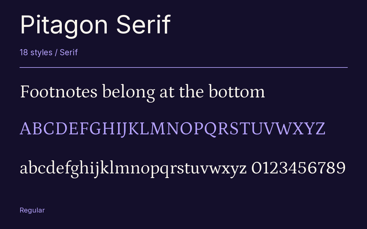
Characters & Figures
721 glyphs reported in the reference style. This selection shows 400 recorded characters.
ABCDEFGHIJKLMNOPQRSTUVWXYZ
abcdefghijklmnopqrstuvwxyz
0123456789 & @ ? !
View The Recorded Character Selection
The Font Files
Download
Pitagon Serif
18 TTF styles with the accompanying CSS, README and license information.
Download ZIP · 1.4 MB ↓- Version
- 1.001
- License
- SIL Open Font License 1.1
Install On Your Computer
Extract the ZIP first. On Windows, select the font files and choose Install from the context menu. On macOS, open the files in Font Book and choose Install.
Use On A Website
Keep the font files and the included stylesheet together. Update the stylesheet path to match your project.
<link rel="stylesheet"
  href="/fonts/pitagon-serif/pitagon-serif.css">

body {
  font-family: 'Pitagon Serif', sans-serif;
}
Keep the copyright and license notices with redistributed files.
Heading & Body
The family provides the heading; Inter carries the supporting text.
Pitagon Serif Heading · Inter Body
Notes From The Reading Room
The reading room opens onto a quiet courtyard. Along the shelves, small handwritten labels mark the collections. A visitor leaves a book open beside the window, keeping a place for the next reader.