
Josefin Slab
Designed By
Santiago Orozco
14 Styles Serif
The pleasure
of a well-set
page.
Josefin Slab · Regular
Compare this serif family in headings and a continuous reading sample.
14 styles available. Compare the specimens below, or enter your own text.
Download Josefin Slab ↓TTF · SIL Open Font License 1.1
Set Your Own Text
Change the style and size to compare the letterforms.
Smørrebrød at the harbor café
A Page In Josefin Slab
Josefin Slab · Regular
Headings, labels and running text.
Notes From The Reading Room
The reading room opens onto a quiet courtyard. Along the shelves, small handwritten labels mark the collections. A visitor leaves a book open beside the window, keeping a place for the next reader.
A heading marks the next chapter. The margins leave room for a note while the text continues across the page.
14 Styles,
One Family
Every available style is shown below in its own font file.
Thin100
Smørrebrød at the harbor café
Thin Italic100
Smørrebrød at the harbor café
Extra Light200
Smørrebrød at the harbor café
Extra Light Italic200
Smørrebrød at the harbor café
Light300
Smørrebrød at the harbor café
Light Italic300
Smørrebrød at the harbor café
Regular400
Smørrebrød at the harbor café
Italic400
Smørrebrød at the harbor café
Medium500
Smørrebrød at the harbor café
Medium Italic500
Smørrebrød at the harbor café
Semi Bold600
Smørrebrød at the harbor café
Semi Bold Italic600
Smørrebrød at the harbor café
Bold700
Smørrebrød at the harbor café
Bold Italic700
Smørrebrød at the harbor café
The æ came first, in a way. Santiago Orozco wanted Josefin Slab to feel Scandinavian, so he spent a lot of his time on the diacritics, and on æ above all, where the loops join in 1 continuous movement. The slope of the e was then set to match it. An odd order of work, and a likeable one.
He calls Slab the first typeface he designed, in his head anyway, though Josefin Sans got finished first because it was the simpler job. The recipe was 1930s geometry, something between Kabel and Memphis with modern details, and on top of that a few typewriter habits picked up from Letter Gothic, a face he had liked since high school.
The lowercase is very small. Its x-height comes to 54% of the cap height, so the capitals loom and the small letters look delicate, and our advice is to keep it big. At body sizes on a screen the Thin and Extra Light would melt away.
14 styles, Thin at 100 to Bold at 700, every weight with an italic. The character set is compact, 214 characters for Western European Latin, and kerning is the only OpenType feature.
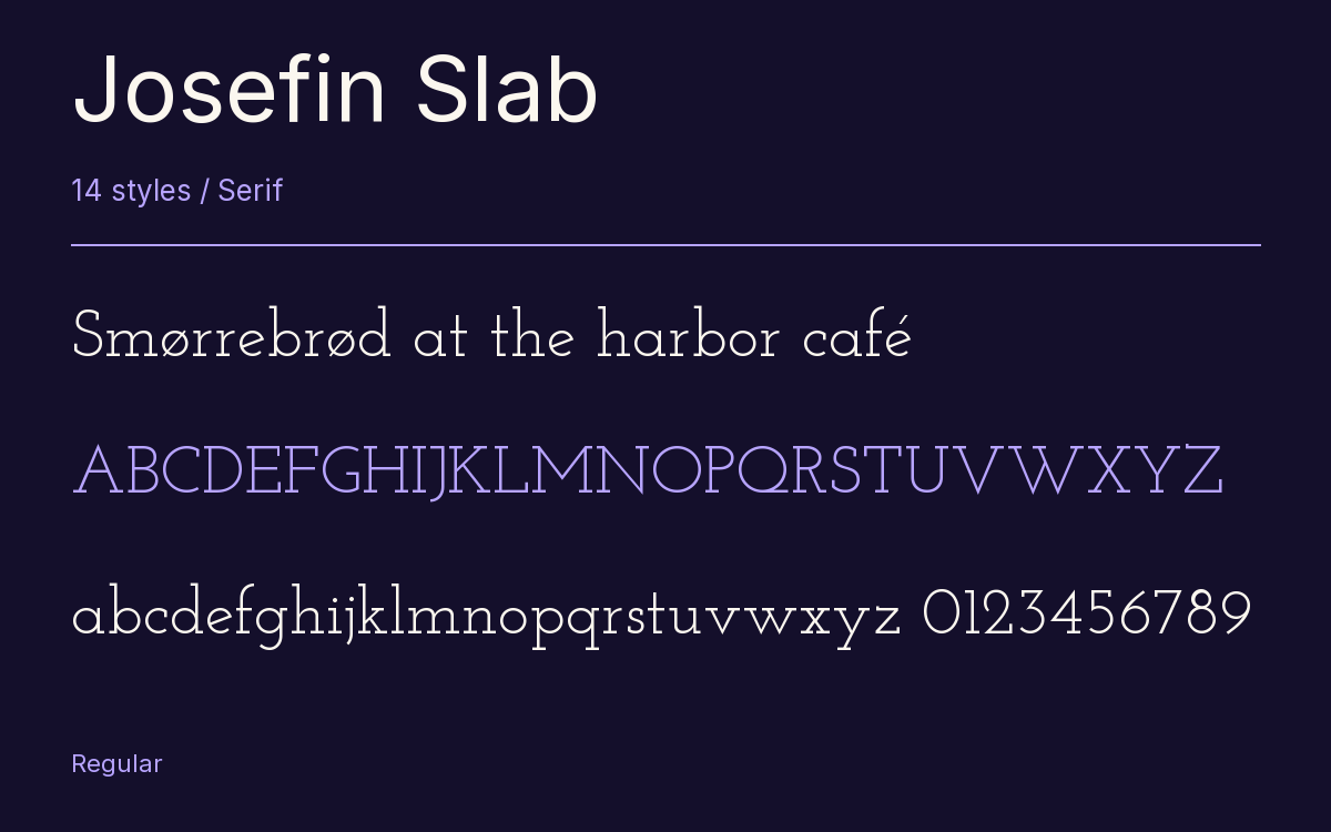
Characters & Figures
214 glyphs reported in the reference style. This selection shows 211 recorded characters.
ABCDEFGHIJKLMNOPQRSTUVWXYZ
abcdefghijklmnopqrstuvwxyz
0123456789 & @ ? !
View The Recorded Character Selection
The Font Files
Download
Josefin Slab
14 TTF styles with the accompanying CSS, README and license information.
Download ZIP · 215 KB ↓- Version
- 2.100
- License
- SIL Open Font License 1.1
Install On Your Computer
Extract the ZIP first. On Windows, select the font files and choose Install from the context menu. On macOS, open the files in Font Book and choose Install.
Use On A Website
Keep the font files and the included stylesheet together. Update the stylesheet path to match your project.
<link rel="stylesheet"
  href="/fonts/josefin-slab-2/josefin-slab-2.css">

body {
  font-family: 'Josefin Slab', sans-serif;
}
Keep the copyright and license notices with redistributed files.
Heading & Body
The family provides the heading; Inter carries the supporting text.
Josefin Slab Heading · Inter Body
Notes From The Reading Room
The reading room opens onto a quiet courtyard. Along the shelves, small handwritten labels mark the collections. A visitor leaves a book open beside the window, keeping a place for the next reader.