
Arvo
Designed By
Anton Koovit
4 Styles Serif
The pleasure
of a well-set
page.
Arvo · Regular
Compare this serif family in headings and a continuous reading sample.
4 styles available. Compare the specimens below, or enter your own text.
Download Arvo ↓TTF · SIL Open Font License 1.1
Set Your Own Text
Change the style and size to compare the letterforms.
Departures resume at platform 9
A Page In Arvo
Arvo · Regular
Headings, labels and running text.
Notes From The Reading Room
The reading room opens onto a quiet courtyard. Along the shelves, small handwritten labels mark the collections. A visitor leaves a book open beside the window, keeping a place for the next reader.
A heading marks the next chapter. The margins leave room for a note while the text continues across the page.
4 Styles,
One Family
Every available style is shown below in its own font file.
Regular400
Departures resume at platform 9
Italic400
Departures resume at platform 9
Bold700
Departures resume at platform 9
Bold Italic700
Departures resume at platform 9
Arvo is an Estonian man’s name, not much given any more. In Finnish the same word means number, value or worth, and Anton Koovit enjoyed the fit, since hinting a font for screens involves so much programming. He released it in 2010, and Google Fonts was where it was published first.
The design is a geometric slab serif, square-footed and close to monolinear, though Koovit left a tiny bit of contrast in the strokes because it helped legibility on Mac OS X. He describes its flavor as mixed, which is honest. The family is the classic 4: Regular, Italic, Bold and Bold Italic, with 226 characters each in this build, Latin only.
Who drew it? Koovit was born in Tallinn in 1981 and studied graphic design at the Estonian Academy of Arts, then in Paris at ESAG and in Amsterdam at the Gerrit Rietveld Academie, before a master’s in type design at the Royal Academy of Art in The Hague. He set up his own studio afterward, working on exhibitions, logos, posters and type, and has lived in Berlin since 2007, where he also teaches typography. Adam, Aleksei, GQ Slab and U8 are other faces of his.
Our view: Arvo is at home in headlines and short web text, where its sturdy slabs keep a heading upright and readable. It sets wider than Georgia by close to 10%, so long paragraphs eat more lines than you expect, and a report set in it all the way through would feel heavy going.
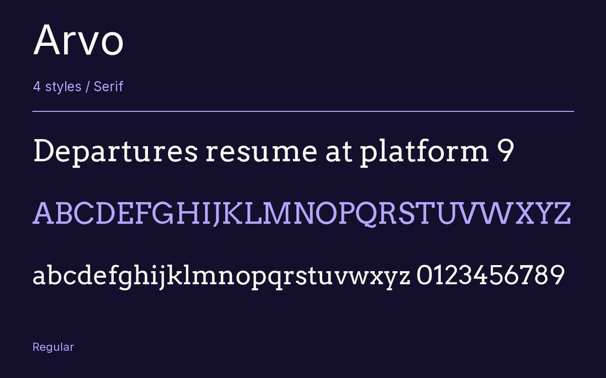
Characters & Figures
226 glyphs reported in the reference style. This selection shows 224 recorded characters.
ABCDEFGHIJKLMNOPQRSTUVWXYZ
abcdefghijklmnopqrstuvwxyz
0123456789 & @ ? !
View The Recorded Character Selection
The Font Files
Download
Arvo
4 TTF styles with the accompanying CSS, README and license information.
Download ZIP · 89 KB ↓- Version
- 1.006
- License
- SIL Open Font License 1.1
Install On Your Computer
Extract the ZIP first. On Windows, select the font files and choose Install from the context menu. On macOS, open the files in Font Book and choose Install.
Use On A Website
Keep the font files and the included stylesheet together. Update the stylesheet path to match your project.
<link rel="stylesheet"
  href="/fonts/arvo/arvo.css">

body {
  font-family: 'Arvo', sans-serif;
}
Keep the copyright and license notices with redistributed files.
Heading & Body
The family provides the heading; Inter carries the supporting text.
Arvo Heading · Inter Body
Notes From The Reading Room
The reading room opens onto a quiet courtyard. Along the shelves, small handwritten labels mark the collections. A visitor leaves a book open beside the window, keeping a place for the next reader.