
Noto Serif
Designed By
18 Styles Serif
The pleasure
of a well-set
page.
Noto Serif · Regular
Compare this serif family in headings and a continuous reading sample.
18 styles available. Compare the specimens below, or enter your own text.
Download Noto Serif ↓TTF · SIL Open Font License 1.1
Set Your Own Text
Change the style and size to compare the letterforms.
Notes toward a common alphabet
A Page In Noto Serif
Noto Serif · Regular
Headings, labels and running text.
Notes From The Reading Room
The reading room opens onto a quiet courtyard. Along the shelves, small handwritten labels mark the collections. A visitor leaves a book open beside the window, keeping a place for the next reader.
A heading marks the next chapter. The margins leave room for a note while the text continues across the page.
18 Styles,
One Family
Every available style is shown below in its own font file.
Thin100
Notes toward a common alphabet
Thin Italic100
Notes toward a common alphabet
Extra Light200
Notes toward a common alphabet
Extra Light Italic200
Notes toward a common alphabet
Light300
Notes toward a common alphabet
Light Italic300
Notes toward a common alphabet
Regular400
Notes toward a common alphabet
Italic400
Notes toward a common alphabet
Medium500
Notes toward a common alphabet
Medium Italic500
Notes toward a common alphabet
Semi Bold600
Notes toward a common alphabet
Semi Bold Italic600
Notes toward a common alphabet
Bold700
Notes toward a common alphabet
Bold Italic700
Notes toward a common alphabet
Extra Bold800
Notes toward a common alphabet
Extra Bold Italic800
Notes toward a common alphabet
Black900
Notes toward a common alphabet
Black Italic900
Notes toward a common alphabet
The script-specific Noto Serif fonts need a partner for the Latin, Greek and Cyrillic that sits around them, and Noto Serif is that partner, a modulated design for those 3 alphabets.
Those 3 alphabets carry a lot of history between them. Greek has written the Greek language since the 8th century BCE, and its 24 letters were standardized in the 4th century BCE; it was written with 3 accents until 1982, when Greece moved to monotonic spelling with a single diacritic. Cyrillic was created in the 9th century, traditionally credited to Saint Cyril, a monk from Thessaloniki working in Bulgaria, and Peter the Great reformed it in 1708. Latin, derived from Western Greek and attested in Rome in the 7th century BCE, now writes over 3,000 languages.
The family on this page is large:
- 18 styles, Thin at 100 to Black at 900, each weight with an italic.
- Small caps, old style and lining figures, tabular and proportional figures, a slashed zero and 3 stylistic sets.
- Latin with Vietnamese, plus Greek and Cyrillic, including the extended ranges.
The italic runs slightly narrower than the roman, so it sits a little tighter in a sentence. For a multilingual book or a scholarly site we would treat it as the default and only swap in something with more character for display. It has been on Google Fonts since 2013.
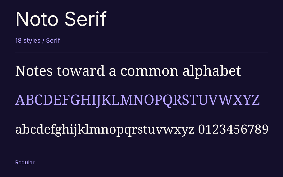
Characters & Figures
2,965 glyphs reported in the reference style. This selection shows 400 recorded characters.
ABCDEFGHIJKLMNOPQRSTUVWXYZ
abcdefghijklmnopqrstuvwxyz
0123456789 & @ ? !
View The Recorded Character Selection
The Font Files
Download
Noto Serif
18 TTF styles with the accompanying CSS, README and license information.
Download ZIP · 4.6 MB ↓- Version
- 2.015
- License
- SIL Open Font License 1.1
Install On Your Computer
Extract the ZIP first. On Windows, select the font files and choose Install from the context menu. On macOS, open the files in Font Book and choose Install.
Use On A Website
Keep the font files and the included stylesheet together. Update the stylesheet path to match your project.
<link rel="stylesheet"
  href="/fonts/noto-serif-2/noto-serif-2.css">

body {
  font-family: 'Noto Serif', sans-serif;
}
Keep the copyright and license notices with redistributed files.
Heading & Body
The family provides the heading; Inter carries the supporting text.
Noto Serif Heading · Inter Body
Notes From The Reading Room
The reading room opens onto a quiet courtyard. Along the shelves, small handwritten labels mark the collections. A visitor leaves a book open beside the window, keeping a place for the next reader.