
Source Serif Pro
Designed By
Frank Grießhammer
12 Styles Serif
The pleasure
of a well-set
page.
Source Serif Pro · Regular
Compare this serif family in headings and a continuous reading sample.
12 styles available. Compare the specimens below, or enter your own text.
Download Source Serif Pro ↓TTF · SIL Open Font License 1.1
Set Your Own Text
Change the style and size to compare the letterforms.
Second printing, with corrections
A Page In Source Serif Pro
Source Serif Pro · Regular
Headings, labels and running text.
Notes From The Reading Room
The reading room opens onto a quiet courtyard. Along the shelves, small handwritten labels mark the collections. A visitor leaves a book open beside the window, keeping a place for the next reader.
A heading marks the next chapter. The margins leave room for a note while the text continues across the page.
12 Styles,
One Family
Every available style is shown below in its own font file.
Extra Light200
Second printing, with corrections
Extra Light Italic200
Second printing, with corrections
Light300
Second printing, with corrections
Light Italic300
Second printing, with corrections
Regular400
Second printing, with corrections
Italic400
Second printing, with corrections
Semi Bold600
Second printing, with corrections
Semi Bold Italic600
Second printing, with corrections
Bold700
Second printing, with corrections
Bold Italic700
Second printing, with corrections
Black900
Second printing, with corrections
Black Italic900
Second printing, with corrections
Bulgarian readers expect several Cyrillic letters to take different shapes from the Russian ones, and Source Serif Pro keeps those shapes in a stylistic set, ss01. Switch it on for a Bulgarian text and the letters change throughout. ss02 does the same for Serbian and Macedonian.
The design is Frank Grießhammer’s, for Adobe. It came out in 2014 as Adobe’s third open-source family, drawn to go with Paul D. Hunt’s Source Sans, and the model, followed at a distance, was Pierre Simon Fournier. Greek and Cyrillic arrived with version 2.0 in 2017, the italics in 2018. Later on the Pro was dropped and optical sizes came in, and the design carries on as Source Serif 4; what you get here are the Pro files at version 3.001.
There are 12 styles, Extra Light at 200 through Black at 900, and the roman and italic of each weight share a good deal:
- the same 907 characters, Latin, Vietnamese, Greek and Cyrillic, so an italic Greek word is no trouble
- old style, lining, tabular and proportional figures, with fractions and a slashed zero
Small caps are the exception, found in the romans only.
A line of it holds nearly as many words as Georgia does, under 2% fewer, which makes it an easy swap on a page already laid out for that face. Would we set a thesis in it? Yes, in Regular with old style figures, and we’d keep Black for a book jacket or a poster title.
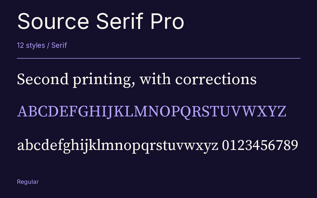
Characters & Figures
907 glyphs reported in the reference style. This selection shows 400 recorded characters.
ABCDEFGHIJKLMNOPQRSTUVWXYZ
abcdefghijklmnopqrstuvwxyz
0123456789 & @ ? !
View The Recorded Character Selection
The Font Files
Download
Source Serif Pro
12 TTF styles with the accompanying CSS, README and license information.
Download ZIP · 1.1 MB ↓- Version
- 3.001
- License
- SIL Open Font License 1.1
Install On Your Computer
Extract the ZIP first. On Windows, select the font files and choose Install from the context menu. On macOS, open the files in Font Book and choose Install.
Use On A Website
Keep the font files and the included stylesheet together. Update the stylesheet path to match your project.
<link rel="stylesheet"
  href="/fonts/source-serif-pro-2/source-serif-pro-2.css">

body {
  font-family: 'Source Serif Pro', sans-serif;
}
Keep the copyright and license notices with redistributed files.
Heading & Body
The family provides the heading; Inter carries the supporting text.
Source Serif Pro Heading · Inter Body
Notes From The Reading Room
The reading room opens onto a quiet courtyard. Along the shelves, small handwritten labels mark the collections. A visitor leaves a book open beside the window, keeping a place for the next reader.