
Playwrite NO
Designed By
TypeTogether, Veronika Burian, José Scaglione
4 Styles Handwriting
A little note,
before you go.
Playwrite NO · Regular
Try a short note, a name or a line of your own to compare the strokes and spacing.
4 styles available. Compare the specimens below, or enter your own text.
Download Playwrite NO ↓TTF · SIL Open Font License 1.1
Set Your Own Text
Change the style and size to compare the letterforms.
Dear Ingrid, thanks for the skates
A Note On The Page
Playwrite NO · Regular
A short letter, set in the family.
Thursday afternoon
Dear Alex,
I left the book by the window. There is a note on page twenty-three that I thought you would like. Bring it along on Thursday; we can finish the conversation over coffee.
See you there.
4 Styles,
One Family
Every available style is shown below in its own font file.
Thin100
Dear Ingrid, thanks for the skates
Extra Light200
Dear Ingrid, thanks for the skates
Light300
Dear Ingrid, thanks for the skates
Regular400
Dear Ingrid, thanks for the skates
Norwegian children learn to write twice. In first grade they are taught trykkskrift, a plain print script, and somewhere in the middle of second grade or the start of third they move on to stavskrift, an unlooped modern cursive that borrows its joining strokes from continuous handwriting. By fourth grade the hand is supposed to be fluent. Playwrite NO is a font of that second stage.
It is semi-connected, so some letters join and some stand apart, the way a 9 year old’s writing does when it is going well. The capitals are where the decoration lives: G and Y drop a looped descender that runs on into the next letter. The lowercase is plainer, ascenders and descenders of middling length with no loops, an f whose tail goes straight down, a z without the cursive loop, and p and b in their written shapes.
It is TypeTogether’s work, by Veronika Burian and José Scaglione, for Playwrite, the school font series built on Primarium, their study of school handwriting country by country. Google added it in May 2024. There is a sister font with ruled guide lines, Playwrite NO Guides, for practice sheets.
Before you use it
The joins come from contextual alternates, and some programs leave those off. In Word, open Font, then Advanced, and switch on contextual alternates and kerning. There are 4 weights, Thin to Regular, and no bold or italic, so do not press B or I and let the software fake one. The 9 stylistic sets are worth going through for alternate letter shapes.
It covers more than 150 languages written in Latin.
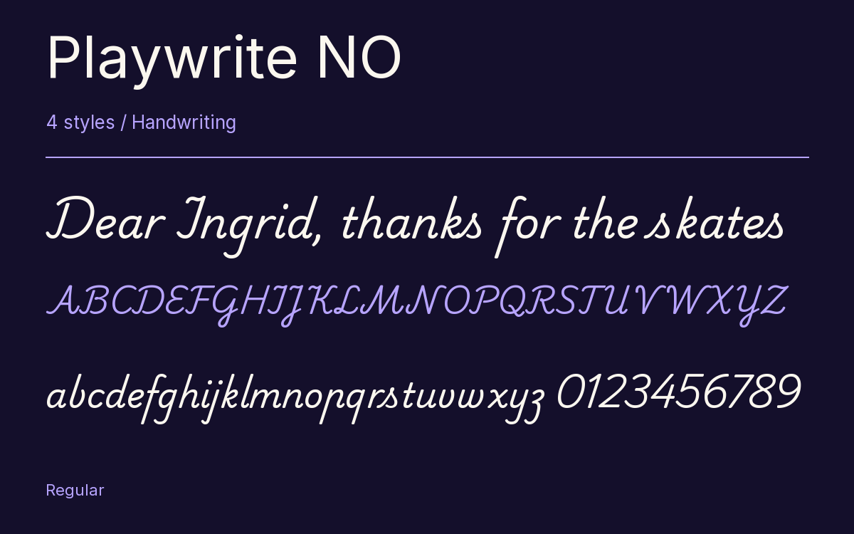
Characters & Figures
486 glyphs reported in the reference style. This selection shows 400 recorded characters.
ABCDEFGHIJKLMNOPQRSTUVWXYZ
abcdefghijklmnopqrstuvwxyz
0123456789 & @ ? !
View The Recorded Character Selection
The Font Files
Download
Playwrite NO
4 TTF styles with the accompanying CSS, README and license information.
Download ZIP · 411 KB ↓- Version
- 1.003
- License
- SIL Open Font License 1.1
Install On Your Computer
Extract the ZIP first. On Windows, select the font files and choose Install from the context menu. On macOS, open the files in Font Book and choose Install.
Use On A Website
Keep the font files and the included stylesheet together. Update the stylesheet path to match your project.
<link rel="stylesheet"
  href="/fonts/playwrite-no-2/playwrite-no-2.css">

body {
  font-family: 'Playwrite NO', cursive;
}
Keep the copyright and license notices with redistributed files.
Heading & Body
The family provides the heading; Inter carries the supporting text.
Playwrite NO Heading · Inter Body
Thursday, Half Past Four
I left the book by the window. There is a note on page twenty-three that I thought you would like. Bring it along on Thursday; we can finish the conversation over coffee.