
Tourney
Designed By
Tyler Finck, ETC
18 Styles Display
The evening
edition.
Tourney · Regular
Try a short headline and compare the letterforms at a larger scale.
18 styles available. Compare the specimens below, or enter your own text.
Download Tourney ↓TTF · SIL Open Font License 1.1
Set Your Own Text
Change the style and size to compare the letterforms.
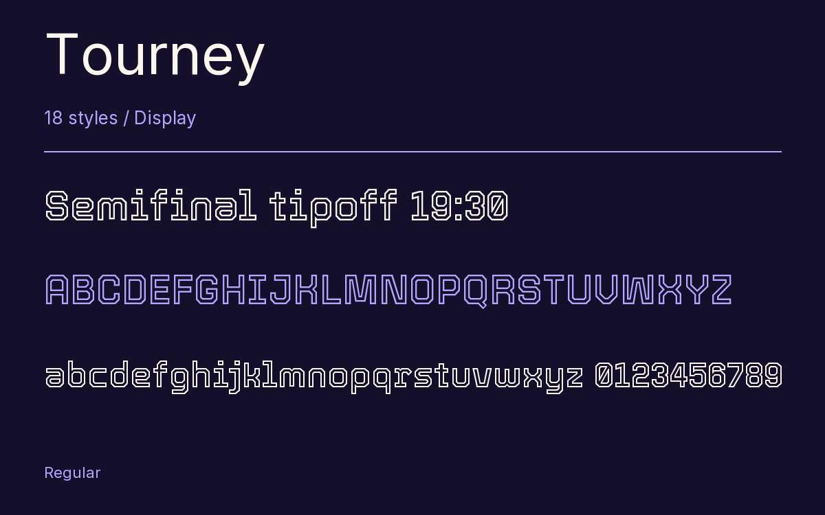
Semifinal tipoff 19:30
A Headline In Place
Tourney · Regular
A poster setting with supporting text.
Theatre / Music / Conversation
An Evening
In Good
Company.
Friday · 7:30 pm
The Assembly Rooms
18 Styles,
One Family
Every available style is shown below in its own font file.
Thin100
Semifinal tipoff 19:30
Thin Italic100
Semifinal tipoff 19:30
Extra Light200
Semifinal tipoff 19:30
Extra Light Italic200
Semifinal tipoff 19:30
Light300
Semifinal tipoff 19:30
Light Italic300
Semifinal tipoff 19:30
Regular400
Semifinal tipoff 19:30
Italic400
Semifinal tipoff 19:30
Medium500
Semifinal tipoff 19:30
Medium Italic500
Semifinal tipoff 19:30
Semi Bold600
Semifinal tipoff 19:30
Semi Bold Italic600
Semifinal tipoff 19:30
Bold700
Semifinal tipoff 19:30
Bold Italic700
Semifinal tipoff 19:30
Extra Bold800
Semifinal tipoff 19:30
Extra Bold Italic800
Semifinal tipoff 19:30
Black900
Semifinal tipoff 19:30
Black Italic900
Semifinal tipoff 19:30
At weight 100 Tourney is very nearly an outline, letters drawn as a thin double line with empty space inside. Every step up the weight scale thickens that line, and by 900 the inside has filled in and the letter is solid. It is among the clearer demonstrations of what a weight range can do to a design, and in between you get some odd, lovely halfway states where the letters look inlined.
Tyler Finck of Etcetera Type Co says the idea came from tech and sport meeting. It would be at home, in his words, on a spaceship or in a stadium, which is about right, and every weight comes with a matching italic.
Finck, a designer and musician based in Ithaca, New York, runs ETC as a variable-font foundry; Epilogue, Gluten, Imbue and Trispace are among its other Google families.
The family on this page is 18 static styles, Thin to Black, upright and italic, with a slashed zero and tabular figures for scores and clocks. Use the Thin and Extra Light big, since the double line needs size to read, and lean on Bold or Black for anything smaller.
Characters & Figures
645 glyphs reported in the reference style. This selection shows 400 recorded characters.
ABCDEFGHIJKLMNOPQRSTUVWXYZ
abcdefghijklmnopqrstuvwxyz
0123456789 & @ ? !
View The Recorded Character Selection
The Font Files
Download
Tourney
18 TTF styles with the accompanying CSS, README and license information.
Download ZIP · 634 KB ↓- Version
- 1.015
- License
- SIL Open Font License 1.1
Install On Your Computer
Extract the ZIP first. On Windows, select the font files and choose Install from the context menu. On macOS, open the files in Font Book and choose Install.
Use On A Website
Keep the font files and the included stylesheet together. Update the stylesheet path to match your project.
<link rel="stylesheet"
  href="/fonts/tourney/tourney.css">

body {
  font-family: 'Tourney', sans-serif;
}
Keep the copyright and license notices with redistributed files.
Heading & Body
The family provides the heading; Inter carries the supporting text.
Tourney Heading · Inter Body
The Evening Performance
Doors open at seven. The performance begins at half past. Please take your seat before the lights go down.