
Bitcount Prop Double Ink
Designed By
Petr van Blokland
9 Styles Display
The evening
edition.
Bitcount Prop Double Ink · Regular
Try a short headline and compare the letterforms at a larger scale.
9 styles available. Compare the specimens below, or enter your own text.
Download Bitcount Prop Double Ink ↓TTF · SIL Open Font License 1.1
Set Your Own Text
Change the style and size to compare the letterforms.
Next train: 4 min
A Headline In Place
Bitcount Prop Double Ink · Regular
A poster setting with supporting text.
Theatre / Music / Conversation
An Evening
In Good
Company.
Friday · 7:30 pm
The Assembly Rooms
9 Styles,
One Family
Every available style is shown below in its own font file.
Thin100
Next train: 4 min
Extra Light200
Next train: 4 min
Light300
Next train: 4 min
Regular400
Next train: 4 min
Medium500
Next train: 4 min
Semi Bold600
Next train: 4 min
Bold700
Next train: 4 min
Extra Bold800
Next train: 4 min
Black900
Next train: 4 min
5 pixels is the least height Petr van Blokland found he needed to draw an a and an e. Bitcount is built on that. Add 1 pixel for ascenders and 1 for descenders, and the smallest grid comes out 5 pixels wide and 7 high; the whole family grows out of that field of 35 or so dots, varied by stem thickness, slant, width, accent shapes and the shape of the pixel itself, circles or squares, large or small.
The name of this one places it in the family. Prop means proportional spacing, next to the Grid and Mono variants, and Double means stems 2 pixels thick. There are 9 weights, Thin to Black.
Since letters within a variant share their spacing, you can stack layers in different colors, each nudged slightly off center, for shadows, highlights or a 3D effect, and TYPETR hands out the HTML and CSS for its own combinations. Van Blokland lists less obvious uses too:
- signs and devices with a fixed dot grid, running LED displays among them
- very small type on low resolution screens
- bitmap fonts built into displays and printers
- templates for physical type made of LEGO bricks, flower pots or lit windows in a building
Small caps, old style and tabular figures, a slashed zero and 6 stylistic sets come along. We like it best layered: 2 weights, 2 colors, 1 pixel of offset.
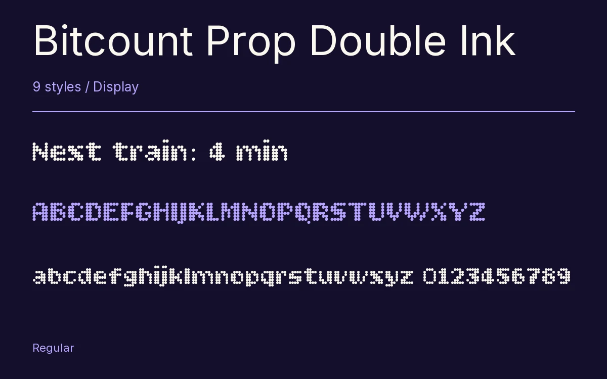
Characters & Figures
396 glyphs reported in the reference style. This selection shows 393 recorded characters.
ABCDEFGHIJKLMNOPQRSTUVWXYZ
abcdefghijklmnopqrstuvwxyz
0123456789 & @ ? !
View The Recorded Character Selection
The Font Files
Download
Bitcount Prop Double Ink
9 TTF styles with the accompanying CSS, README and license information.
Download ZIP · 462 KB ↓- Version
- 1.001
- License
- SIL Open Font License 1.1
Install On Your Computer
Extract the ZIP first. On Windows, select the font files and choose Install from the context menu. On macOS, open the files in Font Book and choose Install.
Use On A Website
Keep the font files and the included stylesheet together. Update the stylesheet path to match your project.
<link rel="stylesheet"
  href="/fonts/bitcount-prop-double-ink/bitcount-prop-double-ink.css">

body {
  font-family: 'Bitcount Prop Double Ink', sans-serif;
}
Keep the copyright and license notices with redistributed files.
Heading & Body
The family provides the heading; Inter carries the supporting text.
Bitcount Prop Double Ink Heading · Inter Body
The Evening Performance
Doors open at seven. The performance begins at half past. Please take your seat before the lights go down.