
Cabinet Grotesk
Designed By
Shiva Nallaperumal
1 Style Sans Serif

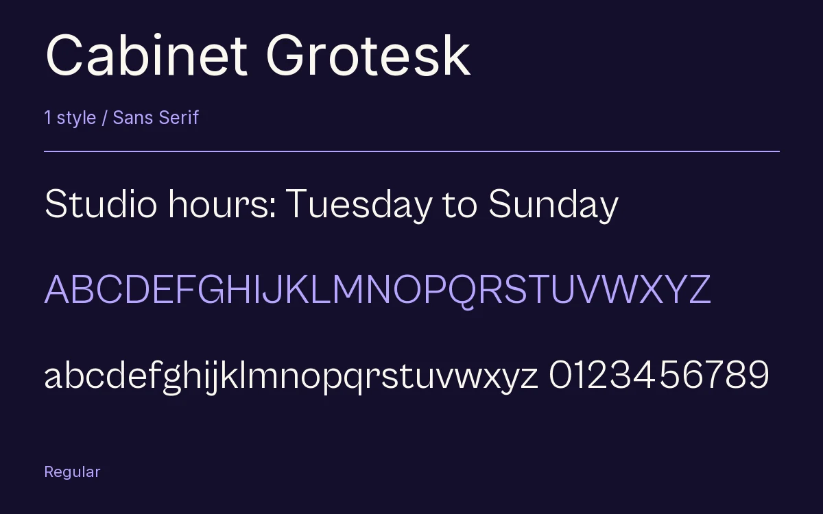
Cabinet Grotesk · Regular
View the family information below and visit the publisher for font files and usage terms.
1 style available. The specimen image shows the family; live testing is available from its publisher.
Get Cabinet Grotesk ↓TTF · ITF Free Font License
1 Style,
One Family
Style names from the catalog. Visit the publisher to test each style.
Regular400
Most sans serifs keep their strokes even. Cabinet Grotesk has contrast, thick against thin, and keeps it all the way down to the Thin weight, while the heavier weights get pinched joins. Shiva Nallaperumal drew it for Indian Type Foundry, which publishes it and aims it mainly at editorial design.
The details reward a close look. The a and g are double-story by default, and stylistic sets swap in single-story versions. Dutch gets a proper IJ, with acutes too, and there are alternate Ä and Ü with the dots set lower. Case-sensitive punctuation and a long run of ligatures fill out the rest.
On Fontshare the family runs from Thin to Extra Bold; this page has the Regular. A magazine headline or a logotype is where we would put it.
The Font Files
Download
Cabinet Grotesk
Obtain the original files from the publisher. Its terms govern download and use.
Visit The Publisher ↗Read The Font License ↗Download From The Publisher
This family is listed for reference. Font files are supplied by the publisher under its own terms.