
Familjen Grotesk
Designed By
Familjen STHLM AB
8 Styles Sans Serif
Letters for
every day.
Familjen Grotesk · Regular
Compare the family in headings, short labels and paragraph text.
8 styles available. Compare the specimens below, or enter your own text.
Download Familjen Grotesk ↓TTF · SIL Open Font License 1.1
Set Your Own Text
Change the style and size to compare the letterforms.
Platform 4, departures delayed
A Clear Hierarchy
Familjen Grotesk · Regular
Headings, labels and running text.
Departures09:00 →
Before You Travel
The morning service leaves at nine. Tickets are available at the station, and the platform is listed on the departure board. Keep your ticket until the end of the journey.
8 Styles,
One Family
Every available style is shown below in its own font file.
Regular400
Platform 4, departures delayed
Italic400
Platform 4, departures delayed
Medium500
Platform 4, departures delayed
Medium Italic500
Platform 4, departures delayed
Semi Bold600
Platform 4, departures delayed
Semi Bold Italic600
Platform 4, departures delayed
Bold700
Platform 4, departures delayed
Bold Italic700
Platform 4, departures delayed
Blow a Familjen Grotesk headline up to 120 px and you will see bites taken out of the joins, deep notches cut into the corners where 1 stroke meets another. Those are ink traps. On paper they used to keep ink from flooding the corners at small sizes; here they do 2 jobs at once, giving the big sizes some edge and keeping the small ones open.
The rest of it is grotesque in the old sense: a large x-height, apertures that close up tightly, capitals with some heft to them. Familjen STHLM AB, a Stockholm studio, made it in 2021, and Google picked it up in March 2022.
The weights stop short at both ends. Regular, Medium, Semi Bold and Bold, 400 to 700, each with an italic, so 8 files and no hairline or Black for the extremes. For a website or an annual report that is enough, and the OpenType set covers the dull parts properly: tabular figures for the columns, a slashed zero, fractions, case sensitive forms that raise hyphens and brackets to sit right among capitals. There are 2 stylistic sets too.
We would give the Semi Bold to headings and let Regular run the text at 16 px or more, where those notches stop being visible and only the clarity is left.
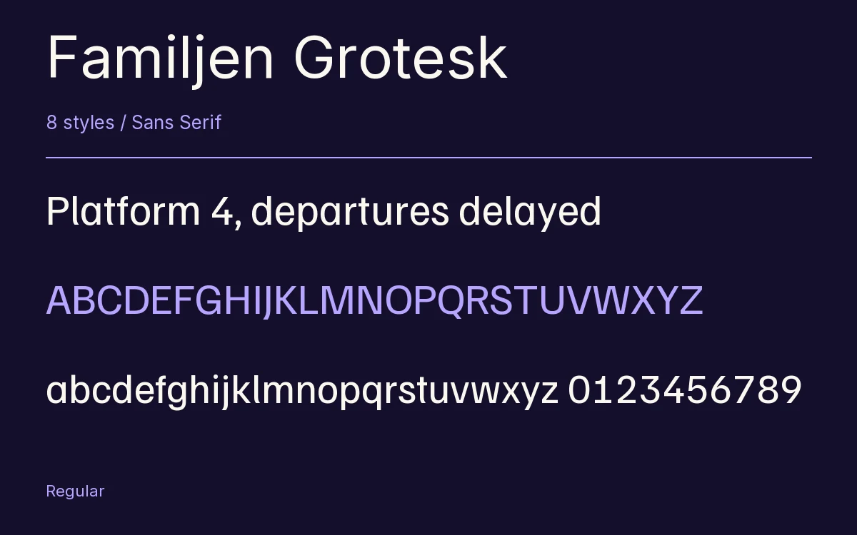
Characters & Figures
619 glyphs reported in the reference style. This selection shows 400 recorded characters.
ABCDEFGHIJKLMNOPQRSTUVWXYZ
abcdefghijklmnopqrstuvwxyz
0123456789 & @ ? !
View The Recorded Character Selection
The Font Files
Download
Familjen Grotesk
8 TTF styles with the accompanying CSS, README and license information.
Download ZIP · 239 KB ↓- Version
- 2.002
- License
- SIL Open Font License 1.1
Install On Your Computer
Extract the ZIP first. On Windows, select the font files and choose Install from the context menu. On macOS, open the files in Font Book and choose Install.
Use On A Website
Keep the font files and the included stylesheet together. Update the stylesheet path to match your project.
<link rel="stylesheet"
  href="/fonts/familjen-grotesk/familjen-grotesk.css">

body {
  font-family: 'Familjen Grotesk', sans-serif;
}
Keep the copyright and license notices with redistributed files.
Heading & Body
Compare a larger heading with the same family at reading size.
Familjen Grotesk Heading · Familjen Grotesk Body
Before You Travel
The morning service leaves at nine. Tickets are available at the station, and the platform is listed on the departure board. Keep your ticket until the end of the journey.