
Georama
Designed By
Production Type
18 Styles Sans Serif
Letters for
every day.
Georama · Regular
Compare the family in headings, short labels and paragraph text.
18 styles available. Compare the specimens below, or enter your own text.
Download Georama ↓TTF · SIL Open Font License 1.1
Set Your Own Text
Change the style and size to compare the letterforms.
Platform 4 departs at 9:40
A Clear Hierarchy
Georama · Regular
Headings, labels and running text.
Departures09:00 →
Before You Travel
The morning service leaves at nine. Tickets are available at the station, and the platform is listed on the departure board. Keep your ticket until the end of the journey.
18 Styles,
One Family
Every available style is shown below in its own font file.
Thin100
Platform 4 departs at 9:40
Thin Italic100
Platform 4 departs at 9:40
Extra Light200
Platform 4 departs at 9:40
Extra Light Italic200
Platform 4 departs at 9:40
Light300
Platform 4 departs at 9:40
Light Italic300
Platform 4 departs at 9:40
Regular400
Platform 4 departs at 9:40
Italic400
Platform 4 departs at 9:40
Medium500
Platform 4 departs at 9:40
Medium Italic500
Platform 4 departs at 9:40
Semi Bold600
Platform 4 departs at 9:40
Semi Bold Italic600
Platform 4 departs at 9:40
Bold700
Platform 4 departs at 9:40
Bold Italic700
Platform 4 departs at 9:40
Extra Bold800
Platform 4 departs at 9:40
Extra Bold Italic800
Platform 4 departs at 9:40
Black900
Platform 4 departs at 9:40
Black Italic900
Platform 4 departs at 9:40
Georama hides a lot of typesetting machinery behind a plain face.
Turn on small caps and the letters swap to proper drawn ones, and the same goes for case-sensitive forms, which lift hyphens and brackets to sit with capitals. Old-style figures for a paragraph, tabular figures for a column of prices, a slashed zero for anything where 0 and O could be confused. That is more than we expect from a free sans, and it is why we would reach for this one before most look-alikes.
The family comes from Production Type, with Jean-Baptiste Levée as its designer, and Google Fonts added it in July 2020. Its glyph set is the Latin Plus one that Google asks for, enough to cover English, the Western European languages, Vietnamese and, by the studio’s count, more than 130 other languages.
There are 9 weights, Thin at 100 through Black at 900, and each has an italic. The italics are slimmer than the uprights, 6.4% narrower across a sentence, so an italic phrase tightens up the line a little.
How would we split the weights? Something like:
- 100 to 200 for very large display lines, where the thin strokes still hold
- 400 and 500 for running text and interface labels
- 700 to 900 for headings and short brand marks
The x-height is generous, so the Regular sits comfortably in an app or a dashboard. Data tables are the other obvious home, given the figure options.
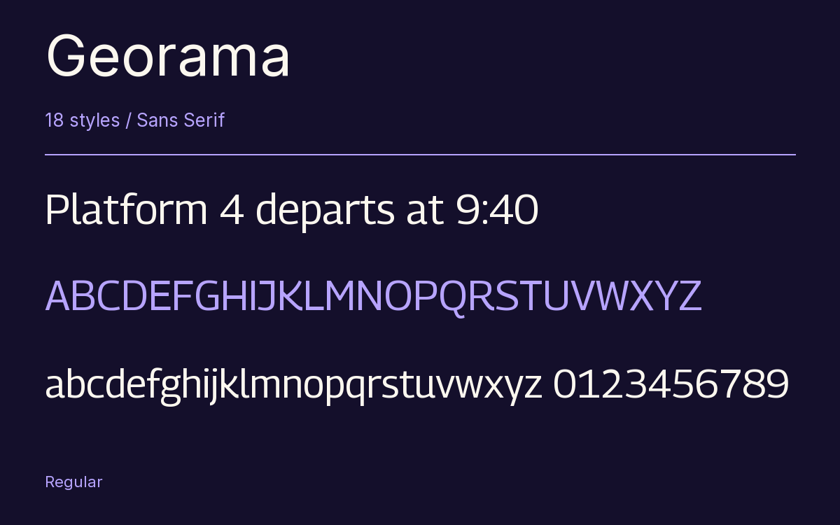
Characters & Figures
655 glyphs reported in the reference style. This selection shows 400 recorded characters.
ABCDEFGHIJKLMNOPQRSTUVWXYZ
abcdefghijklmnopqrstuvwxyz
0123456789 & @ ? !
View The Recorded Character Selection
The Font Files
Download
Georama
18 TTF styles with the accompanying CSS, README and license information.
Download ZIP · 1.1 MB ↓- Version
- 1.001
- License
- SIL Open Font License 1.1
Install On Your Computer
Extract the ZIP first. On Windows, select the font files and choose Install from the context menu. On macOS, open the files in Font Book and choose Install.
Use On A Website
Keep the font files and the included stylesheet together. Update the stylesheet path to match your project.
<link rel="stylesheet"
  href="/fonts/georama/georama.css">

body {
  font-family: 'Georama', sans-serif;
}
Keep the copyright and license notices with redistributed files.
Heading & Body
Compare a larger heading with the same family at reading size.
Georama Heading · Georama Body
Before You Travel
The morning service leaves at nine. Tickets are available at the station, and the platform is listed on the departure board. Keep your ticket until the end of the journey.