
Kalam
Designed By
Indian Type Foundry
3 Styles Handwriting
A little note,
before you go.
Kalam · Regular
Try a short note, a name or a line of your own to compare the strokes and spacing.
3 styles available. Compare the specimens below, or enter your own text.
Download Kalam ↓TTF · SIL Open Font License 1.1
Set Your Own Text
Change the style and size to compare the letterforms.
Chai first, then homework
A Note On The Page
Kalam · Regular
A short letter, set in the family.
Thursday afternoon
Dear Alex,
I left the book by the window. There is a note on page twenty-three that I thought you would like. Bring it along on Thursday; we can finish the conversation over coffee.
See you there.
3 Styles,
One Family
Every available style is shown below in its own font file.
Light300
Chai first, then homework
Regular400
Chai first, then homework
Bold700
Chai first, then homework
Kalam leans hard. Its letters slope steeply from top right to bottom left, and the strokes look as if they came off a thin felt-tip or a ballpoint, the writing you do when you are hurrying to get something down.
Indian Type Foundry in Ahmedabad published it in 2014 and brought it up to version 2.001 in July 2015 with better OpenType features. Lipi Raval designed the Devanagari, and the Latin she worked out together with Jonny Pinhorn. That shared hand counts for something if you set Hindi and English on one page, since the 2 scripts were drawn to sit together.
Most of the work went into the Devanagari. Each of the 3 fonts carries over 1,000 glyphs, many of them conjuncts, enough for the major languages written in the script. Watch the knotted terminals, which are left open while some other counters close up; that mix is a large part of why a line of Kalam reads as quick writing. The Latin set is smaller, aimed at English and the Western European languages.
Light, Regular and Bold, 300 to 700.
Handwritten or not, every weight was tuned for text on screen. We think the Regular holds up in a short note at 16 px, on a worksheet or a recipe card, with Bold taking the heading above it. A long article in a slanted script is another matter, and we would not ask readers to sit through one.
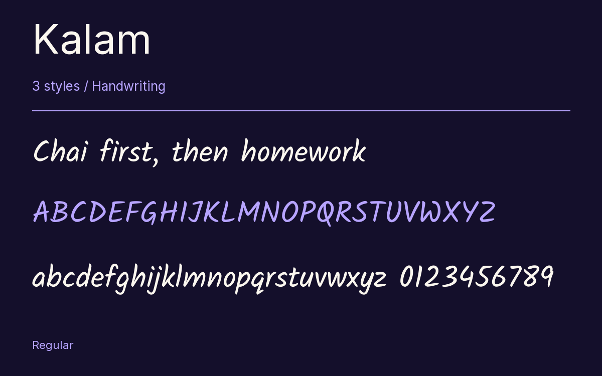
Characters & Figures
1,026 glyphs reported in the reference style. This selection shows 400 recorded characters.
ABCDEFGHIJKLMNOPQRSTUVWXYZ
abcdefghijklmnopqrstuvwxyz
0123456789 & @ ? !
View The Recorded Character Selection
The Font Files
Download
Kalam
3 TTF styles with the accompanying CSS, README and license information.
Download ZIP · 556 KB ↓- Version
- 2.001
- License
- SIL Open Font License 1.1
Install On Your Computer
Extract the ZIP first. On Windows, select the font files and choose Install from the context menu. On macOS, open the files in Font Book and choose Install.
Use On A Website
Keep the font files and the included stylesheet together. Update the stylesheet path to match your project.
<link rel="stylesheet"
  href="/fonts/kalam-fontshare/kalam-fontshare.css">

body {
  font-family: 'Kalam', cursive;
}
Keep the copyright and license notices with redistributed files.
Heading & Body
The family provides the heading; Inter carries the supporting text.
Kalam Heading · Inter Body
Thursday, Half Past Four
I left the book by the window. There is a note on page twenty-three that I thought you would like. Bring it along on Thursday; we can finish the conversation over coffee.