
Nata Sans
Designed By
Daniel Uzquiano
9 Styles Sans Serif
Letters for
every day.
Nata Sans · Regular
Compare the family in headings, short labels and paragraph text.
9 styles available. Compare the specimens below, or enter your own text.
Download Nata Sans ↓TTF · SIL Open Font License 1.1
Set Your Own Text
Change the style and size to compare the letterforms.
Settings saved, sync complete
A Clear Hierarchy
Nata Sans · Regular
Headings, labels and running text.
Departures09:00 →
Before You Travel
The morning service leaves at nine. Tickets are available at the station, and the platform is listed on the departure board. Keep your ticket until the end of the journey.
9 Styles,
One Family
Every available style is shown below in its own font file.
Thin100
Settings saved, sync complete
Extra Light200
Settings saved, sync complete
Light300
Settings saved, sync complete
Regular400
Settings saved, sync complete
Medium500
Settings saved, sync complete
Semi Bold600
Settings saved, sync complete
Bold700
Settings saved, sync complete
Extra Bold800
Settings saved, sync complete
Black900
Settings saved, sync complete
Daniel Uzquiano Cruz aimed Nata Sans at the spot Helvetica usually holds, a grotesque for screens and for print, then warmed it with a little humanist feeling and cut the ascenders and descenders short. Those short extenders are the detail to watch. With less room spent above and below, the lowercase can grow tall inside the line, and the generous x-height comes from there.
Its letters run wide as well. A paragraph in Nata Sans takes about 9% more width than the same words in Arial, so a sidebar or a button label will hold fewer characters than you might plan for.
Interfaces were the first target and the feature set shows it: tabular figures for prices and tables that need to line up, case sensitive punctuation for all caps labels, superscripts and fractions, old style figures for running text, and 5 stylistic sets with alternate letters.
Language coverage is wide. Uzquiano lists 219 Latin based languages across 212 countries, the full Google Fonts Latin Plus set, with Vietnamese and Cyrillic on top.
9 weights run from Thin to Black, interpolated from 3 master drawings, and there are no italics. Is that a problem for a UI face? Rarely, since interfaces lean on weight for emphasis. For long reading with book titles and quotes it would be.
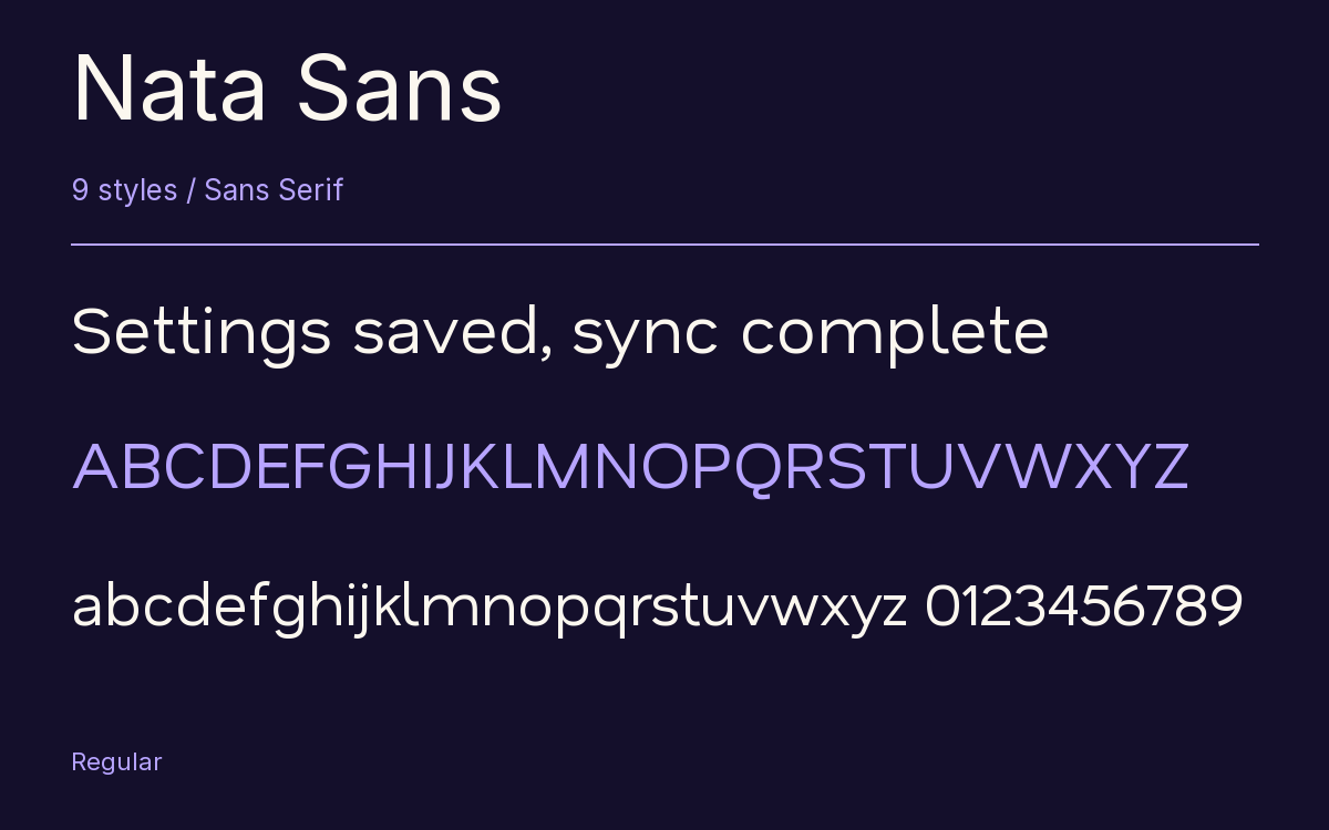
Characters & Figures
870 glyphs reported in the reference style. This selection shows 400 recorded characters.
ABCDEFGHIJKLMNOPQRSTUVWXYZ
abcdefghijklmnopqrstuvwxyz
0123456789 & @ ? !
View The Recorded Character Selection
The Font Files
Download
Nata Sans
9 TTF styles with the accompanying CSS, README and license information.
Download ZIP · 589 KB ↓- Version
- 1.001
- License
- SIL Open Font License 1.1
Install On Your Computer
Extract the ZIP first. On Windows, select the font files and choose Install from the context menu. On macOS, open the files in Font Book and choose Install.
Use On A Website
Keep the font files and the included stylesheet together. Update the stylesheet path to match your project.
<link rel="stylesheet"
  href="/fonts/nata-sans/nata-sans.css">

body {
  font-family: 'Nata Sans', sans-serif;
}
Keep the copyright and license notices with redistributed files.
Heading & Body
Compare a larger heading with the same family at reading size.
Nata Sans Heading · Nata Sans Body
Before You Travel
The morning service leaves at nine. Tickets are available at the station, and the platform is listed on the departure board. Keep your ticket until the end of the journey.