
Noto Sans HK
Designed By
9 Styles Sans Serif
Letters for
every day.
Noto Sans HK · Regular
Compare the family in headings, short labels and paragraph text.
9 styles available. Compare the specimens below, or enter your own text.
Download Noto Sans HK ↓TTF · SIL Open Font License 1.1
Set Your Own Text
Change the style and size to compare the letterforms.
Harbor ferries leave before dawn
A Clear Hierarchy
Noto Sans HK · Regular
Headings, labels and running text.
Departures09:00 →
Before You Travel
The morning service leaves at nine. Tickets are available at the station, and the platform is listed on the departure board. Keep your ticket until the end of the journey.
9 Styles,
One Family
Every available style is shown below in its own font file.
Thin100
Preview Thin · 3.8 MB
Harbor ferries leave before dawn
Extra Light200
Preview Extra Light · 4.0 MB
Harbor ferries leave before dawn
Light300
Preview Light · 4.0 MB
Harbor ferries leave before dawn
Regular400
Harbor ferries leave before dawn
Medium500
Preview Medium · 4.1 MB
Harbor ferries leave before dawn
Semi Bold600
Preview Semi Bold · 4.1 MB
Harbor ferries leave before dawn
Bold700
Preview Bold · 4.1 MB
Harbor ferries leave before dawn
Extra Bold800
Preview Extra Bold · 4.1 MB
Harbor ferries leave before dawn
Black900
Preview Black · 4.0 MB
Harbor ferries leave before dawn
There are 6 people named inside the files of Noto Sans HK, and the work was split by script. The ideographs, kana and bopomofo are Ryoko Nishizuka’s work. Paul D. Hunt drew Latin, Greek and Cyrillic, and Sandoll Communications supplied the hangul, through Soo-young Jang and Joo-yeon Kang. Ken Lunde is credited as project architect, meaning he defined the glyph set and ran production on the whole thing, with Masataka Hattori next to him on production and ideograph elements. The copyright is Adobe’s, 2014 to 2021, with Source as the reserved name, while the Google catalog credits the family to Google. So whose font is it? Adobe drew it and Google publishes it in the Noto collection.
The HK in the name is why this version exists at all. Google describes it as the cut for languages in Hong Kong that are written with the Traditional Chinese form of the Han ideograms, and it went into their library in March 2019. Each style carries 20,755 characters. Japanese kana, hangul and a Latin set with the Vietnamese accents ride along, so a Chinese and English page, or a form with a Korean surname on it, can stay inside 1 family.
There are 9 weights, Thin through Black, and no italics.
Our view on those weights: a dense ideograph drawn in Thin or ExtraLight loses its inner spaces quickly once the size drops, so we would keep the 2 lightest for big headings and let Regular or Medium carry the running text. Black is another matter, a heavy Chinese poster weight that holds together at large sizes very well.
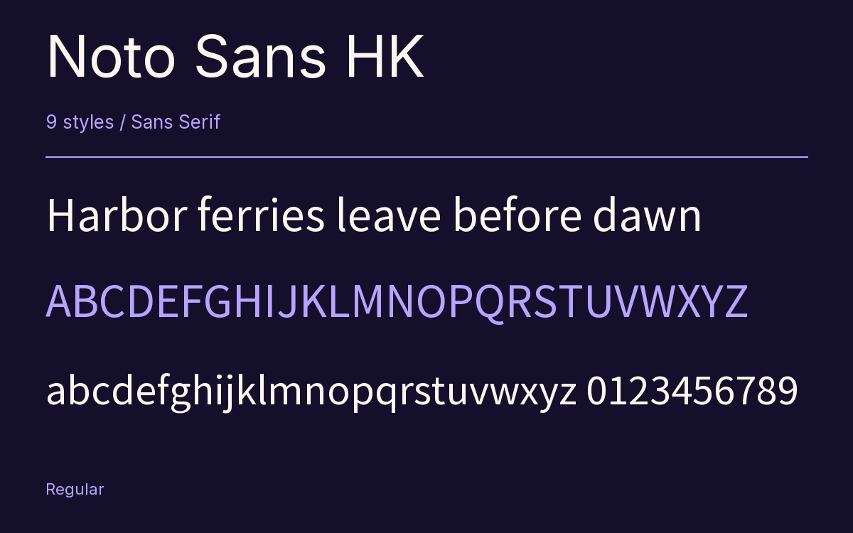
Characters & Figures
20,755 glyphs reported in the reference style. This selection shows 400 recorded characters.
ABCDEFGHIJKLMNOPQRSTUVWXYZ
abcdefghijklmnopqrstuvwxyz
0123456789 & @ ? !
View The Recorded Character Selection
The Font Files
Download
Noto Sans HK
9 TTF styles with the accompanying CSS, README and license information.
Download ZIP · 36.2 MB ↓- Version
- 2.004-H2
- License
- SIL Open Font License 1.1
Install On Your Computer
Extract the ZIP first. On Windows, select the font files and choose Install from the context menu. On macOS, open the files in Font Book and choose Install.
Use On A Website
Keep the font files and the included stylesheet together. Update the stylesheet path to match your project.
<link rel="stylesheet"
  href="/fonts/noto-sans-hk-2/noto-sans-hk-2.css">

body {
  font-family: 'Noto Sans HK', sans-serif;
}
Keep the copyright and license notices with redistributed files.
Heading & Body
Compare a larger heading with the same family at reading size.
Noto Sans HK Heading · Noto Sans HK Body
Before You Travel
The morning service leaves at nine. Tickets are available at the station, and the platform is listed on the departure board. Keep your ticket until the end of the journey.