
Noto Serif SC
Designed By
8 Styles Serif
The pleasure
of a well-set
page.
Noto Serif SC · Regular
Compare this serif family in headings and a continuous reading sample.
8 styles available. Compare the specimens below, or enter your own text.
Download Noto Serif SC ↓TTF · SIL Open Font License 1.1
Set Your Own Text
Change the style and size to compare the letterforms.
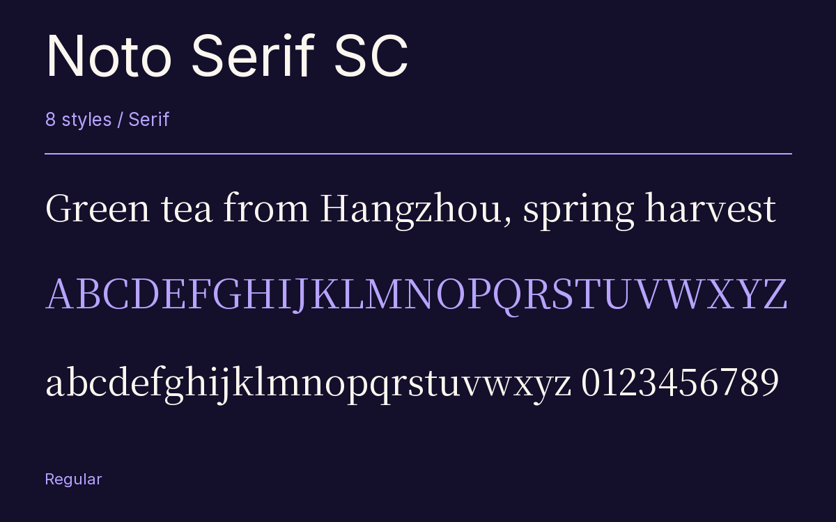
Green tea from Hangzhou, spring harvest
A Page In Noto Serif SC
Noto Serif SC · Regular
Headings, labels and running text.
Notes From The Reading Room
The reading room opens onto a quiet courtyard. Along the shelves, small handwritten labels mark the collections. A visitor leaves a book open beside the window, keeping a place for the next reader.
A heading marks the next chapter. The margins leave room for a note while the text continues across the page.
8 Styles,
One Family
Every available style is shown below in its own font file.
Extra Light200
Preview Extra Light · 7.5 MB
Green tea from Hangzhou, spring harvest
Light300
Preview Light · 8.1 MB
Green tea from Hangzhou, spring harvest
Regular400
Green tea from Hangzhou, spring harvest
Medium500
Preview Medium · 8.2 MB
Green tea from Hangzhou, spring harvest
Semi Bold600
Preview Semi Bold · 8.2 MB
Green tea from Hangzhou, spring harvest
Bold700
Preview Bold · 8.3 MB
Green tea from Hangzhou, spring harvest
Extra Bold800
Preview Extra Bold · 8.3 MB
Green tea from Hangzhou, spring harvest
Black900
Preview Black · 7.9 MB
Green tea from Hangzhou, spring harvest
Nearly 31,000 glyphs sit in each of these files, and most of them are Han ideographs in the Simplified forms that mainland China reads. Noto Serif SC is the modulated, serif design for that readership inside Google’s Noto collection, a project that aims at every modern and ancient language.
Adobe did the drawing and the production. The ideographs and kana are Ryoko Nishizuka’s work and the Western alphabets Frank Grießhammer’s; bopomofo was Wenlong Zhang’s share, the Hangul a Sandoll Communications job, and Ken Lunde ran the project as its architect.
So a single font covers far more than Chinese. Japanese kana, Korean Hangul and a full Latin with Vietnamese accents are in each weight, and the localized forms feature can swap glyph shapes where regional conventions differ.
Weights
There are 8, from Extra Light at 200 to Black at 900. Would we set paragraphs in the Black? We would not. A modulated face gets crowded at the heavy end, and a dense character such as 囊 or 疆 has little white left inside it, so our preference is Regular or Medium for reading and the 800 and 900 for a title or a cover line, where the characters are big enough to stay open.
Characters & Figures
30,928 glyphs reported in the reference style. This selection shows 400 recorded characters.
ABCDEFGHIJKLMNOPQRSTUVWXYZ
abcdefghijklmnopqrstuvwxyz
0123456789 & @ ? !
View The Recorded Character Selection
The Font Files
Download
Noto Serif SC
8 TTF styles with the accompanying CSS, README and license information.
Download ZIP · 64.8 MB ↓- Version
- 2.003-H1
- License
- SIL Open Font License 1.1
Install On Your Computer
Extract the ZIP first. On Windows, select the font files and choose Install from the context menu. On macOS, open the files in Font Book and choose Install.
Use On A Website
Keep the font files and the included stylesheet together. Update the stylesheet path to match your project.
<link rel="stylesheet"
  href="/fonts/noto-serif-sc-2/noto-serif-sc-2.css">

body {
  font-family: 'Noto Serif SC', sans-serif;
}
Keep the copyright and license notices with redistributed files.
Heading & Body
The family provides the heading; Inter carries the supporting text.
Noto Serif SC Heading · Inter Body
Notes From The Reading Room
The reading room opens onto a quiet courtyard. Along the shelves, small handwritten labels mark the collections. A visitor leaves a book open beside the window, keeping a place for the next reader.