
Playwrite FR Moderne
Designed By
TypeTogether, Veronika Burian, José Scaglione
4 Styles Handwriting
A little note,
before you go.
Playwrite FR Moderne · Regular
Try a short note, a name or a line of your own to compare the strokes and spacing.
4 styles available. Compare the specimens below, or enter your own text.
Download Playwrite FR Moderne ↓TTF · SIL Open Font License 1.1
Set Your Own Text
Change the style and size to compare the letterforms.
Cahier du soir, page 3
A Note On The Page
Playwrite FR Moderne · Regular
A short letter, set in the family.
Thursday afternoon
Dear Alex,
I left the book by the window. There is a note on page twenty-three that I thought you would like. Bring it along on Thursday; we can finish the conversation over coffee.
See you there.
4 Styles,
One Family
Every available style is shown below in its own font file.
Thin100
Cahier du soir, page 3
Extra Light200
Cahier du soir, page 3
Light300
Cahier du soir, page 3
Regular400
Cahier du soir, page 3
French children meet Séyès paper in kindergarten, at about 5. The grid dates from 1892, and its horizontal and vertical guides decide how tall a letter may stand and how far its ascenders and descenders reach. The hand they learn on it, écriture cursive, is a vertical cursive descended from the Lettre Ronde, once written with a broad nib and ink.
In 2013 the education ministry tried to modernize that teaching and published 2 free digital families, Écriture A by Laurence Bedoin-Collard and Heloísa Tissot, and Écriture B by Marion Andrews. Playwrite FR Moderne takes the same modern, upright approach. Veronika Burian and José Scaglione drew it at TypeTogether as part of the Playwrite school fonts, which grew out of Primarium, their survey of how primary schools around the world teach handwriting.
What gives this hand away:
- no loops at all, and medium to long ascenders and descenders
- capitals simplified almost to print, with a raised apex on the M as the one flourish
- g and y let go of the next letter, while b and p still reach across to join
- m and n start straight, no curved lead-in
4 weights, Thin to Regular. There is no bold and no italic, and the B and I buttons in a word processor will fake them badly, so leave them off. In Word, switch on contextual alternates in the Advanced font settings, otherwise the letters will sit apart. A sibling, FR Moderne Guides, prints the ruled lines behind the writing for classroom sheets.
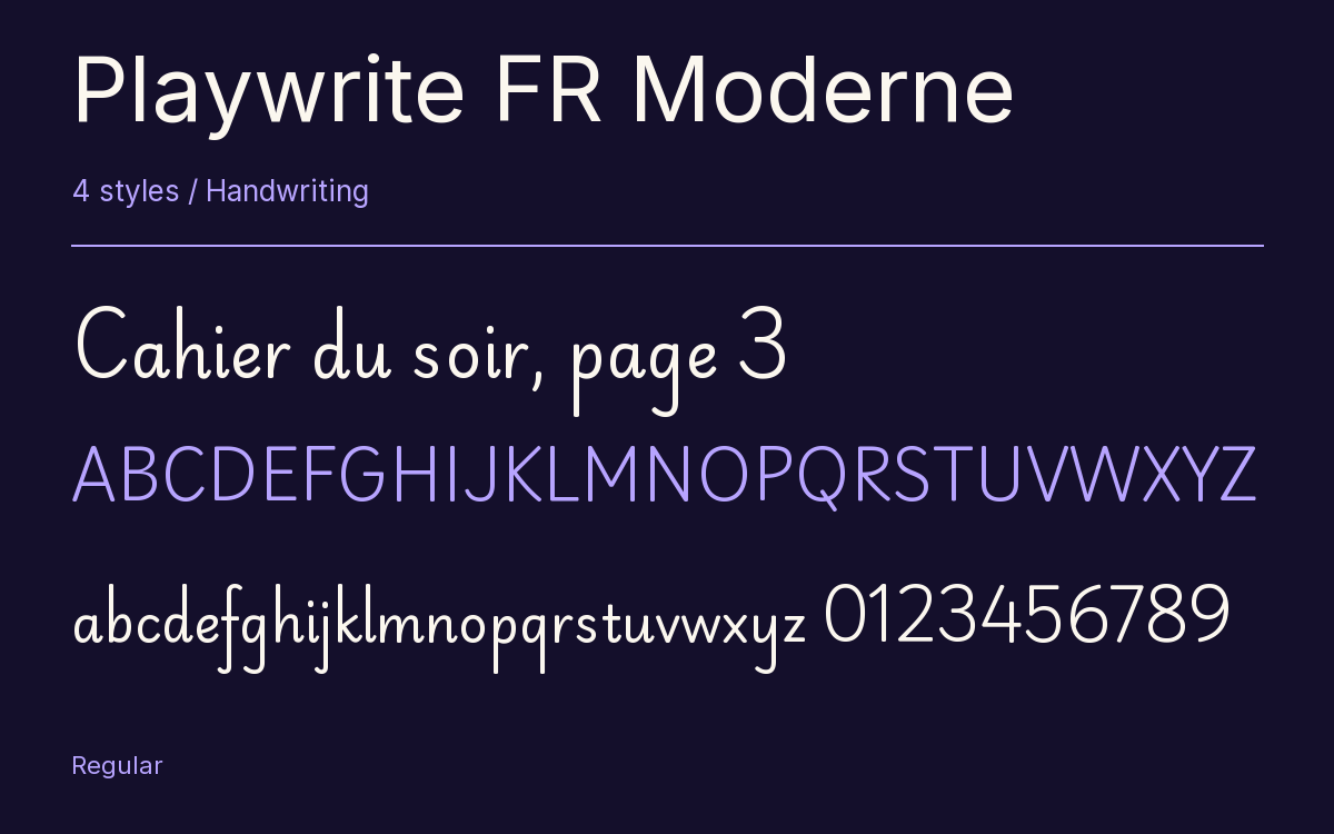
Characters & Figures
486 glyphs reported in the reference style. This selection shows 400 recorded characters.
ABCDEFGHIJKLMNOPQRSTUVWXYZ
abcdefghijklmnopqrstuvwxyz
0123456789 & @ ? !
View The Recorded Character Selection
The Font Files
Download
Playwrite FR Moderne
4 TTF styles with the accompanying CSS, README and license information.
Download ZIP · 387 KB ↓- Version
- 1.003
- License
- SIL Open Font License 1.1
Install On Your Computer
Extract the ZIP first. On Windows, select the font files and choose Install from the context menu. On macOS, open the files in Font Book and choose Install.
Use On A Website
Keep the font files and the included stylesheet together. Update the stylesheet path to match your project.
<link rel="stylesheet"
  href="/fonts/playwrite-fr-moderne-2/playwrite-fr-moderne-2.css">

body {
  font-family: 'Playwrite FR Moderne', cursive;
}
Keep the copyright and license notices with redistributed files.
Heading & Body
The family provides the heading; Inter carries the supporting text.
Playwrite FR Moderne Heading · Inter Body
Thursday, Half Past Four
I left the book by the window. There is a note on page twenty-three that I thought you would like. Bring it along on Thursday; we can finish the conversation over coffee.