
Playwrite NL
Designed By
TypeTogether, Veronika Burian, José Scaglione
4 Styles Handwriting
A little note,
before you go.
Playwrite NL · Regular
Try a short note, a name or a line of your own to compare the strokes and spacing.
4 styles available. Compare the specimens below, or enter your own text.
Download Playwrite NL ↓TTF · SIL Open Font License 1.1
Set Your Own Text
Change the style and size to compare the letterforms.
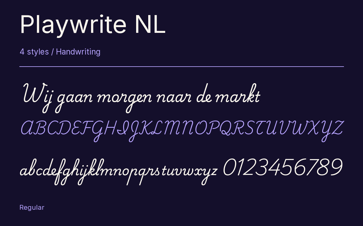
Wij gaan morgen naar de markt
A Note On The Page
Playwrite NL · Regular
A short letter, set in the family.
Thursday afternoon
Dear Alex,
I left the book by the window. There is a note on page twenty-three that I thought you would like. Bring it along on Thursday; we can finish the conversation over coffee.
See you there.
4 Styles,
One Family
Every available style is shown below in its own font file.
Thin100
Wij gaan morgen naar de markt
Extra Light200
Wij gaan morgen naar de markt
Light300
Wij gaan morgen naar de markt
Regular400
Wij gaan morgen naar de markt
Dutch children start handwriting in Groep 3, and which letters they learn depends a good deal on the teacher.
The model most classrooms in the Netherlands still use is verbonden schrift, a slanted cursive, joined all the way through, with loops. More and more teachers have been choosing blokschrift instead, simple unjoined print letters, and some teach both, 1 after the other or side by side, whatever suits the class. Playwrite NL is the first of those 2, verbonden schrift, drawn by Veronika Burian and José Scaglione at TypeTogether from the Primarium research on school handwriting.
Look at the z. It is built as an italic z, a deliberate contrast with the rest of the alphabet. The capitals are cursive too, except the S, and the I and J take fairly involved shapes. In the lowercase the ascenders and descenders are long and every one is looped, and m, n, v, w, x and y begin with a curved entry stroke that carries the pen in from the previous letter.
4 weights, Thin to Regular, joined through contextual alternates, so the feature has to be switched on in apps that leave it off. For practice sheets there is Playwrite NL Guides with guidelines built in.
Characters & Figures
486 glyphs reported in the reference style. This selection shows 400 recorded characters.
ABCDEFGHIJKLMNOPQRSTUVWXYZ
abcdefghijklmnopqrstuvwxyz
0123456789 & @ ? !
View The Recorded Character Selection
The Font Files
Download
Playwrite NL
4 TTF styles with the accompanying CSS, README and license information.
Download ZIP · 410 KB ↓- Version
- 1.003
- License
- SIL Open Font License 1.1
Install On Your Computer
Extract the ZIP first. On Windows, select the font files and choose Install from the context menu. On macOS, open the files in Font Book and choose Install.
Use On A Website
Keep the font files and the included stylesheet together. Update the stylesheet path to match your project.
<link rel="stylesheet"
  href="/fonts/playwrite-nl-2/playwrite-nl-2.css">

body {
  font-family: 'Playwrite NL', cursive;
}
Keep the copyright and license notices with redistributed files.
Heading & Body
The family provides the heading; Inter carries the supporting text.
Playwrite NL Heading · Inter Body
Thursday, Half Past Four
I left the book by the window. There is a note on page twenty-three that I thought you would like. Bring it along on Thursday; we can finish the conversation over coffee.
Other Handwriting Families
Browse All Handwriting Fonts →- Playwrite ES Deco GuidesHandwriting1 StyleGoogle Fonts
 Handwriting1 StyleFontshare
- Playwrite HU GuidesHandwriting1 StyleGoogle Fonts
- Playwrite ROHandwriting4 StylesGoogle Fonts
- KavivanarHandwriting1 StyleGoogle Fonts
- Coming SoonHandwriting1 StyleGoogle Fonts