
Playwrite US Trad
Designed By
TypeTogether, Veronika Burian, José Scaglione
4 Styles Handwriting
A little note,
before you go.
Playwrite US Trad · Regular
Try a short note, a name or a line of your own to compare the strokes and spacing.
4 styles available. Compare the specimens below, or enter your own text.
Download Playwrite US Trad ↓TTF · SIL Open Font License 1.1
Set Your Own Text
Change the style and size to compare the letterforms.
Spelling test moved to Friday
A Note On The Page
Playwrite US Trad · Regular
A short letter, set in the family.
Thursday afternoon
Dear Alex,
I left the book by the window. There is a note on page twenty-three that I thought you would like. Bring it along on Thursday; we can finish the conversation over coffee.
See you there.
4 Styles,
One Family
Every available style is shown below in its own font file.
Thin100
Spelling test moved to Friday
Extra Light200
Spelling test moved to Friday
Light300
Spelling test moved to Friday
Regular400
Spelling test moved to Friday
The United States has no national handwriting model. Schools buy their method from private companies, and even the handwriting specialist Kate Gladstone says it is hard to pin down which ones are taught most, though Zaner-Bloser and D’Nealian, both traditional, and Handwriting Without Tears are among the widest spread. 2 modern cursive programs, Getty-Dubay and Barchowsky Fluent Hand, have been gaining ground too, with adults who want a better hand as well as with schools.
Playwrite US Trad takes the traditional side: the slanted, continuous cursive of Zaner-Bloser and D’Nealian.
Its capitals do not agree with each other, which is true to the model. I, H and G come out ornamental, while A, N and M stay plainly cursive. Ascenders and descenders loop so the pen never has to lift, the p and q mirror each other’s loops, and as in other English-speaking models the v and the w begin with entry strokes all their own. Some letters look fast to write and a few look complicated.
TypeTogether’s Veronika Burian and José Scaglione drew it for the Playwrite series, and Google added it in May 2024 with weights from Thin to Regular. Our worry would be width. It runs a good deal wider than a print face, so a worksheet heading may need a smaller size than you planned, and there is a companion, Playwrite US Trad Guides, with ruled lines for practice.
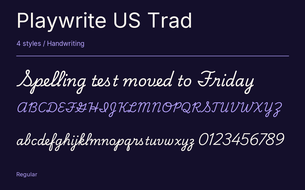
Characters & Figures
486 glyphs reported in the reference style. This selection shows 400 recorded characters.
ABCDEFGHIJKLMNOPQRSTUVWXYZ
abcdefghijklmnopqrstuvwxyz
0123456789 & @ ? !
View The Recorded Character Selection
The Font Files
Download
Playwrite US Trad
4 TTF styles with the accompanying CSS, README and license information.
Download ZIP · 399 KB ↓- Version
- 1.003
- License
- SIL Open Font License 1.1
Install On Your Computer
Extract the ZIP first. On Windows, select the font files and choose Install from the context menu. On macOS, open the files in Font Book and choose Install.
Use On A Website
Keep the font files and the included stylesheet together. Update the stylesheet path to match your project.
<link rel="stylesheet"
  href="/fonts/playwrite-us-trad-2/playwrite-us-trad-2.css">

body {
  font-family: 'Playwrite US Trad', cursive;
}
Keep the copyright and license notices with redistributed files.
Heading & Body
The family provides the heading; Inter carries the supporting text.
Playwrite US Trad Heading · Inter Body
Thursday, Half Past Four
I left the book by the window. There is a note on page twenty-three that I thought you would like. Bring it along on Thursday; we can finish the conversation over coffee.