
Public Sans
Designed By
USWDS, Dan Williams, Pablo Impallari, Rodrigo Fuenzalida
18 Styles Sans Serif
Letters for
every day.
Public Sans · Regular
Compare the family in headings, short labels and paragraph text.
18 styles available. Compare the specimens below, or enter your own text.
Download Public Sans ↓TTF · SIL Open Font License 1.1
Set Your Own Text
Change the style and size to compare the letterforms.
Apply for your permit online
A Clear Hierarchy
Public Sans · Regular
Headings, labels and running text.
Departures09:00 →
Before You Travel
The morning service leaves at nine. Tickets are available at the station, and the platform is listed on the departure board. Keep your ticket until the end of the journey.
18 Styles,
One Family
Every available style is shown below in its own font file.
Thin100
Apply for your permit online
Thin Italic100
Apply for your permit online
Extra Light200
Apply for your permit online
Extra Light Italic200
Apply for your permit online
Light300
Apply for your permit online
Light Italic300
Apply for your permit online
Regular400
Apply for your permit online
Italic400
Apply for your permit online
Medium500
Apply for your permit online
Medium Italic500
Apply for your permit online
Semi Bold600
Apply for your permit online
Semi Bold Italic600
Apply for your permit online
Bold700
Apply for your permit online
Bold Italic700
Apply for your permit online
Extra Bold800
Apply for your permit online
Extra Bold Italic800
Apply for your permit online
Black900
Apply for your permit online
Black Italic900
Apply for your permit online
The U.S. Web Design System built Public Sans for interfaces, text and headings, and it started from Libre Franklin, by Pablo Impallari and Rodrigo Fuenzalida. Dan Williams is credited alongside them. The brief was a strong, neutral face, one that does its work without calling attention to itself.
The family went variable in May 2022. What you get here are the 18 static styles, Thin to Black, each with an italic.
The figures are the practical part. Old style and lining, tabular and proportional, so a table of fees lines up in columns while a date inside a sentence can sit low with the lowercase.
Use Regular and Medium for reading and Bold upward for headings, and keep the Thin out of any form label that someone will read on a phone in bright sun.
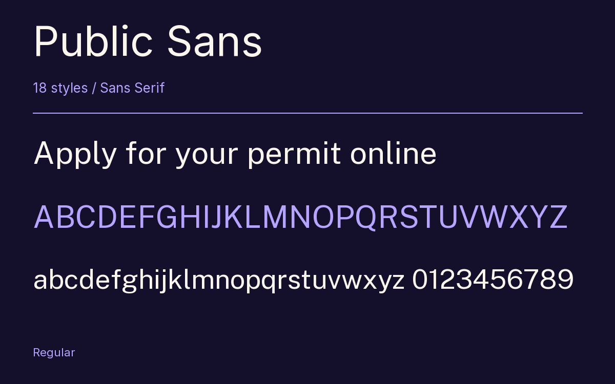
Characters & Figures
565 glyphs reported in the reference style. This selection shows 400 recorded characters.
ABCDEFGHIJKLMNOPQRSTUVWXYZ
abcdefghijklmnopqrstuvwxyz
0123456789 & @ ? !
View The Recorded Character Selection
The Font Files
Download
Public Sans
18 TTF styles with the accompanying CSS, README and license information.
Download ZIP · 582 KB ↓- Version
- 2.001
- License
- SIL Open Font License 1.1
Install On Your Computer
Extract the ZIP first. On Windows, select the font files and choose Install from the context menu. On macOS, open the files in Font Book and choose Install.
Use On A Website
Keep the font files and the included stylesheet together. Update the stylesheet path to match your project.
<link rel="stylesheet"
  href="/fonts/public-sans/public-sans.css">

body {
  font-family: 'Public Sans', sans-serif;
}
Keep the copyright and license notices with redistributed files.
Heading & Body
Compare a larger heading with the same family at reading size.
Public Sans Heading · Public Sans Body
Before You Travel
The morning service leaves at nine. Tickets are available at the station, and the platform is listed on the departure board. Keep your ticket until the end of the journey.