
Spectral SC
Designed By
Production Type
14 Styles Serif
The pleasure
of a well-set
page.
Spectral SC · Regular
Compare this serif family in headings and a continuous reading sample.
14 styles available. Compare the specimens below, or enter your own text.
Download Spectral SC ↓TTF · SIL Open Font License 1.1
Set Your Own Text
Change the style and size to compare the letterforms.
Introduction and acknowledgments
A Page In Spectral SC
Spectral SC · Regular
Headings, labels and running text.
Notes From The Reading Room
The reading room opens onto a quiet courtyard. Along the shelves, small handwritten labels mark the collections. A visitor leaves a book open beside the window, keeping a place for the next reader.
A heading marks the next chapter. The margins leave room for a note while the text continues across the page.
14 Styles,
One Family
Every available style is shown below in its own font file.
Extra Light200
Introduction and acknowledgments
Extra Light Italic200
Introduction and acknowledgments
Light300
Introduction and acknowledgments
Light Italic300
Introduction and acknowledgments
Regular400
Introduction and acknowledgments
Italic400
Introduction and acknowledgments
Medium500
Introduction and acknowledgments
Medium Italic500
Introduction and acknowledgments
Semi Bold600
Introduction and acknowledgments
Semi Bold Italic600
Introduction and acknowledgments
Bold700
Introduction and acknowledgments
Bold Italic700
Introduction and acknowledgments
Extra Bold800
Introduction and acknowledgments
Extra Bold Italic800
Introduction and acknowledgments
Spectral is one of the serifs you can pick inside Google Docs, Sheets and Slides. Google Fonts commissioned it from Production Type, where Jean-Baptiste Levée designed it, as a face for long reading in places where text lives on a screen first.
This is the SC version, where the small capitals take over. Use it for what small caps do best: running heads, the first line of a chapter, abbreviations in body text, a table of contents. The weights run from Extra Light to Extra Bold, each with an italic. The italic sets tighter than the roman, close to 10% narrower.
There is a lot packed in: old style, lining, tabular and proportional figures, fractions, a slashed zero, discretionary ligatures and 6 stylistic sets. Cyrillic and Vietnamese are covered along with Latin.
In a report written in Google Docs, regular Spectral for the text and Spectral SC Semi Bold for section titles makes a tidy pair.
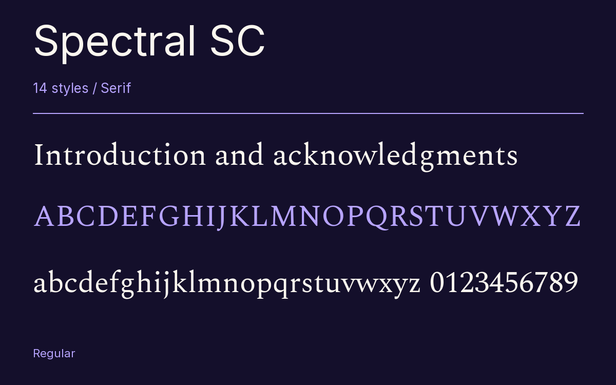
Characters & Figures
878 glyphs reported in the reference style. This selection shows 400 recorded characters.
ABCDEFGHIJKLMNOPQRSTUVWXYZ
abcdefghijklmnopqrstuvwxyz
0123456789 & @ ? !
View The Recorded Character Selection
The Font Files
Download
Spectral SC
14 TTF styles with the accompanying CSS, README and license information.
Download ZIP · 1.6 MB ↓- Version
- 2.005
- License
- SIL Open Font License 1.1
Install On Your Computer
Extract the ZIP first. On Windows, select the font files and choose Install from the context menu. On macOS, open the files in Font Book and choose Install.
Use On A Website
Keep the font files and the included stylesheet together. Update the stylesheet path to match your project.
<link rel="stylesheet"
  href="/fonts/spectral-sc-2/spectral-sc-2.css">

body {
  font-family: 'Spectral SC', sans-serif;
}
Keep the copyright and license notices with redistributed files.
Heading & Body
The family provides the heading; Inter carries the supporting text.
Spectral SC Heading · Inter Body
Notes From The Reading Room
The reading room opens onto a quiet courtyard. Along the shelves, small handwritten labels mark the collections. A visitor leaves a book open beside the window, keeping a place for the next reader.