
Andada Pro
Designed By
HT Fonts, Carolina Giovagnoli
10 Styles Serif
The pleasure
of a well-set
page.
Andada Pro · Regular
Compare this serif family in headings and a continuous reading sample.
10 styles available. Compare the specimens below, or enter your own text.
Download Andada Pro ↓TTF · SIL Open Font License 1.1
Set Your Own Text
Change the style and size to compare the letterforms.
Letters from Asunción, autumn edition
A Page In Andada Pro
Andada Pro · Regular
Headings, labels and running text.
Notes From The Reading Room
The reading room opens onto a quiet courtyard. Along the shelves, small handwritten labels mark the collections. A visitor leaves a book open beside the window, keeping a place for the next reader.
A heading marks the next chapter. The margins leave room for a note while the text continues across the page.
10 Styles,
One Family
Every available style is shown below in its own font file.
Regular400
Letters from Asunción, autumn edition
Italic400
Letters from Asunción, autumn edition
Medium500
Letters from Asunción, autumn edition
Medium Italic500
Letters from Asunción, autumn edition
Semi Bold600
Letters from Asunción, autumn edition
Semi Bold Italic600
Letters from Asunción, autumn edition
Bold700
Letters from Asunción, autumn edition
Bold Italic700
Letters from Asunción, autumn edition
Extra Bold800
Letters from Asunción, autumn edition
Extra Bold Italic800
Letters from Asunción, autumn edition
Guaraní has a consonant called the puso, and it is meant to be written with a letter of its own, the saltillo. Most people type an apostrophe instead. Carolina Giovagnoli drew Andada so the saltillo exists as a real, properly spaced letter, and then, so people could reach it, she published a Guaraní keyboard layout as a separate project.
That is the story of this font in small. Andada was first made for a specific bilingual setting, Spanish beside Guaraní, a language with roots before the Spanish arrived, and Giovagnoli spent about 10 years refining how Guaraní text sets. The digraphs, 2 letters standing for 1 sound, were drawn and spaced as pairs. She did not lean on ligatures for them.
The style is an organic slab serif with medium contrast, which its makers file under hybrid styles. It won an award at the Ibero-American Design Biennial, whose exhibition traveled through Spain and much of Latin America.
What the Pro version holds: 5 weights, Regular to Extra Bold, each with an italic, small caps, old style and lining figures in tabular and proportional cuts, and 6 stylistic sets.
The family was first published in 2011. For a book printed in Spanish and Guaraní, that care over the saltillo and the digraphs is the reason to choose it, and we would happily set a Spanish novel in it too, in the Regular, with the italic for dialogue from another tongue.
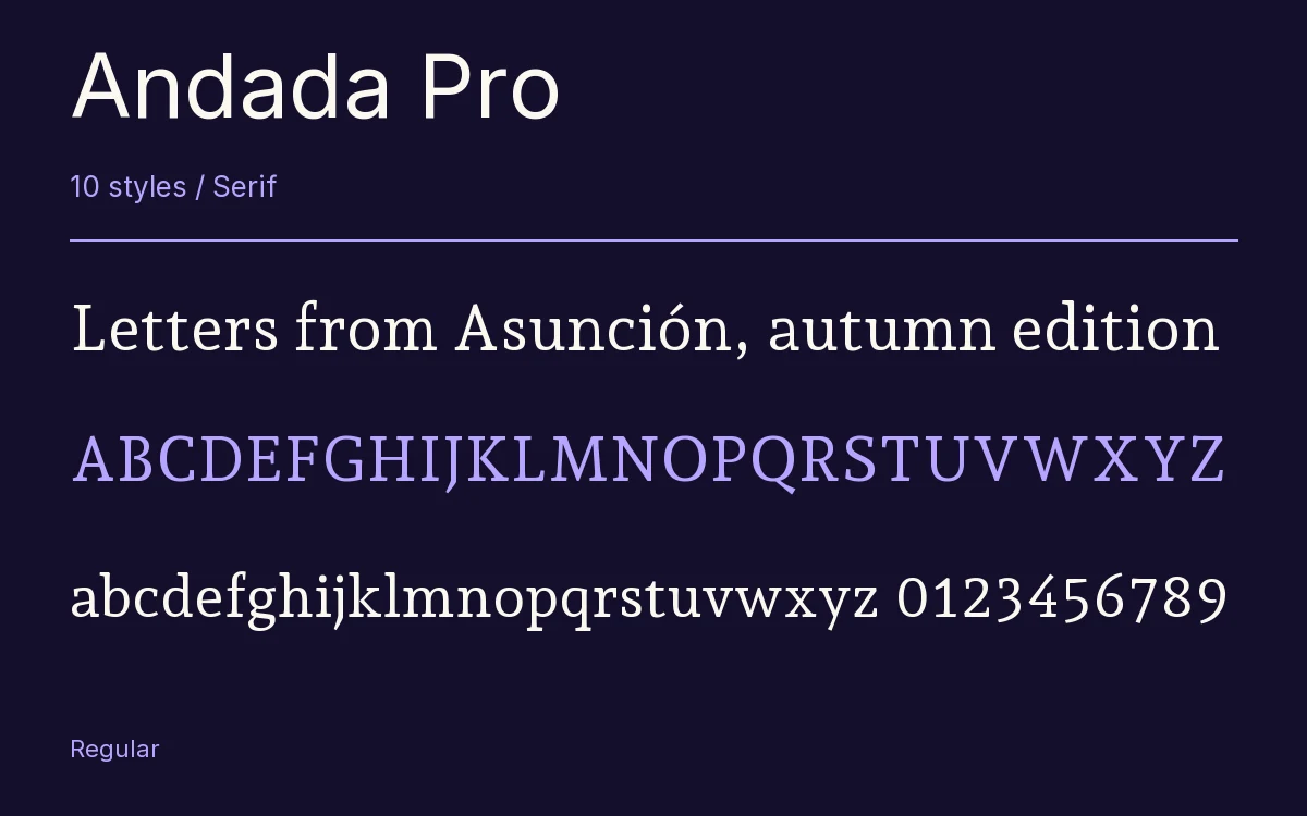
Characters & Figures
753 glyphs reported in the reference style. This selection shows 400 recorded characters.
ABCDEFGHIJKLMNOPQRSTUVWXYZ
abcdefghijklmnopqrstuvwxyz
0123456789 & @ ? !
View The Recorded Character Selection
The Font Files
Download
Andada Pro
10 TTF styles with the accompanying CSS, README and license information.
Download ZIP · 841 KB ↓- Version
- 3.003
- License
- SIL Open Font License 1.1
Install On Your Computer
Extract the ZIP first. On Windows, select the font files and choose Install from the context menu. On macOS, open the files in Font Book and choose Install.
Use On A Website
Keep the font files and the included stylesheet together. Update the stylesheet path to match your project.
<link rel="stylesheet"
  href="/fonts/andada-pro-2/andada-pro-2.css">

body {
  font-family: 'Andada Pro', sans-serif;
}
Keep the copyright and license notices with redistributed files.
Heading & Body
The family provides the heading; Inter carries the supporting text.
Andada Pro Heading · Inter Body
Notes From The Reading Room
The reading room opens onto a quiet courtyard. Along the shelves, small handwritten labels mark the collections. A visitor leaves a book open beside the window, keeping a place for the next reader.
Other Serif Families
Browse All Serif Fonts →- Crimson TextSerif6 StylesGoogle Fonts
- VidalokaSerif1 StyleGoogle Fonts
- PodkovaSerif5 StylesGoogle Fonts
 Serif1 StyleFontshare
- Redaction 35Serif3 StylesBunny Fonts
- BevanSerif2 StylesGoogle Fonts