
Aileron
Designed By
Sora Sagano
16 Styles Sans Serif
Letters for
every day.
Aileron · Regular
Compare the family in headings, short labels and paragraph text.
16 styles available. Compare the specimens below, or enter your own text.
Download Aileron ↓OTF · CC0 1.0
Set Your Own Text
Change the style and size to compare the letterforms.
Gate 14 is now boarding
A Clear Hierarchy
Aileron · Regular
Headings, labels and running text.
Departures09:00 →
Before You Travel
The morning service leaves at nine. Tickets are available at the station, and the platform is listed on the departure board. Keep your ticket until the end of the journey.
16 Styles,
One Family
Every available style is shown below in its own font file.
Thin100
Gate 14 is now boarding
Thin Italic100
Gate 14 is now boarding
Extra Light200
Gate 14 is now boarding
Extra Light Italic200
Gate 14 is now boarding
Light300
Gate 14 is now boarding
Light Italic300
Gate 14 is now boarding
Regular400
Gate 14 is now boarding
Italic400
Gate 14 is now boarding
Semi Bold600
Gate 14 is now boarding
Semi Bold Italic600
Gate 14 is now boarding
Bold700
Gate 14 is now boarding
Bold Italic700
Gate 14 is now boarding
Extra Bold800
Gate 14 is now boarding
Extra Bold Italic800
Gate 14 is now boarding
Black900
Gate 14 is now boarding
Black Italic900
Gate 14 is now boarding
Find the lowercase l in Aileron and you will see a small curved tail at its foot. Sora Sagano put it there so the letter cannot pass for a capital I, which in a plain neo-grotesque is a daily nuisance (passwords, serial numbers, the word Illinois).
Sagano publishes as Dot Colon and describes the face as his own reading of the neo-grotesques that begin with Helvetica. He adds, a little unexpectedly, that it looks closer to Helvetica while the thinking behind it is closer to Univers. You can feel both. The surface is familiar and the family is laid out like a system.
A few details soften it:
- the dots on i and j, and the period, are round
- the curves follow clothoid principles, so a bend tightens gradually
- the letter spacing is a little open, set that way for body text
- the italic was slanted mechanically and then corrected by eye
That italic was the first Dot Colon ever made, and it keeps close to the width of the roman, so switching to it inside a paragraph does not change how far a line runs.
8 weights up to Black, each with an italic, 16 files in all, Latin with the extended accents. We would set reading text in the Light and Regular and keep the Black for short headings. Sagano later released an upgraded design under a new name, Nacelle, in December 2021.
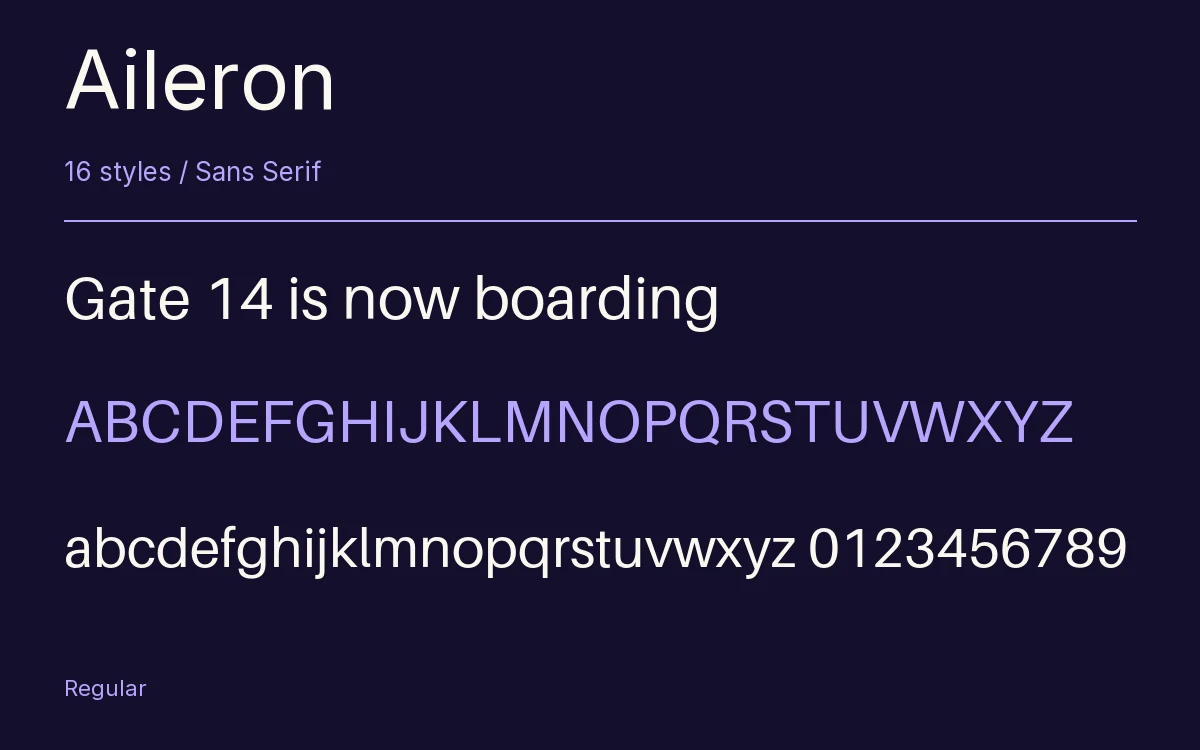
Characters & Figures
337 glyphs reported in the reference style. This selection shows 336 recorded characters.
ABCDEFGHIJKLMNOPQRSTUVWXYZ
abcdefghijklmnopqrstuvwxyz
0123456789 & @ ? !
View The Recorded Character Selection
The Font Files
Download
Aileron
16 OTF styles with the accompanying CSS, README and license information.
Download ZIP · 346 KB ↓- Version
- 1.102
- License
- CC0 1.0
Install On Your Computer
Extract the ZIP first. On Windows, select the font files and choose Install from the context menu. On macOS, open the files in Font Book and choose Install.
Use On A Website
Keep the font files and the included stylesheet together. Update the stylesheet path to match your project.
<link rel="stylesheet"
  href="/fonts/aileron/aileron.css">

body {
  font-family: 'Aileron', sans-serif;
}
Keep the copyright and license notices with redistributed files.
Heading & Body
Compare a larger heading with the same family at reading size.
Aileron Heading · Aileron Body
Before You Travel
The morning service leaves at nine. Tickets are available at the station, and the platform is listed on the departure board. Keep your ticket until the end of the journey.