
Alegreya Sans
Designed By
Juan Pablo del Peral, HT Fonts
14 Styles Sans Serif
Letters for
every day.
Alegreya Sans · Regular
Compare the family in headings, short labels and paragraph text.
14 styles available. Compare the specimens below, or enter your own text.
Download Alegreya Sans ↓TTF · SIL Open Font License 1.1
Set Your Own Text
Change the style and size to compare the letterforms.
Chapter 12, in which nobody sleeps
A Clear Hierarchy
Alegreya Sans · Regular
Headings, labels and running text.
Departures09:00 →
Before You Travel
The morning service leaves at nine. Tickets are available at the station, and the platform is listed on the departure board. Keep your ticket until the end of the journey.
14 Styles,
One Family
Every available style is shown below in its own font file.
Thin100
Chapter 12, in which nobody sleeps
Thin Italic100
Chapter 12, in which nobody sleeps
Light300
Chapter 12, in which nobody sleeps
Light Italic300
Chapter 12, in which nobody sleeps
Regular400
Chapter 12, in which nobody sleeps
Italic400
Chapter 12, in which nobody sleeps
Medium500
Chapter 12, in which nobody sleeps
Medium Italic500
Chapter 12, in which nobody sleeps
Bold700
Chapter 12, in which nobody sleeps
Bold Italic700
Chapter 12, in which nobody sleeps
Extra Bold800
Chapter 12, in which nobody sleeps
Extra Bold Italic800
Chapter 12, in which nobody sleeps
Black900
Chapter 12, in which nobody sleeps
Black Italic900
Chapter 12, in which nobody sleeps
The italic of Alegreya Sans comes out about 9% shorter than the roman over the same sentence, with more slope and swing in every letter. The italics were meant to give emphasis with some force, and they do. Juan Pablo del Peral gave the whole family the humanist proportions and the calligraphic feel of its serif sibling, Alegreya, so the rhythm along a line keeps changing a little from letter to letter, which is what makes a long page of it pleasant to read.
That family background explains a lot. Alegreya was planned at Huerta Tipográfica as a super family for literature, with serif and sans branches built on the same principles, so the 2 can share a book without arguing: sans for headings and notes, serif for the story, or the other way round.
14 styles in all, from Thin at 100 to Black at 900 with an italic each, and 1,235 characters covering Greek, Cyrillic and Vietnamese along with Latin. Small caps are built in (there is also a separate Alegreya Sans SC family), with old style and lining figures, fractions and 5 stylistic sets. We’d set novels and essays in the Regular at a comfortable size and let Black handle the chapter numbers.
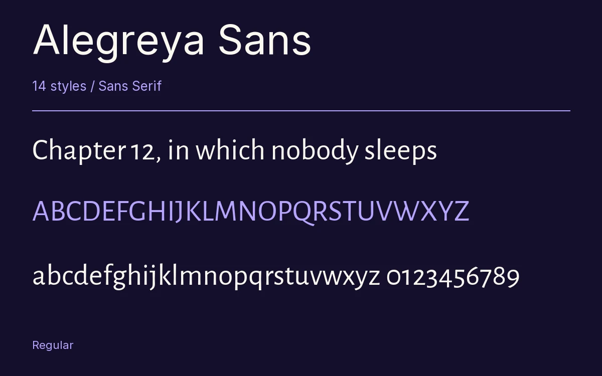
Characters & Figures
1,235 glyphs reported in the reference style. This selection shows 400 recorded characters.
ABCDEFGHIJKLMNOPQRSTUVWXYZ
abcdefghijklmnopqrstuvwxyz
0123456789 & @ ? !
View The Recorded Character Selection
The Font Files
Download
Alegreya Sans
14 TTF styles with the accompanying CSS, README and license information.
Download ZIP · 1.6 MB ↓- Version
- 2.004
- License
- SIL Open Font License 1.1
Install On Your Computer
Extract the ZIP first. On Windows, select the font files and choose Install from the context menu. On macOS, open the files in Font Book and choose Install.
Use On A Website
Keep the font files and the included stylesheet together. Update the stylesheet path to match your project.
<link rel="stylesheet"
  href="/fonts/alegreya-sans-2/alegreya-sans-2.css">

body {
  font-family: 'Alegreya Sans', sans-serif;
}
Keep the copyright and license notices with redistributed files.
Heading & Body
Compare a larger heading with the same family at reading size.
Alegreya Sans Heading · Alegreya Sans Body
Before You Travel
The morning service leaves at nine. Tickets are available at the station, and the platform is listed on the departure board. Keep your ticket until the end of the journey.