
Alegreya
Designed By
Juan Pablo del Peral, HT Fonts
12 Styles Serif
The pleasure
of a well-set
page.
Alegreya · Regular
Compare this serif family in headings and a continuous reading sample.
12 styles available. Compare the specimens below, or enter your own text.
Download Alegreya ↓TTF · SIL Open Font License 1.1
Set Your Own Text
Change the style and size to compare the letterforms.
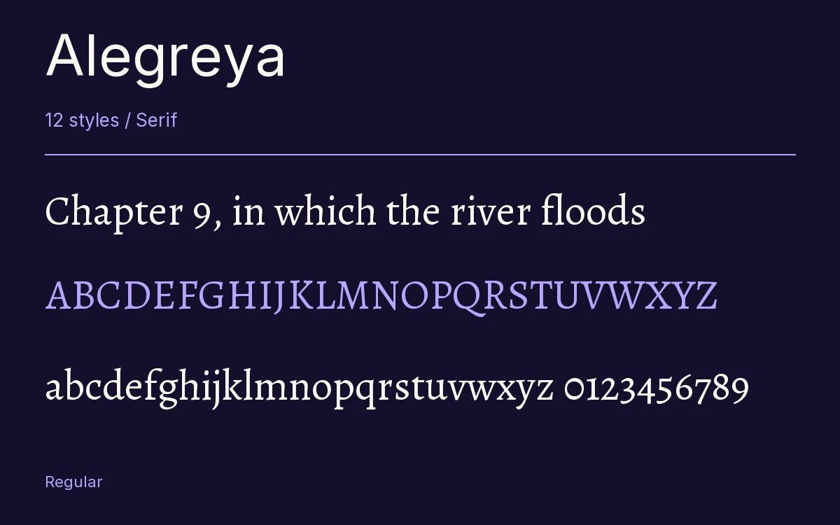
Chapter 9, in which the river floods
A Page In Alegreya
Alegreya · Regular
Headings, labels and running text.
Notes From The Reading Room
The reading room opens onto a quiet courtyard. Along the shelves, small handwritten labels mark the collections. A visitor leaves a book open beside the window, keeping a place for the next reader.
A heading marks the next chapter. The margins leave room for a note while the text continues across the page.
12 Styles,
One Family
Every available style is shown below in its own font file.
Regular400
Chapter 9, in which the river floods
Italic400
Chapter 9, in which the river floods
Medium500
Chapter 9, in which the river floods
Medium Italic500
Chapter 9, in which the river floods
Semi Bold600
Chapter 9, in which the river floods
Semi Bold Italic600
Chapter 9, in which the river floods
Bold700
Chapter 9, in which the river floods
Bold Italic700
Chapter 9, in which the river floods
Extra Bold800
Chapter 9, in which the river floods
Extra Bold Italic800
Chapter 9, in which the river floods
Black900
Chapter 9, in which the river floods
Black Italic900
Chapter 9, in which the river floods
Juan Pablo del Peral meant Alegreya for literature, and the type world liked it early. In September 2011 the ATypI Letter2 competition named it among its 53 Fonts of the Decade and among the top 14 text type systems, and a year before that it had been selected for the 2nd Bienal Iberoamericana de Diseño in Madrid.
The letters come from calligraphy. You can see the pen behind them, though del Peral redrew it in the language of contemporary type, and the result has a lively, uneven rhythm that keeps a long page from going flat. That rhythm is the reason to pick it for a novel. On a dense settings screen in a web app it would probably feel restless.
He gave the italic as much attention as the roman, and it shows when you run a few lines of it. The bold weights are firm, and the Black ones go further than most text serifs ever dare, which Huerta Tipográfica itself calls experimental. Here you get 6 weights, Regular through Black, with an italic for each, 12 files.
Inside the fonts there is a proper literary toolkit, small caps and old style figures and 5 stylistic sets, and the language reach goes past Latin into Greek, Cyrillic and Vietnamese. Alegreya is also the hub of a larger system. There is a separate small caps family, and a sans serif sister drawn to sit beside it.
Set a short story in Regular at a comfortable reading size, put the chapter titles in Black, and see whether you still want a second typeface.
Characters & Figures
1,254 glyphs reported in the reference style. This selection shows 400 recorded characters.
ABCDEFGHIJKLMNOPQRSTUVWXYZ
abcdefghijklmnopqrstuvwxyz
0123456789 & @ ? !
View The Recorded Character Selection
The Font Files
Download
Alegreya
12 TTF styles with the accompanying CSS, README and license information.
Download ZIP · 1.4 MB ↓- Version
- 2.009
- License
- SIL Open Font License 1.1
Install On Your Computer
Extract the ZIP first. On Windows, select the font files and choose Install from the context menu. On macOS, open the files in Font Book and choose Install.
Use On A Website
Keep the font files and the included stylesheet together. Update the stylesheet path to match your project.
<link rel="stylesheet"
  href="/fonts/alegreya/alegreya.css">

body {
  font-family: 'Alegreya', sans-serif;
}
Keep the copyright and license notices with redistributed files.
Heading & Body
The family provides the heading; Inter carries the supporting text.
Alegreya Heading · Inter Body
Notes From The Reading Room
The reading room opens onto a quiet courtyard. Along the shelves, small handwritten labels mark the collections. A visitor leaves a book open beside the window, keeping a place for the next reader.