
Baskervville SC
Designed By
ANRT
4 Styles Serif
The pleasure
of a well-set
page.
Baskervville SC · Regular
Compare this serif family in headings and a continuous reading sample.
4 styles available. Compare the specimens below, or enter your own text.
Download Baskervville SC ↓TTF · SIL Open Font License 1.1
Set Your Own Text
Change the style and size to compare the letterforms.
Chapter the First
A Page In Baskervville SC
Baskervville SC · Regular
Headings, labels and running text.
Notes From The Reading Room
The reading room opens onto a quiet courtyard. Along the shelves, small handwritten labels mark the collections. A visitor leaves a book open beside the window, keeping a place for the next reader.
A heading marks the next chapter. The margins leave room for a note while the text continues across the page.
4 Styles,
One Family
Every available style is shown below in its own font file.
Regular400
Chapter the First
Medium500
Chapter the First
Semi Bold600
Chapter the First
Bold700
Chapter the First
The double v in the name carries a history. In 1779 Sarah Eaves sold John Baskerville’s punches to Beaumarchais, whose printing house was in Kehl, and an employee there named Claude Jacob was sent to Birmingham to check and repair them. Back in Kehl he fell out with his employer, set up a foundry in Strasbourg in 1784, and cut his own version of the type, selling it as “caractères dans le genre Baskerwille”, with a w. His specimens grew from 3 sizes to 6, in roman and italic, and from 1815 the type was distributed by the Berger-Levrault foundry.
What makes Jacob’s version interesting is the split in it. The roman stays close to Baskerville, while the italic leans toward Didot, so the type sits between the transitional and the modern.
The digital version is an ANRT student project from 2017, led by Charles Mazé and Thomas Huot-Marchand, which Rosalie Wagner, 1 of the 6 students, carried on to a finished font. The Bold came later, in 2025, drawn by Huot-Marchand himself.
This SC family sets everything as small caps, in Regular, Medium, Semi Bold and Bold. It is the version for running heads and title pages, next to the regular Baskervville for the text itself. Old style figures and fractions are included.
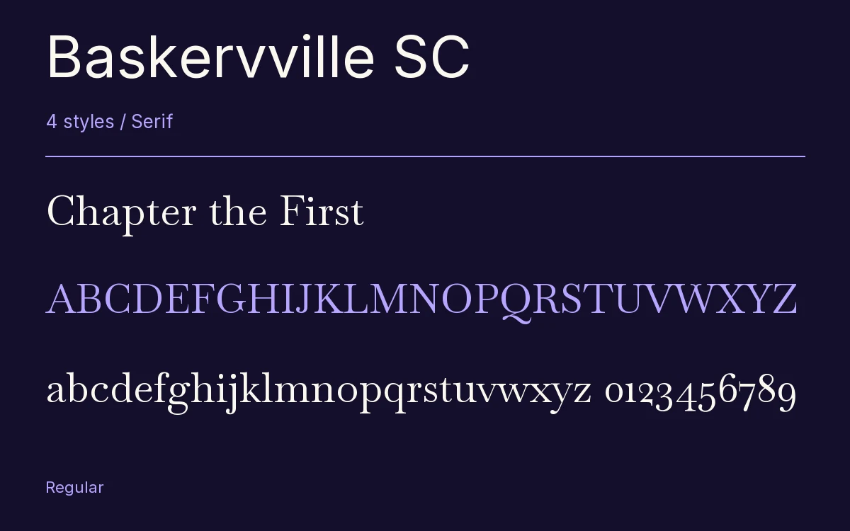
Characters & Figures
411 glyphs reported in the reference style. This selection shows 400 recorded characters.
ABCDEFGHIJKLMNOPQRSTUVWXYZ
abcdefghijklmnopqrstuvwxyz
0123456789 & @ ? !
View The Recorded Character Selection
The Font Files
Download
Baskervville SC
4 TTF styles with the accompanying CSS, README and license information.
Download ZIP · 177 KB ↓- Version
- 1.100
- License
- SIL Open Font License 1.1
Install On Your Computer
Extract the ZIP first. On Windows, select the font files and choose Install from the context menu. On macOS, open the files in Font Book and choose Install.
Use On A Website
Keep the font files and the included stylesheet together. Update the stylesheet path to match your project.
<link rel="stylesheet"
  href="/fonts/baskervville-sc-2/baskervville-sc-2.css">

body {
  font-family: 'Baskervville SC', sans-serif;
}
Keep the copyright and license notices with redistributed files.
Heading & Body
The family provides the heading; Inter carries the supporting text.
Baskervville SC Heading · Inter Body
Notes From The Reading Room
The reading room opens onto a quiet courtyard. Along the shelves, small handwritten labels mark the collections. A visitor leaves a book open beside the window, keeping a place for the next reader.
Other Serif Families
Browse All Serif Fonts →- Grandiflora OneSerif1 StyleGoogle Fonts
 Serif1 StyleFontshare
- RufinaSerif2 StylesGoogle Fonts
- Chiron Sung HKSerif12 StylesGoogle Fonts
- MerriweatherSerif14 StylesGoogle Fonts
- Antic DidoneSerif1 StyleGoogle Fonts