
Merriweather
Designed By
Sorkin Type
14 Styles Serif
The pleasure
of a well-set
page.
Merriweather Regular & Italic
A serif family for reading on screens, with generous lowercase letters and sturdy details.
Compare its seven weights and their italics, set a line of your own, or read the family notes below.
Download Merriweather ↓TTF · SIL Open Font License 1.1
Set Your Own Text
Change the style and size to compare the letterforms.
The pleasure of a well-set page.
A Page In Merriweather
Regular · 18 px
Line Height · 1.85
Notes From The Reading Room
The reading room opens onto a quiet courtyard. Along the shelves, small handwritten labels mark the collections. A visitor leaves a book open beside the window, keeping a place for the next reader.
Across the page, a heading marks the next chapter. The margins leave space for an occasional note, while the text continues in an even rhythm. Read it at the size you would use in your own document.
“A few lines are enough to begin comparing the shape and rhythm of a typeface.”
Specimen text for comparing paragraph settings.
Fourteen Styles,
One Family
Light through Black, each with a corresponding italic.
Light300
Letters in the afternoon.
Light Italic300
Letters in the afternoon.
Regular400
Letters in the afternoon.
Italic400
Letters in the afternoon.
Medium500
Letters in the afternoon.
Medium Italic500
Letters in the afternoon.
Semi Bold600
Letters in the afternoon.
Semi Bold Italic600
Letters in the afternoon.
Bold700
Letters in the afternoon.
Bold Italic700
Letters in the afternoon.
Extra Bold800
Letters in the afternoon.
Extra Bold Italic800
Letters in the afternoon.
Black900
Letters in the afternoon.
Black Italic900
Letters in the afternoon.
Zoom a page of Merriweather to 16 px and look at the serif on the n. It is a fat little block with no taper, and most of the design is in that block. Eben Sorkin drew the face at Sorkin Type for reading on a screen, and on a screen a hairline serif is thinner than 1 pixel, so the renderer has to either round it up to a full dark pixel or smear it across 2 gray ones, and both look wrong, 1 too heavy and the other fuzzy. So Sorkin skipped the hairline. He also pushed the x-height up to 55.5% of the em, and a lowercase line set at the same size as Georgia runs about 10% wider, the price of letters that big, which is why the lowercase stays readable on a phone where a bookish serif has gone to mush.
The stress is only a touch diagonal. On a long page that keeps the gray of the paragraph the same from the top of the screen to the bottom, no dark patches where the round letters cluster, and that evenness is the reason it has ended up as the body face on so many blogs and ebook readers.
Our opinion, because a font page should carry 1, is to keep it under about 36 px on a white background. The same fat serifs that carry a paragraph make a headline look as if it had been set in bold when it had not, and most of the sites that use it well have a plain sans doing the titles and Merriweather doing the reading underneath.
The italic was drawn on its own, and we measured it against the roman by setting the same lowercase line in both at 1 size, and the italic finished about 6% shorter across the line with more movement in the letters. Captions and pulled quotes, then. A full page of it would be hard going.
The family on this page:
- 14 styles, Light at 300 up to Black at 900, and every weight has its own italic.
- 1,423 characters in each style, Latin with the extended accents, Greek, Cyrillic and Vietnamese.
- Small caps, old style and tabular figures, fractions and 3 stylistic sets built in.
- Version 2.100, from the 2024 Merriweather project.
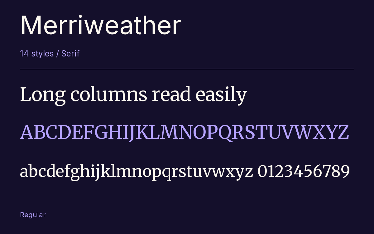
Characters & Figures
1,423 glyphs reported in the reference style. This selection shows 400 recorded characters.
ABCDEFGHIJKLMNOPQRSTUVWXYZ
abcdefghijklmnopqrstuvwxyz
0123456789 & @ ? !
View The Recorded Character Selection
The Font Files
Download
Merriweather
14 TTF styles with the accompanying CSS, README and license information.
Download ZIP · 7.7 MB ↓- Version
- 2.100
- License
- SIL Open Font License 1.1
Install On Your Computer
Extract the ZIP first. On Windows, select the font files and choose Install from the context menu. On macOS, open the files in Font Book and choose Install.
Use On A Website
Keep the font files and the included stylesheet together. Update the stylesheet path to match your project.
<link rel="stylesheet"
  href="/fonts/merriweather/merriweather.css">

body {
  font-family: 'Merriweather', Georgia, serif;
}
Keep the copyright and license notices with redistributed files.
Heading & Body
A sans-serif heading gives Merriweather’s paragraph text a clear contrast.
Inter Heading · Merriweather Body
The Reading Room
The reading room opens onto a quiet courtyard. Along the shelves, small handwritten labels mark the collections. A visitor leaves a book open beside the window, keeping a place for the next reader.