
Markazi Text
Designed By
Borna Izadpanah, Florian Runge, Fiona Ross
4 Styles Serif
The pleasure
of a well-set
page.
Markazi Text · Regular
Compare this serif family in headings and a continuous reading sample.
4 styles available. Compare the specimens below, or enter your own text.
Download Markazi Text ↓TTF · SIL Open Font License 1.1
Set Your Own Text
Change the style and size to compare the letterforms.
A page from the city archive
A Page In Markazi Text
Markazi Text · Regular
Headings, labels and running text.
Notes From The Reading Room
The reading room opens onto a quiet courtyard. Along the shelves, small handwritten labels mark the collections. A visitor leaves a book open beside the window, keeping a place for the next reader.
A heading marks the next chapter. The margins leave room for a note while the text continues across the page.
4 Styles,
One Family
Every available style is shown below in its own font file.
Regular400
A page from the city archive
Medium500
A page from the city archive
Semi Bold600
A page from the city archive
Bold700
A page from the city archive
Tim Holloway’s Markazi was the starting point, and Holloway encouraged the project. Gerry Leonidas set it up as a joint effort between the University of Reading and Google, and the result is a reading face for Arabic with a Latin partner, built for print and screen alike.
Borna Izadpanah designed the Arabic, with Fiona Ross as design director. It takes its cues from the original Markazi and keeps a moderate contrast between thick and thin. Florian Runge drew the Latin to echo the main traits of the Arabic while staying inside established Latin habits.
Compact is the word for that Latin. It is open and clear but narrow, with the same words taking about 24% less width than in Georgia, and the rhythm runs evenly along the line. On a bilingual page that saves room.
- Regular, Medium, Semi Bold, Bold
- Arabic plus Latin with Vietnamese
The OpenType side includes fractions, subscripts, superscripts, a slashed zero and a stylistic set. We would give it the body of a bilingual annual report or a university press book and let the Bold take the headings. It sits small on the body, so set it a size or 2 larger than you would set Georgia.
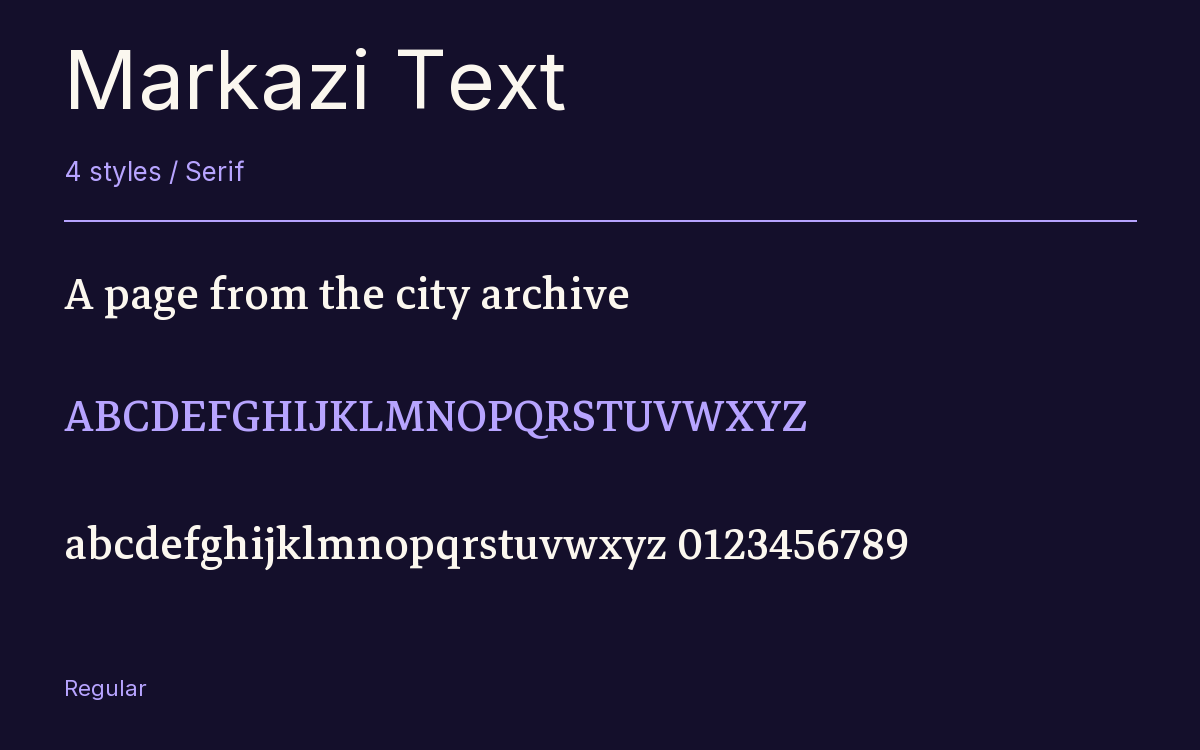
Characters & Figures
999 glyphs reported in the reference style. This selection shows 400 recorded characters.
ABCDEFGHIJKLMNOPQRSTUVWXYZ
abcdefghijklmnopqrstuvwxyz
0123456789 & @ ? !
View The Recorded Character Selection
The Font Files
Download
Markazi Text
4 TTF styles with the accompanying CSS, README and license information.
Download ZIP · 287 KB ↓- Version
- 1.001
- License
- SIL Open Font License 1.1
Install On Your Computer
Extract the ZIP first. On Windows, select the font files and choose Install from the context menu. On macOS, open the files in Font Book and choose Install.
Use On A Website
Keep the font files and the included stylesheet together. Update the stylesheet path to match your project.
<link rel="stylesheet"
  href="/fonts/markazi-text-2/markazi-text-2.css">

body {
  font-family: 'Markazi Text', sans-serif;
}
Keep the copyright and license notices with redistributed files.
Heading & Body
The family provides the heading; Inter carries the supporting text.
Markazi Text Heading · Inter Body
Notes From The Reading Room
The reading room opens onto a quiet courtyard. Along the shelves, small handwritten labels mark the collections. A visitor leaves a book open beside the window, keeping a place for the next reader.