
Cormorant Garamond
Designed By
Christian Thalmann
10 Styles Serif
The pleasure
of a well-set
page.
Cormorant Garamond · Regular
Compare this serif family in headings and a continuous reading sample.
10 styles available. Compare the specimens below, or enter your own text.
Download Cormorant Garamond ↓TTF · SIL Open Font License 1.1
Set Your Own Text
Change the style and size to compare the letterforms.
Of rivers and quiet ink
A Page In Cormorant Garamond
Cormorant Garamond · Regular
Headings, labels and running text.
Notes From The Reading Room
The reading room opens onto a quiet courtyard. Along the shelves, small handwritten labels mark the collections. A visitor leaves a book open beside the window, keeping a place for the next reader.
A heading marks the next chapter. The margins leave room for a note while the text continues across the page.
10 Styles,
One Family
Every available style is shown below in its own font file.
Light300
Of rivers and quiet ink
Light Italic300
Of rivers and quiet ink
Regular400
Of rivers and quiet ink
Italic400
Of rivers and quiet ink
Medium500
Of rivers and quiet ink
Medium Italic500
Of rivers and quiet ink
Semi Bold600
Of rivers and quiet ink
Semi Bold Italic600
Of rivers and quiet ink
Bold700
Of rivers and quiet ink
Bold Italic700
Of rivers and quiet ink
When Christian Thalmann needed guidance on a character while drawing Cormorant, he searched for the word Garamond and skimmed the results for a general impression. That was the method. No particular Garamond served as a model, most glyphs were drawn from scratch, and Claude Garamont’s legacy hangs over the family as inspiration only.
Thalmann did all of it himself at Catharsis Fonts in Zurich, the drawing, spacing, kerning, programming, interpolation and production. Google Fonts, through Dave Crossland, paid for the development so it could go out as libre fonts. The whole Cormorant project runs to 45 files in 9 visual styles, from Infant and Upright Cursive to Unicase, and Cormorant Garamond is the branch that joined Google Fonts in January 2017.
It was conceived as display type, and the small x-height gives that away. A paragraph at 16 px looks small and pale, so for a book interior go to Regular or Medium at 18 px and up, and save the Light for titles.
The italic is much more compact than the roman, about a tenth narrower over the same words, handy for a long title in a narrow column.
Under the hood
11 stylistic sets, true small caps with a caps-to-small-caps feature for acronyms, old style, lining and tabular figures, and a slashed zero. This download has 10 styles, Light to Bold with italics, 974 characters each, Cyrillic and Vietnamese included.
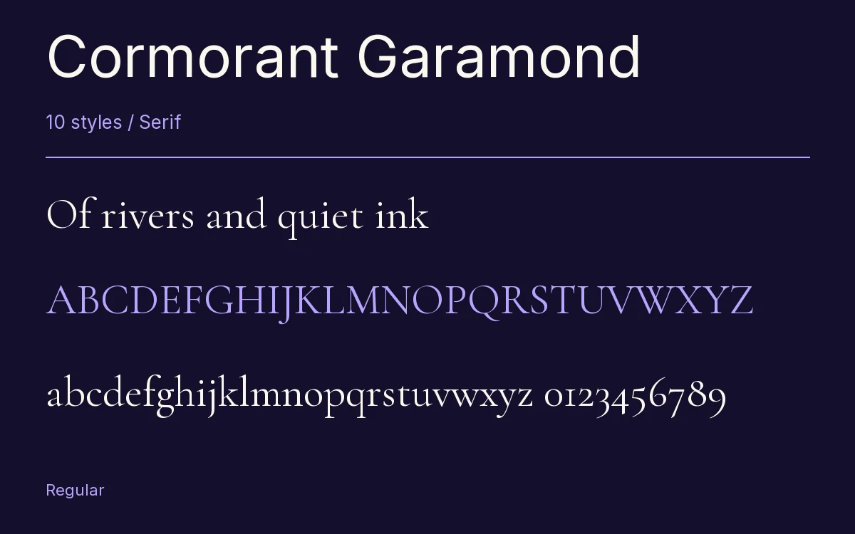
Characters & Figures
974 glyphs reported in the reference style. This selection shows 400 recorded characters.
ABCDEFGHIJKLMNOPQRSTUVWXYZ
abcdefghijklmnopqrstuvwxyz
0123456789 & @ ? !
View The Recorded Character Selection
The Font Files
Download
Cormorant Garamond
10 TTF styles with the accompanying CSS, README and license information.
Download ZIP · 1.5 MB ↓- Version
- 4.001
- License
- SIL Open Font License 1.1
Install On Your Computer
Extract the ZIP first. On Windows, select the font files and choose Install from the context menu. On macOS, open the files in Font Book and choose Install.
Use On A Website
Keep the font files and the included stylesheet together. Update the stylesheet path to match your project.
<link rel="stylesheet"
  href="/fonts/cormorant-garamond-2/cormorant-garamond-2.css">

body {
  font-family: 'Cormorant Garamond', sans-serif;
}
Keep the copyright and license notices with redistributed files.
Heading & Body
The family provides the heading; Inter carries the supporting text.
Cormorant Garamond Heading · Inter Body
Notes From The Reading Room
The reading room opens onto a quiet courtyard. Along the shelves, small handwritten labels mark the collections. A visitor leaves a book open beside the window, keeping a place for the next reader.