
Cormorant
Designed By
Christian Thalmann
10 Styles Serif
The pleasure
of a well-set
page.
Cormorant · Regular
Compare this serif family in headings and a continuous reading sample.
10 styles available. Compare the specimens below, or enter your own text.
Download Cormorant ↓TTF · SIL Open Font License 1.1
Set Your Own Text
Change the style and size to compare the letterforms.
Quiet rooms above the harbor
A Page In Cormorant
Cormorant · Regular
Headings, labels and running text.
Notes From The Reading Room
The reading room opens onto a quiet courtyard. Along the shelves, small handwritten labels mark the collections. A visitor leaves a book open beside the window, keeping a place for the next reader.
A heading marks the next chapter. The margins leave room for a note while the text continues across the page.
10 Styles,
One Family
Every available style is shown below in its own font file.
Light300
Quiet rooms above the harbor
Light Italic300
Quiet rooms above the harbor
Regular400
Quiet rooms above the harbor
Italic400
Quiet rooms above the harbor
Medium500
Quiet rooms above the harbor
Medium Italic500
Quiet rooms above the harbor
Semi Bold600
Quiet rooms above the harbor
Semi Bold Italic600
Quiet rooms above the harbor
Bold700
Quiet rooms above the harbor
Bold Italic700
Quiet rooms above the harbor
The lowercase in Cormorant is small. An x stands only about 62% as tall as an H, and the ascenders and descenders get the rest of the height, so a word set large shows long elegant stems with little bodies between them. At 12 px on a screen that same proportion turns into squinting. Christian Thalmann meant it as a display family, and it should be set big.
He drew everything himself at Catharsis Fonts in Zurich: the glyphs, the spacing, the kerning, the programming, the interpolation. Claude Garamont was the inspiration, but no particular Garamond sat on his desk as a model, and most letters were drawn from scratch. Google Fonts and Dave Crossland funded the work so it could be released as a libre family.
This is the main Cormorant, Roman and Italic in 5 weights, Light to Bold. The italic is noticeably more compact than the roman. The wider project goes on into Garamond, Infant, Upright Cursive, Small Caps and Unicase versions, 45 files in total, but you may not need them, since the file here already holds small caps, old style and lining figures, a slashed zero and 12 stylistic sets.
A pull quote in the Light Italic, at 48 px or so, is where we would start.
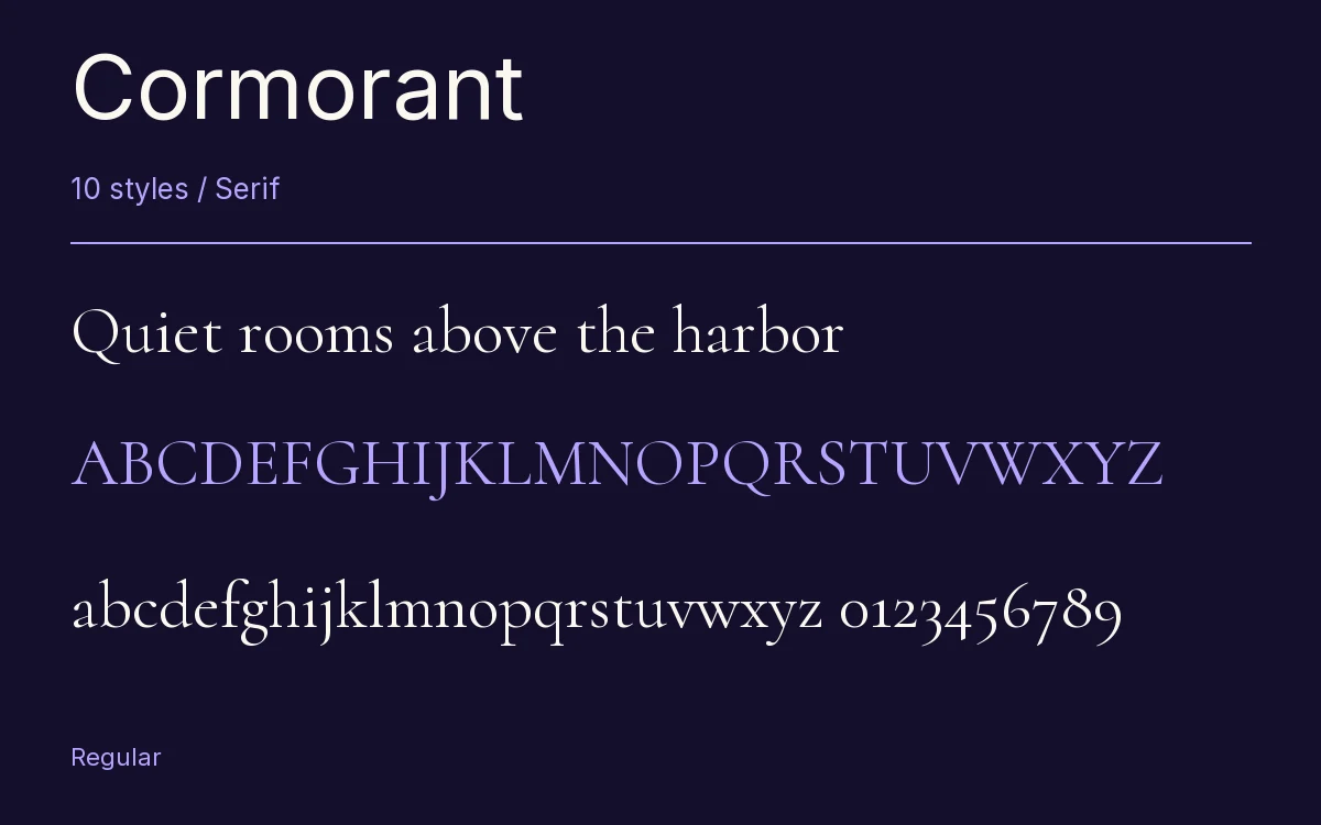
Characters & Figures
972 glyphs reported in the reference style. This selection shows 400 recorded characters.
ABCDEFGHIJKLMNOPQRSTUVWXYZ
abcdefghijklmnopqrstuvwxyz
0123456789 & @ ? !
View The Recorded Character Selection
The Font Files
Download
Cormorant
10 TTF styles with the accompanying CSS, README and license information.
Download ZIP · 1.2 MB ↓- Version
- 4.000
- License
- SIL Open Font License 1.1
Install On Your Computer
Extract the ZIP first. On Windows, select the font files and choose Install from the context menu. On macOS, open the files in Font Book and choose Install.
Use On A Website
Keep the font files and the included stylesheet together. Update the stylesheet path to match your project.
<link rel="stylesheet"
  href="/fonts/cormorant/cormorant.css">

body {
  font-family: 'Cormorant', sans-serif;
}
Keep the copyright and license notices with redistributed files.
Heading & Body
The family provides the heading; Inter carries the supporting text.
Cormorant Heading · Inter Body
Notes From The Reading Room
The reading room opens onto a quiet courtyard. Along the shelves, small handwritten labels mark the collections. A visitor leaves a book open beside the window, keeping a place for the next reader.