
Vollkorn
Designed By
Friedrich Althausen
12 Styles Serif
The pleasure
of a well-set
page.
Vollkorn · Regular
Compare this serif family in headings and a continuous reading sample.
12 styles available. Compare the specimens below, or enter your own text.
Download Vollkorn ↓TTF · SIL Open Font License 1.1
Set Your Own Text
Change the style and size to compare the letterforms.
Fresh rye loaves every Saturday
A Page In Vollkorn
Vollkorn · Regular
Headings, labels and running text.
Notes From The Reading Room
The reading room opens onto a quiet courtyard. Along the shelves, small handwritten labels mark the collections. A visitor leaves a book open beside the window, keeping a place for the next reader.
A heading marks the next chapter. The margins leave room for a note while the text continues across the page.
12 Styles,
One Family
Every available style is shown below in its own font file.
Regular400
Fresh rye loaves every Saturday
Italic400
Fresh rye loaves every Saturday
Medium500
Fresh rye loaves every Saturday
Medium Italic500
Fresh rye loaves every Saturday
Semi Bold600
Fresh rye loaves every Saturday
Semi Bold Italic600
Fresh rye loaves every Saturday
Bold700
Fresh rye loaves every Saturday
Bold Italic700
Fresh rye loaves every Saturday
Extra Bold800
Fresh rye loaves every Saturday
Extra Bold Italic800
Fresh rye loaves every Saturday
Black900
Fresh rye loaves every Saturday
Black Italic900
Fresh rye loaves every Saturday
Say it “Follkorn”. The word is German for wholemeal, and Friedrich Althausen picked it as a nod to Brotschrift, bread type, the old name for the small everyday fonts of the hand-setting era. That is the ambition here, a quiet, modest text face for bread-and-butter work.
It was Althausen’s first typeface. He first published it in 2005, people downloaded it thousands of times and put it into web and print projects of all kinds, and it came to Google Fonts in 2010. In May 2020 he rebuilt it as a variable font with a weight axis in both roman and italic.
What sets it apart from most text serifs is the serifs themselves, dark and meaty where tradition would make them light, which gives a page of Vollkorn a bouncing, well-fed look. That darkness is why it also holds up in a headline.
What the files carry
12 styles, from Regular at 400 to Black at 900, each with an italic. Greek and Cyrillic come along with an extended Latin, 1,242 characters in all. The italic is a good deal narrower than the roman, around 14% across a line, so it saves space in a caption as well as marking emphasis. Small caps, old style and lining figures in both tabular and proportional widths, fractions, a slashed zero and 9 stylistic sets give a book designer most of what a book needs. Our pick for a novel would be Regular with old style figures switched on.
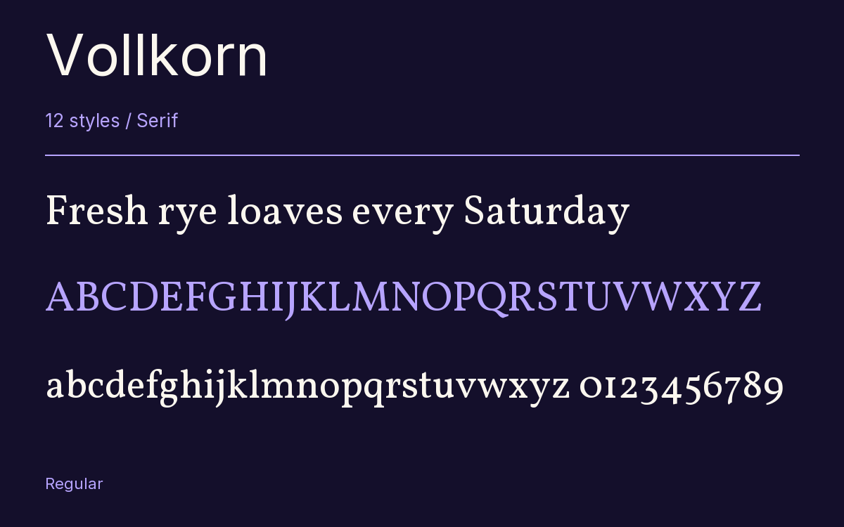
Characters & Figures
1,242 glyphs reported in the reference style. This selection shows 400 recorded characters.
ABCDEFGHIJKLMNOPQRSTUVWXYZ
abcdefghijklmnopqrstuvwxyz
0123456789 & @ ? !
View The Recorded Character Selection
The Font Files
Download
Vollkorn
12 TTF styles with the accompanying CSS, README and license information.
Download ZIP · 1.7 MB ↓- Version
- 5.001
- License
- SIL Open Font License 1.1
Install On Your Computer
Extract the ZIP first. On Windows, select the font files and choose Install from the context menu. On macOS, open the files in Font Book and choose Install.
Use On A Website
Keep the font files and the included stylesheet together. Update the stylesheet path to match your project.
<link rel="stylesheet"
  href="/fonts/vollkorn/vollkorn.css">

body {
  font-family: 'Vollkorn', sans-serif;
}
Keep the copyright and license notices with redistributed files.
Heading & Body
The family provides the heading; Inter carries the supporting text.
Vollkorn Heading · Inter Body
Notes From The Reading Room
The reading room opens onto a quiet courtyard. Along the shelves, small handwritten labels mark the collections. A visitor leaves a book open beside the window, keeping a place for the next reader.