
Inknut Antiqua
Designed By
Claus Eggers Sørensen
7 Styles Serif
The pleasure
of a well-set
page.
Inknut Antiqua · Regular
Compare this serif family in headings and a continuous reading sample.
7 styles available. Compare the specimens below, or enter your own text.
Download Inknut Antiqua ↓TTF · SIL Open Font License 1.1
Set Your Own Text
Change the style and size to compare the letterforms.
Chapter 1, in which the ink dries
A Page In Inknut Antiqua
Inknut Antiqua · Regular
Headings, labels and running text.
Notes From The Reading Room
The reading room opens onto a quiet courtyard. Along the shelves, small handwritten labels mark the collections. A visitor leaves a book open beside the window, keeping a place for the next reader.
A heading marks the next chapter. The margins leave room for a note while the text continues across the page.
7 Styles,
One Family
Every available style is shown below in its own font file.
Light300
Chapter 1, in which the ink dries
Regular400
Chapter 1, in which the ink dries
Medium500
Chapter 1, in which the ink dries
Semi Bold600
Chapter 1, in which the ink dries
Bold700
Chapter 1, in which the ink dries
Extra Bold800
Chapter 1, in which the ink dries
Black900
Chapter 1, in which the ink dries
The inknut is a real fruit. Terminalia chebula, called harad in Hindi, grows on a tree native to the Indian subcontinent and Southeast Asia; it can be used to make ink, and it is said to cure blindness. Claus Eggers Sørensen, a type designer in Amsterdam, named his Antiqua after it.
His idea was to treat publishing on the web as a modern private press. So Inknut Antiqua looks back to Venetian incunabula and humanist manuscripts, and it keeps the quirks you find in the faces of that artisanal tradition, the odd letter that is a little too proud of itself. He meant it for literature and long reading, and he drew proportions that hold up on low-resolution screens.
The type is broad. A line of it is a quarter wider than Georgia, and the capitals are tall, so give it a generous measure and leading.
There are 7 weights, from Light at 300 to Black at 900, and the OpenType set is a private-press kit: discretionary ligatures, contextual and stylistic alternates, 5 stylistic sets, fractions, superscripts and subscripts. Devanagari is supported alongside Latin.
Would we set a novel in it? An online one, yes, in Regular, with Black kept for the title page.
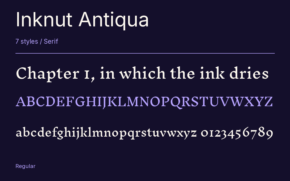
Characters & Figures
576 glyphs reported in the reference style. This selection shows 400 recorded characters.
ABCDEFGHIJKLMNOPQRSTUVWXYZ
abcdefghijklmnopqrstuvwxyz
0123456789 & @ ? !
View The Recorded Character Selection
The Font Files
Download
Inknut Antiqua
7 TTF styles with the accompanying CSS, README and license information.
Download ZIP · 1.1 MB ↓- Version
- 1.003
- License
- SIL Open Font License 1.1
Install On Your Computer
Extract the ZIP first. On Windows, select the font files and choose Install from the context menu. On macOS, open the files in Font Book and choose Install.
Use On A Website
Keep the font files and the included stylesheet together. Update the stylesheet path to match your project.
<link rel="stylesheet"
  href="/fonts/inknut-antiqua-2/inknut-antiqua-2.css">

body {
  font-family: 'Inknut Antiqua', sans-serif;
}
Keep the copyright and license notices with redistributed files.
Heading & Body
The family provides the heading; Inter carries the supporting text.
Inknut Antiqua Heading · Inter Body
Notes From The Reading Room
The reading room opens onto a quiet courtyard. Along the shelves, small handwritten labels mark the collections. A visitor leaves a book open beside the window, keeping a place for the next reader.