
Newsreader
Designed By
Production Type
14 Styles Serif
The pleasure
of a well-set
page.
Newsreader · Regular
Compare this serif family in headings and a continuous reading sample.
14 styles available. Compare the specimens below, or enter your own text.
Download Newsreader ↓TTF · SIL Open Font License 1.1
Set Your Own Text
Change the style and size to compare the letterforms.
Opinion: the case for slower trains
A Page In Newsreader
Newsreader · Regular
Headings, labels and running text.
Notes From The Reading Room
The reading room opens onto a quiet courtyard. Along the shelves, small handwritten labels mark the collections. A visitor leaves a book open beside the window, keeping a place for the next reader.
A heading marks the next chapter. The margins leave room for a note while the text continues across the page.
14 Styles,
One Family
Every available style is shown below in its own font file.
Extra Light200
Opinion: the case for slower trains
Extra Light Italic200
Opinion: the case for slower trains
Light300
Opinion: the case for slower trains
Light Italic300
Opinion: the case for slower trains
Regular400
Opinion: the case for slower trains
Italic400
Opinion: the case for slower trains
Medium500
Opinion: the case for slower trains
Medium Italic500
Opinion: the case for slower trains
Semi Bold600
Opinion: the case for slower trains
Semi Bold Italic600
Opinion: the case for slower trains
Bold700
Opinion: the case for slower trains
Bold Italic700
Opinion: the case for slower trains
Extra Bold800
Opinion: the case for slower trains
Extra Bold Italic800
Opinion: the case for slower trains
Google Fonts went to Production Type in Paris with a commission: a serif for people who read on screens, inside news streams and on publishing platforms full of content. Hugues Gentile and Jean-Baptiste Levée designed it, with Marion Sendral, Igino Marini and Yanone on the team. The brief, in the studio’s own summary, was something elegant and sturdy that still felt bookish.
The full design is bigger than what you see here. Production Type built it in 3 optical sizes, Caption, Text and Display, each in 7 weights with italics, 42 styles in all, and Google serves it as a variable font with an optical size axis. This download has the 7 weights from Extra Light to Extra Bold, each with its italic, as 14 static files.
Gentile teaches in the EsadType postgraduate program in Amiens. Levée founded and runs Production Type. The family was shortlisted at D&AD in 2021.
Reading it on a phone, the Regular has enough weight to hold up against a white background, and the italic is a little narrower, which works for pull quotes and subheads. Vietnamese is covered, along with 130 or so other languages.
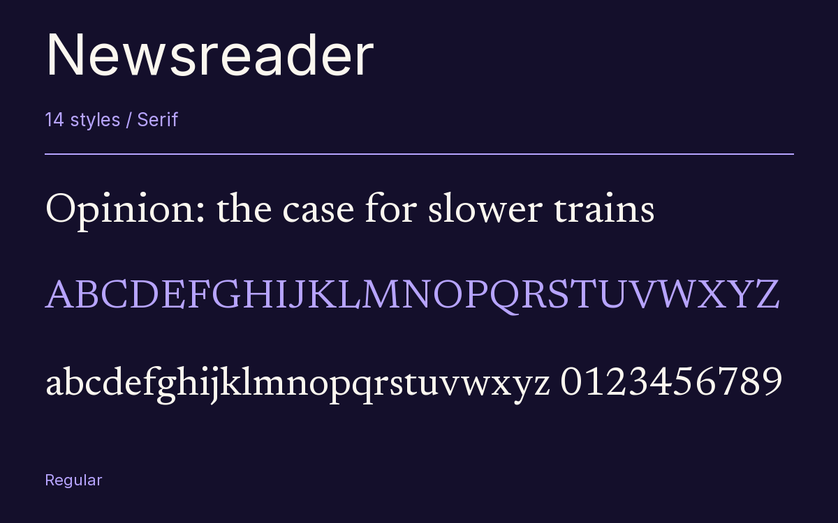
Characters & Figures
564 glyphs reported in the reference style. This selection shows 400 recorded characters.
ABCDEFGHIJKLMNOPQRSTUVWXYZ
abcdefghijklmnopqrstuvwxyz
0123456789 & @ ? !
View The Recorded Character Selection
The Font Files
Download
Newsreader
14 TTF styles with the accompanying CSS, README and license information.
Download ZIP · 901 KB ↓- Version
- 1.003
- License
- SIL Open Font License 1.1
Install On Your Computer
Extract the ZIP first. On Windows, select the font files and choose Install from the context menu. On macOS, open the files in Font Book and choose Install.
Use On A Website
Keep the font files and the included stylesheet together. Update the stylesheet path to match your project.
<link rel="stylesheet"
  href="/fonts/newsreader/newsreader.css">

body {
  font-family: 'Newsreader', sans-serif;
}
Keep the copyright and license notices with redistributed files.
Heading & Body
The family provides the heading; Inter carries the supporting text.
Newsreader Heading · Inter Body
Notes From The Reading Room
The reading room opens onto a quiet courtyard. Along the shelves, small handwritten labels mark the collections. A visitor leaves a book open beside the window, keeping a place for the next reader.