
Josefin Sans
Designed By
Santiago Orozco
14 Styles Sans Serif
Letters for
every day.
Josefin Sans · Regular
Compare the family in headings, short labels and paragraph text.
14 styles available. Compare the specimens below, or enter your own text.
Download Josefin Sans ↓TTF · SIL Open Font License 1.1
Set Your Own Text
Change the style and size to compare the letterforms.
Cocktails on the terrace at sunset
A Clear Hierarchy
Josefin Sans · Regular
Headings, labels and running text.
Departures09:00 →
Before You Travel
The morning service leaves at nine. Tickets are available at the station, and the platform is listed on the departure board. Keep your ticket until the end of the journey.
14 Styles,
One Family
Every available style is shown below in its own font file.
Thin100
Cocktails on the terrace at sunset
Thin Italic100
Cocktails on the terrace at sunset
Extra Light200
Cocktails on the terrace at sunset
Extra Light Italic200
Cocktails on the terrace at sunset
Light300
Cocktails on the terrace at sunset
Light Italic300
Cocktails on the terrace at sunset
Regular400
Cocktails on the terrace at sunset
Italic400
Cocktails on the terrace at sunset
Medium500
Cocktails on the terrace at sunset
Medium Italic500
Cocktails on the terrace at sunset
Semi Bold600
Cocktails on the terrace at sunset
Semi Bold Italic600
Cocktails on the terrace at sunset
Bold700
Cocktails on the terrace at sunset
Bold Italic700
Cocktails on the terrace at sunset
The small letters of Josefin Sans stop about halfway up to the capitals, an unusual proportion, as Santiago Orozco notes himself. It makes the capitals look grand over a low lowercase, and to our eye it is most of what gives the face its period feeling.
Orozco took his cues from the geometric sans serifs of the 1920s and wanted something geometric with a vintage air, made for larger sizes. He released it through Typemade in 2010. A variable weight axis followed in December 2019.
The download holds 7 weights from Thin at 100 to Bold at 700, each with an italic, 14 styles, and 574 characters with Vietnamese. A slashed zero and discretionary ligatures sit among the features. There is a sister family, Josefin Slab, if you want a slab to match.
Our advice is to respect the designer’s note about size. At 40 px on a wedding invitation the low lowercase looks deliberate and stylish; at 14 px in a paragraph it looks small.
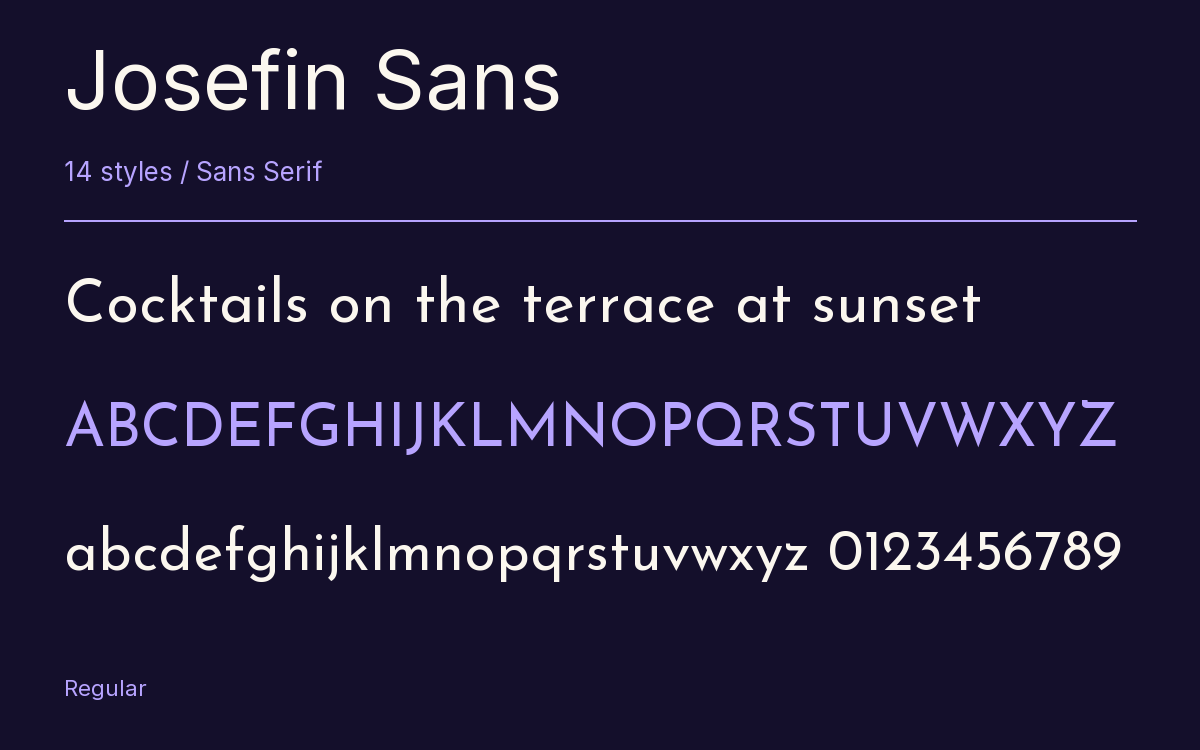
Characters & Figures
574 glyphs reported in the reference style. This selection shows 400 recorded characters.
ABCDEFGHIJKLMNOPQRSTUVWXYZ
abcdefghijklmnopqrstuvwxyz
0123456789 & @ ? !
View The Recorded Character Selection
The Font Files
Download
Josefin Sans
14 TTF styles with the accompanying CSS, README and license information.
Download ZIP · 425 KB ↓- Version
- 2.001
- License
- SIL Open Font License 1.1
Install On Your Computer
Extract the ZIP first. On Windows, select the font files and choose Install from the context menu. On macOS, open the files in Font Book and choose Install.
Use On A Website
Keep the font files and the included stylesheet together. Update the stylesheet path to match your project.
<link rel="stylesheet"
  href="/fonts/josefin-sans-2/josefin-sans-2.css">

body {
  font-family: 'Josefin Sans', sans-serif;
}
Keep the copyright and license notices with redistributed files.
Heading & Body
Compare a larger heading with the same family at reading size.
Josefin Sans Heading · Josefin Sans Body
Before You Travel
The morning service leaves at nine. Tickets are available at the station, and the platform is listed on the departure board. Keep your ticket until the end of the journey.