
PT Sans Narrow
Designed By
ParaType
2 Styles Sans Serif
Letters for
every day.
PT Sans Narrow · Regular
Compare the family in headings, short labels and paragraph text.
2 styles available. Compare the specimens below, or enter your own text.
Download PT Sans Narrow ↓TTF · SIL Open Font License 1.1
Set Your Own Text
Change the style and size to compare the letterforms.
Departures, gates 14 to 22
A Clear Hierarchy
PT Sans Narrow · Regular
Headings, labels and running text.
Departures09:00 →
Before You Travel
The morning service leaves at nine. Tickets are available at the station, and the platform is listed on the departure board. Keep your ticket until the end of the journey.
2 Styles,
One Family
Every available style is shown below in its own font file.
Regular400
Departures, gates 14 to 22
Bold700
Departures, gates 14 to 22
Squeeze is the point of this one. Against Arial, a sentence in PT Sans Narrow comes out 21.4% shorter, and ParaType made the 2 narrow styles for exactly that economy, documents and tables where every column has to give a little space back.
The parent family has a civic backstory. It came from a state-funded project for the 300th anniversary of Peter the Great’s civil type, one meant to cover the languages of the whole Russian Federation, the alphabets of the national republics’ title languages included, on top of standard Latin and Cyrillic. Alexandra Korolkova designed it with Olga Umpeleva, under the supervision of Vladimir Yefimov, and ParaType released it in 2009.
The look draws on Russian sans serifs from the second half of the 20th century, warmed up with humanist details.
8 styles make up PT Sans in full: 4 basic ones, 2 captions for small sizes and these 2 narrows. Narrow has only Regular and Bold, no italics, which you will notice the first time you need to set a book title inside a table cell.
ParaType mentions direction signs and information kiosks as uses, and the Narrow fits that well, long station names on a short sign. Pair it with regular PT Sans for the body text and the 2 will look like they belong together, because they do.
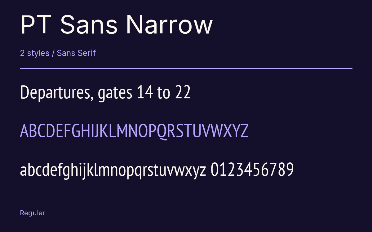
Characters & Figures
717 glyphs reported in the reference style. This selection shows 400 recorded characters.
ABCDEFGHIJKLMNOPQRSTUVWXYZ
abcdefghijklmnopqrstuvwxyz
0123456789 & @ ? !
View The Recorded Character Selection
The Font Files
Download
PT Sans Narrow
2 TTF styles with the accompanying CSS, README and license information.
Download ZIP · 292 KB ↓- Version
- 2.003W
- License
- SIL Open Font License 1.1
Install On Your Computer
Extract the ZIP first. On Windows, select the font files and choose Install from the context menu. On macOS, open the files in Font Book and choose Install.
Use On A Website
Keep the font files and the included stylesheet together. Update the stylesheet path to match your project.
<link rel="stylesheet"
  href="/fonts/pt-sans-narrow-2/pt-sans-narrow-2.css">

body {
  font-family: 'PT Sans Narrow', sans-serif;
}
Keep the copyright and license notices with redistributed files.
Heading & Body
Compare a larger heading with the same family at reading size.
PT Sans Narrow Heading · PT Sans Narrow Body
Before You Travel
The morning service leaves at nine. Tickets are available at the station, and the platform is listed on the departure board. Keep your ticket until the end of the journey.