
Kaisei Tokumin
Designed By
Font-Kai
4 Styles Serif
The pleasure
of a well-set
page.
Kaisei Tokumin · Regular
Compare this serif family in headings and a continuous reading sample.
4 styles available. Compare the specimens below, or enter your own text.
Download Kaisei Tokumin ↓TTF · SIL Open Font License 1.1
Set Your Own Text
Change the style and size to compare the letterforms.
Tonight's main event
A Page In Kaisei Tokumin
Kaisei Tokumin · Regular
Headings, labels and running text.
Notes From The Reading Room
The reading room opens onto a quiet courtyard. Along the shelves, small handwritten labels mark the collections. A visitor leaves a book open beside the window, keeping a place for the next reader.
A heading marks the next chapter. The margins leave room for a note while the text continues across the page.
4 Styles,
One Family
Every available style is shown below in its own font file.
Regular400
Tonight's main event
Medium500
Preview Medium · 2.5 MB
Tonight's main event
Bold700
Preview Bold · 2.5 MB
Tonight's main event
Extra Bold800
Preview Extra Bold · 2.7 MB
Tonight's main event
Tokumin is short for Tokudai Mincho Kana, extra bold serif kana, and the name says what the font is for: strong titles. Heavy Mincho has a known weakness. Pile on weight and the strokes crowd each other, the balance goes and a word loses its air. Kazuo Kanai tried to keep the power of an extra bold while holding on to legibility.
Kanai, who works as Font-Kai, came to type from graphic design and logo lettering in 1984, after winning an award in the Morisawa Type Competition. He began the Kaisei project in 2016. Kaisei is written 解星, and the strokes follow the movement of a scratching pen where most Mincho follow the brush, with small star-like dots set on the right-hand sweeps and the hooks. The horizontal strokes of the kanji are heavier than in a traditional Mincho, to hold up on screens.
Tokumin is 1 of 4 sister families, with Opti, Decol and HaruUmi. All 4 share the same kanji, Latin and symbols, over 7,000 kanji in all, and differ only in their kana, so you can change the mood of a heading by swapping the family without the kanji moving at all.
4 weights here, Regular, Medium, Bold and Extra Bold. For a cover or a poster headline, start with the Extra Bold.
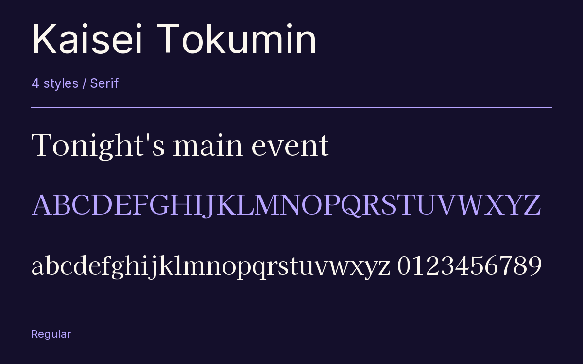
Characters & Figures
7,930 glyphs reported in the reference style. This selection shows 400 recorded characters.
ABCDEFGHIJKLMNOPQRSTUVWXYZ
abcdefghijklmnopqrstuvwxyz
0123456789 & @ ? !
View The Recorded Character Selection
The Font Files
Download
Kaisei Tokumin
4 TTF styles with the accompanying CSS, README and license information.
Download ZIP · 10.3 MB ↓- Version
- 5.003
- License
- SIL Open Font License 1.1
Install On Your Computer
Extract the ZIP first. On Windows, select the font files and choose Install from the context menu. On macOS, open the files in Font Book and choose Install.
Use On A Website
Keep the font files and the included stylesheet together. Update the stylesheet path to match your project.
<link rel="stylesheet"
  href="/fonts/kaisei-tokumin-2/kaisei-tokumin-2.css">

body {
  font-family: 'Kaisei Tokumin', sans-serif;
}
Keep the copyright and license notices with redistributed files.
Heading & Body
The family provides the heading; Inter carries the supporting text.
Kaisei Tokumin Heading · Inter Body
Notes From The Reading Room
The reading room opens onto a quiet courtyard. Along the shelves, small handwritten labels mark the collections. A visitor leaves a book open beside the window, keeping a place for the next reader.