
Kola
Designed By
Jean-Baptiste Morizot
1 Style Display

Kola · Regular
View the family information below and visit the publisher for font files and usage terms.
1 style available. The specimen image shows the family; live testing is available from its publisher.
Get Kola ↓TTF · ITF Free Font License
1 Style,
One Family
Style names from the catalog. Visit the publisher to test each style.
Regular400
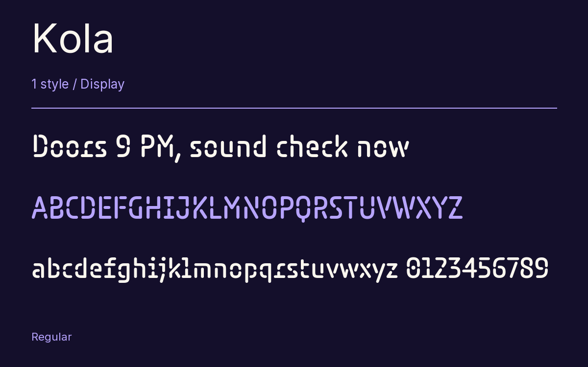
Kola looks like the lettering on an LED display, with rounded stroke ends and stencil cuts, and its stencil bridges do not stay put: in K, j and r they move around inside the letter. Jean-Baptiste Morizot, a designer based in Paris, made it for Indian Type Foundry.
He took care over letters that get confused. I and J are drawn differently enough that they cannot be mistaken, the Q gets a straight vertical tail, and the accents are oversized and sit above everything else, since the ascenders already reach cap height.
The proportions are close to a modern condensed sans. This page offers the single Italic. ITF suggests logos and concert posters at large sizes, and that is where we would put it too.
The Font Files
Download
Kola
Obtain the original files from the publisher. Its terms govern download and use.
Visit The Publisher ↗Read The Font License ↗Download From The Publisher
This family is listed for reference. Font files are supplied by the publisher under its own terms.
Other Display Families
Browse All Display Fonts →- MiniverDisplay1 StyleGoogle Fonts
 Display1 StyleFontshare
- KatibehDisplay1 StyleGoogle Fonts
- Badeen DisplayDisplay1 StyleGoogle Fonts
- Rubik Spray PaintDisplay1 StyleGoogle Fonts
- JomhuriaDisplay1 StyleGoogle Fonts