
Lexend Mega
Designed By
Bonnie Shaver-Troup, Thomas Jockin, Santiago Orozco, Héctor Gómez, Superunion
9 Styles Sans Serif
Letters for
every day.
Lexend Mega · Regular
Compare the family in headings, short labels and paragraph text.
9 styles available. Compare the specimens below, or enter your own text.
Download Lexend Mega ↓TTF · SIL Open Font License 1.1
Set Your Own Text
Change the style and size to compare the letterforms.
Read it slowly, then again
A Clear Hierarchy
Lexend Mega · Regular
Headings, labels and running text.
Departures09:00 →
Before You Travel
The morning service leaves at nine. Tickets are available at the station, and the platform is listed on the departure board. Keep your ticket until the end of the journey.
9 Styles,
One Family
Every available style is shown below in its own font file.
Thin100
Read it slowly, then again
Extra Light200
Read it slowly, then again
Light300
Read it slowly, then again
Regular400
Read it slowly, then again
Medium500
Read it slowly, then again
Semi Bold600
Read it slowly, then again
Bold700
Read it slowly, then again
Extra Bold800
Read it slowly, then again
Black900
Read it slowly, then again
Mega sits toward the wide end of the Lexend collection. Words set in it take up about 57% more room across a line than the same words in Arial, which on a phone means fewer words per line and a lot of air between letters.
The air is deliberate. Bonnie Shaver-Troup came to fonts through her work as an educational therapist in Silicon Valley, where she took the reading assignments of students with dyslexia and other reading problems and spaced certain letters further apart. Their reading and comprehension got better. She concluded that a large share of reading problems are visual and perceptual, and that standard fonts are set too tight for a lot of readers to process. Lexend splits that idea into 7 families of different widths, built on the method she named the Shaver-Troup Formulations, so a reader can be fitted to one the way you’d be fitted for glasses.
Would we set a novel in Mega? No. A teacher with a child who loses their place in Arial might, though, and a short heading or a building sign can take this width with no fuss.
The credit is shared with Thomas Jockin, Santiago Orozco, Héctor Gómez and Superunion. Font Bureau made the families variable in June 2021, Thin to Black, and you get those 9 weights here as separate files, with Vietnamese, fractions and a slashed zero.
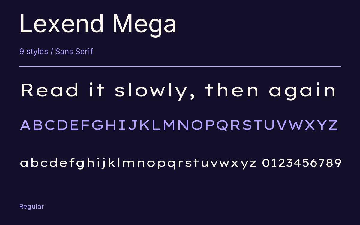
Characters & Figures
685 glyphs reported in the reference style. This selection shows 400 recorded characters.
ABCDEFGHIJKLMNOPQRSTUVWXYZ
abcdefghijklmnopqrstuvwxyz
0123456789 & @ ? !
View The Recorded Character Selection
The Font Files
Download
Lexend Mega
9 TTF styles with the accompanying CSS, README and license information.
Download ZIP · 360 KB ↓- Version
- 1.007
- License
- SIL Open Font License 1.1
Install On Your Computer
Extract the ZIP first. On Windows, select the font files and choose Install from the context menu. On macOS, open the files in Font Book and choose Install.
Use On A Website
Keep the font files and the included stylesheet together. Update the stylesheet path to match your project.
<link rel="stylesheet"
  href="/fonts/lexend-mega-3/lexend-mega-3.css">

body {
  font-family: 'Lexend Mega', sans-serif;
}
Keep the copyright and license notices with redistributed files.
Heading & Body
Compare a larger heading with the same family at reading size.
Lexend Mega Heading · Lexend Mega Body
Before You Travel
The morning service leaves at nine. Tickets are available at the station, and the platform is listed on the departure board. Keep your ticket until the end of the journey.