
Libertinus Serif
Designed By
Philipp H. Poll
6 Styles Serif
The pleasure
of a well-set
page.
Libertinus Serif · Regular
Compare this serif family in headings and a continuous reading sample.
6 styles available. Compare the specimens below, or enter your own text.
Download Libertinus Serif ↓TTF · SIL Open Font License 1.1
Set Your Own Text
Change the style and size to compare the letterforms.
Footnotes to the second edition
A Page In Libertinus Serif
Libertinus Serif · Regular
Headings, labels and running text.
Notes From The Reading Room
The reading room opens onto a quiet courtyard. Along the shelves, small handwritten labels mark the collections. A visitor leaves a book open beside the window, keeping a place for the next reader.
A heading marks the next chapter. The margins leave room for a note while the text continues across the page.
6 Styles,
One Family
Every available style is shown below in its own font file.
Regular400
Footnotes to the second edition
Italic400
Footnotes to the second edition
Semi Bold600
Footnotes to the second edition
Semi Bold Italic600
Footnotes to the second edition
Bold700
Footnotes to the second edition
Bold Italic700
Footnotes to the second edition
Libertinus started as a fork. Its parents are Linux Libertine and Linux Biolinum, the free serif and sans by Philipp H. Poll, and the new name covers the cleanup done on top of them: refined details, better spacing, kerning and hinting, and files that behave in modern typesetting systems. Khaled Hosny is credited alongside Poll, and Google Fonts took the serif on in April 2025.
The look is an old book face. Small letters sit fairly low against the capitals, at about 2 thirds of their height, and the letters run a little narrow, so a column holds plenty of words without seeming cramped. That proportion is made for reading at book sizes and is less friendly in small type on a phone, where a bigger x-height would read easier. We would keep it for print and PDFs, or for screens where the text can be set large.
Where it gets used
Coverage is why scholars pick it. There are 2,382 characters, with Greek and its extended set, Cyrillic, Hebrew and Vietnamese sitting next to the Latin, and the wider family has mathematical symbols too, so scholarly publishing and technical documentation were the obvious targets. Writing a paper with Greek quotations and the odd Hebrew word? This font will not make you switch halfway.
The serif comes here in 6 styles, Regular, Semi Bold and Bold, each with its own italic, and the italics run slightly narrower than the romans. There are relatives as well. Libertinus Sans does headings when a document wants a sans, and Libertinus Mono handles code listings.
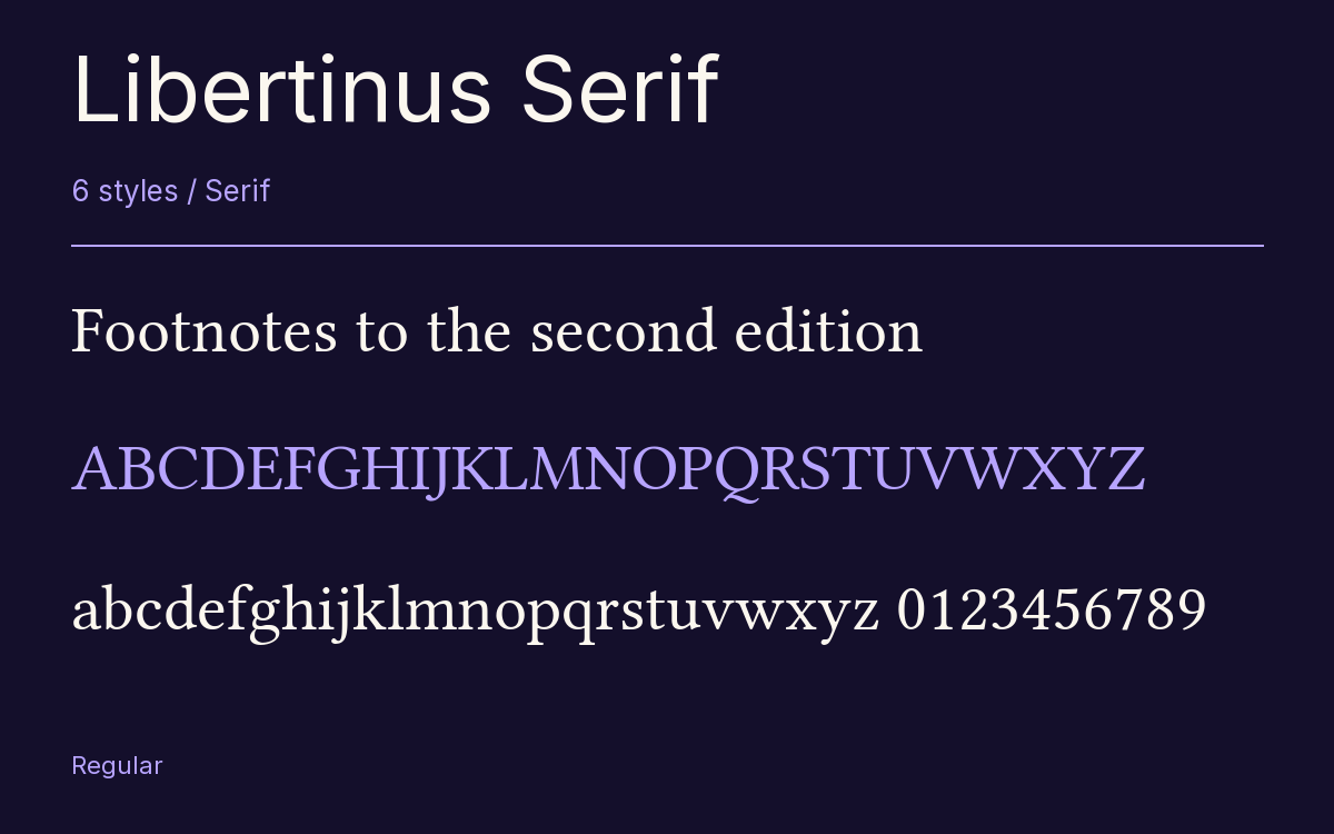
Characters & Figures
2,382 glyphs reported in the reference style. This selection shows 400 recorded characters.
ABCDEFGHIJKLMNOPQRSTUVWXYZ
abcdefghijklmnopqrstuvwxyz
0123456789 & @ ? !
View The Recorded Character Selection
The Font Files
Download
Libertinus Serif
6 TTF styles with the accompanying CSS, README and license information.
Download ZIP · 1.4 MB ↓- Version
- 7.051
- License
- SIL Open Font License 1.1
Install On Your Computer
Extract the ZIP first. On Windows, select the font files and choose Install from the context menu. On macOS, open the files in Font Book and choose Install.
Use On A Website
Keep the font files and the included stylesheet together. Update the stylesheet path to match your project.
<link rel="stylesheet"
  href="/fonts/libertinus-serif/libertinus-serif.css">

body {
  font-family: 'Libertinus Serif', sans-serif;
}
Keep the copyright and license notices with redistributed files.
Heading & Body
The family provides the heading; Inter carries the supporting text.
Libertinus Serif Heading · Inter Body
Notes From The Reading Room
The reading room opens onto a quiet courtyard. Along the shelves, small handwritten labels mark the collections. A visitor leaves a book open beside the window, keeping a place for the next reader.