
Gentium Book Plus
Designed By
SIL International
4 Styles Serif
The pleasure
of a well-set
page.
Gentium Book Plus · Regular
Compare this serif family in headings and a continuous reading sample.
4 styles available. Compare the specimens below, or enter your own text.
Download Gentium Book Plus ↓TTF · SIL Open Font License 1.1
Set Your Own Text
Change the style and size to compare the letterforms.
Notes for the island dialect dictionary
A Page In Gentium Book Plus
Gentium Book Plus · Regular
Headings, labels and running text.
Notes From The Reading Room
The reading room opens onto a quiet courtyard. Along the shelves, small handwritten labels mark the collections. A visitor leaves a book open beside the window, keeping a place for the next reader.
A heading marks the next chapter. The margins leave room for a note while the text continues across the page.
4 Styles,
One Family
Every available style is shown below in its own font file.
Regular400
Notes for the island dialect dictionary
Italic400
Notes for the island dialect dictionary
Bold700
Notes for the island dialect dictionary
Bold Italic700
Notes for the island dialect dictionary
Gentium is Latin for “belonging to the nations”, and SIL International took the name literally. The family was made so that communities writing in Latin, Cyrillic or Greek could print material that reads well and looks good. It won the TDC2003 type design competition and was shown in the bukva:raz! exhibition at the United Nations headquarters.
Book, and Plus
Gentium Book Plus is the slightly heavier sibling of Gentium Plus, sitting a little darker on the page. It replaces Gentium Book Basic, which only ever covered a limited set of Latin. The Plus version keeps the same 4 styles, Regular, Italic, Bold and Bold Italic, and takes on the full Gentium character set: extended Latin, Cyrillic, Vietnamese, and Greek both modern and polytonic, 2,783 characters in all. It also brought much better hinting for Windows and WOFF2 web files. The Plus release dates from May 2022.
The design goals were modest and practical. Counters are slightly generous for readability, capitals slightly compressed to save room, spacing careful, and the general feel has a light calligraphic warmth. The Greek was drawn as a script in its own right yet mixes well with Latin on the same line. The italic is narrow and lively, 10.4% narrower than the roman across a sentence.
Small caps are built in, and 6 stylistic sets offer alternate letter shapes.
If you are setting a Greek reader or a dictionary with phonetic notes, Gentium is one of the first fonts to try.
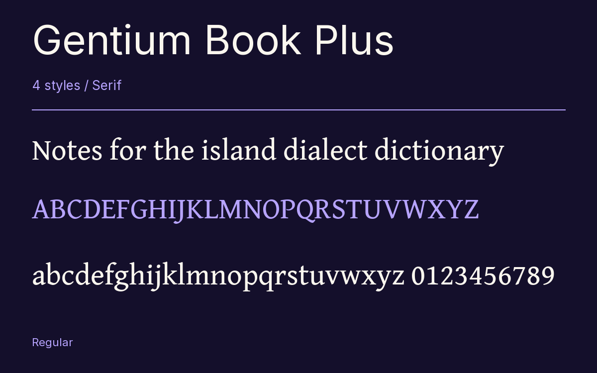
Characters & Figures
2,783 glyphs reported in the reference style. This selection shows 400 recorded characters.
ABCDEFGHIJKLMNOPQRSTUVWXYZ
abcdefghijklmnopqrstuvwxyz
0123456789 & @ ? !
View The Recorded Character Selection
The Font Files
Download
Gentium Book Plus
4 TTF styles with the accompanying CSS, README and license information.
Download ZIP · 1.6 MB ↓- Version
- 6.101
- License
- SIL Open Font License 1.1
Install On Your Computer
Extract the ZIP first. On Windows, select the font files and choose Install from the context menu. On macOS, open the files in Font Book and choose Install.
Use On A Website
Keep the font files and the included stylesheet together. Update the stylesheet path to match your project.
<link rel="stylesheet"
  href="/fonts/gentium-book-plus-2/gentium-book-plus-2.css">

body {
  font-family: 'Gentium Book Plus', sans-serif;
}
Keep the copyright and license notices with redistributed files.
Heading & Body
The family provides the heading; Inter carries the supporting text.
Gentium Book Plus Heading · Inter Body
Notes From The Reading Room
The reading room opens onto a quiet courtyard. Along the shelves, small handwritten labels mark the collections. A visitor leaves a book open beside the window, keeping a place for the next reader.