
PT Serif
Designed By
ParaType
4 Styles Serif
The pleasure
of a well-set
page.
PT Serif · Regular
Compare this serif family in headings and a continuous reading sample.
4 styles available. Compare the specimens below, or enter your own text.
Download PT Serif ↓TTF · SIL Open Font License 1.1
Set Your Own Text
Change the style and size to compare the letterforms.
Minutes of the spring meeting
A Page In PT Serif
PT Serif · Regular
Headings, labels and running text.
Notes From The Reading Room
The reading room opens onto a quiet courtyard. Along the shelves, small handwritten labels mark the collections. A visitor leaves a book open beside the window, keeping a place for the next reader.
A heading marks the next chapter. The margins leave room for a note while the text continues across the page.
4 Styles,
One Family
Every available style is shown below in its own font file.
Regular400
Minutes of the spring meeting
Italic400
Minutes of the spring meeting
Bold700
Minutes of the spring meeting
Bold Italic700
Minutes of the spring meeting
Put a heading in PT Sans over a paragraph of PT Serif and the 2 agree on almost everything, metrics and proportions alike, with weights that match. ParaType planned it that way. PT Sans came out in 2009 as the first family of the Public Types of the Russian Federation project, and PT Serif followed in 2010 as its companion, drawn from the start to match it.
Those serifs are wedges, short and sturdy, and the terminals end in little triangles. The contrast is modest and the lowercase is big. ParaType calls it transitional with humanistic terminals, which is a fair description; in practice it reads well in a long report and still has enough edge for an advertisement.
The project had a public purpose, with money from the Federal Agency for Press and Mass Communications. Its goal was for people across Russia to read and write in their own languages, so next to Western and Central European Latin and standard Cyrillic each font has the alphabets of the republics’ title languages, and most of what the neighboring countries need too.
Alexandra Korolkova designed it with help from Olga Umpeleva, under Vladimir Yefimov’s supervision.
This download has Regular, Italic, Bold and Bold Italic. The italic sets about 6% narrower than the roman, handy when a long book title or a quoted phrase has to fit in a single line. The 2 Caption styles for very small text live on their own page as PT Serif Caption.
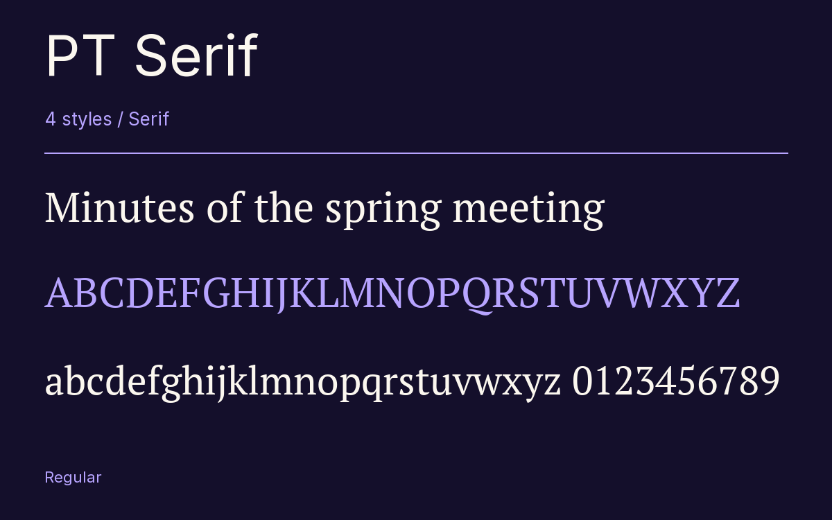
Characters & Figures
717 glyphs reported in the reference style. This selection shows 400 recorded characters.
ABCDEFGHIJKLMNOPQRSTUVWXYZ
abcdefghijklmnopqrstuvwxyz
0123456789 & @ ? !
View The Recorded Character Selection
The Font Files
Download
PT Serif
4 TTF styles with the accompanying CSS, README and license information.
Download ZIP · 428 KB ↓- Version
- 1.000W
- License
- SIL Open Font License 1.1
Install On Your Computer
Extract the ZIP first. On Windows, select the font files and choose Install from the context menu. On macOS, open the files in Font Book and choose Install.
Use On A Website
Keep the font files and the included stylesheet together. Update the stylesheet path to match your project.
<link rel="stylesheet"
  href="/fonts/pt-serif-2/pt-serif-2.css">

body {
  font-family: 'PT Serif', sans-serif;
}
Keep the copyright and license notices with redistributed files.
Heading & Body
The family provides the heading; Inter carries the supporting text.
PT Serif Heading · Inter Body
Notes From The Reading Room
The reading room opens onto a quiet courtyard. Along the shelves, small handwritten labels mark the collections. A visitor leaves a book open beside the window, keeping a place for the next reader.
Other Serif Families
Browse All Serif Fonts →- KarmaSerif1 StyleFontshare
- RokkittSerif18 StylesGoogle Fonts
 Serif1 StyleFontshare
- Crimson TextSerif6 StylesGoogle Fonts
- Noto Serif BengaliSerif9 StylesGoogle Fonts
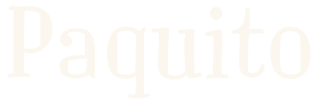 Serif1 StyleFontshare