
Rokkitt
Designed By
Vernon Adams
18 Styles Serif
The pleasure
of a well-set
page.
Rokkitt · Regular
Compare this serif family in headings and a continuous reading sample.
18 styles available. Compare the specimens below, or enter your own text.
Download Rokkitt ↓TTF · SIL Open Font License 1.1
Set Your Own Text
Change the style and size to compare the letterforms.
Freight rates rise in spring
A Page In Rokkitt
Rokkitt · Regular
Headings, labels and running text.
Notes From The Reading Room
The reading room opens onto a quiet courtyard. Along the shelves, small handwritten labels mark the collections. A visitor leaves a book open beside the window, keeping a place for the next reader.
A heading marks the next chapter. The margins leave room for a note while the text continues across the page.
18 Styles,
One Family
Every available style is shown below in its own font file.
Thin100
Freight rates rise in spring
Thin Italic100
Freight rates rise in spring
Extra Light200
Freight rates rise in spring
Extra Light Italic200
Freight rates rise in spring
Light300
Freight rates rise in spring
Light Italic300
Freight rates rise in spring
Regular400
Freight rates rise in spring
Italic400
Freight rates rise in spring
Medium500
Freight rates rise in spring
Medium Italic500
Freight rates rise in spring
Semi Bold600
Freight rates rise in spring
Semi Bold Italic600
Freight rates rise in spring
Bold700
Freight rates rise in spring
Bold Italic700
Freight rates rise in spring
Extra Bold800
Freight rates rise in spring
Extra Bold Italic800
Freight rates rise in spring
Black900
Freight rates rise in spring
Black Italic900
Freight rates rise in spring
Litho Antique, from the Inland Type Foundry in 1910, is 1 of the slabs behind Rokkitt. Vernon Adams was taken with that whole group of geometric slab serifs, sometimes called Egyptians, which American Type Founders and Monotype also put out versions of in the 1920s and 1930s, and he started his own in 2011.
The family took a long road to its current shape:
- 2011 to 2014, Adams develops the typeface
- 2016, Kalapi Gajjar completes his original work, with 9 weights and support for more Latin languages
- 2019, the family is converted to a variable font
- 2023, an italic arrives
So what you download now is 18 styles, Thin at 100 through Black at 900, each with its italic, and 705 characters per style with Vietnamese. The italics barely differ in width from the romans.
Rokkitt was meant mainly for headings and headlines, though the notes suggest it can stand in for a sans at text sizes too. Before you try that, know that its letters are small for their point size, the capitals short and the lowercase shorter, and next to another family at the same setting it will look a size behind. At the heavy end, in a magazine heading, it is at its best.
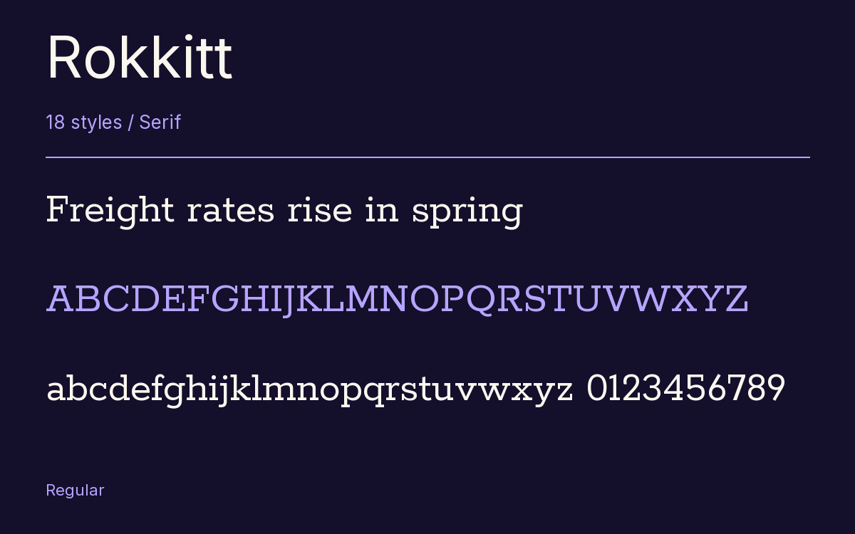
Characters & Figures
705 glyphs reported in the reference style. This selection shows 400 recorded characters.
ABCDEFGHIJKLMNOPQRSTUVWXYZ
abcdefghijklmnopqrstuvwxyz
0123456789 & @ ? !
View The Recorded Character Selection
The Font Files
Download
Rokkitt
18 TTF styles with the accompanying CSS, README and license information.
Download ZIP · 617 KB ↓- Version
- 3.103
- License
- SIL Open Font License 1.1
Install On Your Computer
Extract the ZIP first. On Windows, select the font files and choose Install from the context menu. On macOS, open the files in Font Book and choose Install.
Use On A Website
Keep the font files and the included stylesheet together. Update the stylesheet path to match your project.
<link rel="stylesheet"
  href="/fonts/rokkitt/rokkitt.css">

body {
  font-family: 'Rokkitt', sans-serif;
}
Keep the copyright and license notices with redistributed files.
Heading & Body
The family provides the heading; Inter carries the supporting text.
Rokkitt Heading · Inter Body
Notes From The Reading Room
The reading room opens onto a quiet courtyard. Along the shelves, small handwritten labels mark the collections. A visitor leaves a book open beside the window, keeping a place for the next reader.