
M PLUS 1
Designed By
Coji Morishita
9 Styles Sans Serif
Letters for
every day.
M PLUS 1 · Regular
Compare the family in headings, short labels and paragraph text.
9 styles available. Compare the specimens below, or enter your own text.
Download M PLUS 1 ↓TTF · SIL Open Font License 1.1
Set Your Own Text
Change the style and size to compare the letterforms.
Last train leaves at 23:40
A Clear Hierarchy
M PLUS 1 · Regular
Headings, labels and running text.
Departures09:00 →
Before You Travel
The morning service leaves at nine. Tickets are available at the station, and the platform is listed on the departure board. Keep your ticket until the end of the journey.
9 Styles,
One Family
Every available style is shown below in its own font file.
Thin100
Last train leaves at 23:40
Extra Light200
Last train leaves at 23:40
Light300
Last train leaves at 23:40
Regular400
Last train leaves at 23:40
Medium500
Last train leaves at 23:40
Semi Bold600
Last train leaves at 23:40
Bold700
Last train leaves at 23:40
Extra Bold800
Last train leaves at 23:40
Black900
Last train leaves at 23:40
The 1 in the name is old M+ shorthand. When Coji Morishita started M+ FONTS in November 2003, out of the M+ BITMAP FONTS he had begun the year before, the numbers 1 and 2 marked 2 different glyph styles, and M PLUS 1 carries on the first of them. Its siblings are M PLUS 2, with more classic letterforms, and M PLUS 1 Code, a monospaced cut that shares its full-width Japanese.
Morishita, a graphic designer who works between Tokyo and Nagano as Underforest Design, describes M+ as a little family for everyday use. That undersells it a little. There are 9 weights from Thin to Black, and each covers more than 5,700 kanji, plus kana and an extended Latin with Vietnamese, 6,335 characters a style.
The design pairs easy curves with straight lines and comes across modern and roomy, comfortable in small text and in big titles. The Latin has tabular and proportional figures and fractions, which helps on a Japanese site with prices or timetables.
At 9 weights it can do everything in a layout, headline to footnote, without another font, and we would let it.
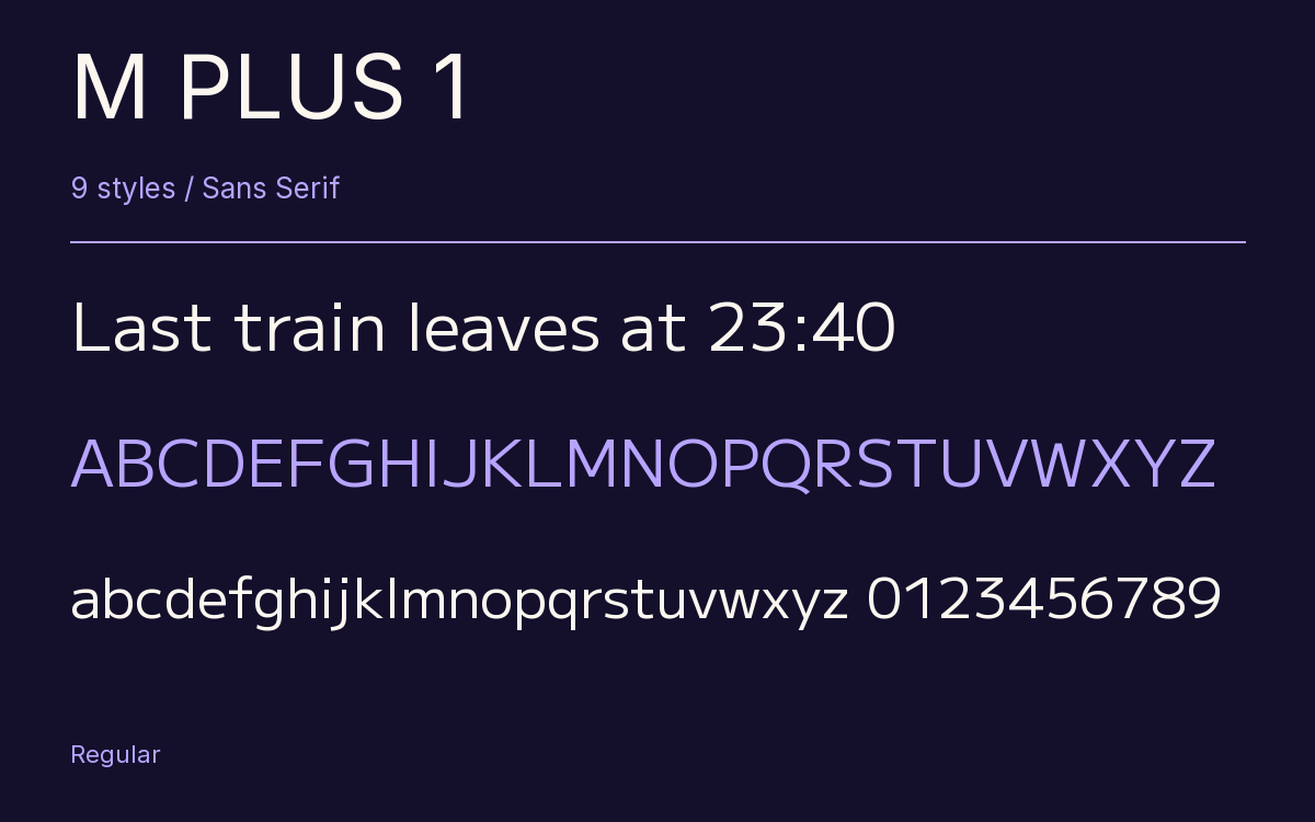
Characters & Figures
6,335 glyphs reported in the reference style. This selection shows 400 recorded characters.
ABCDEFGHIJKLMNOPQRSTUVWXYZ
abcdefghijklmnopqrstuvwxyz
0123456789 & @ ? !
View The Recorded Character Selection
The Font Files
Download
M PLUS 1
9 TTF styles with the accompanying CSS, README and license information.
Download ZIP · 8.3 MB ↓- Version
- 1.001
- License
- SIL Open Font License 1.1
Install On Your Computer
Extract the ZIP first. On Windows, select the font files and choose Install from the context menu. On macOS, open the files in Font Book and choose Install.
Use On A Website
Keep the font files and the included stylesheet together. Update the stylesheet path to match your project.
<link rel="stylesheet"
  href="/fonts/m-plus-1-2/m-plus-1-2.css">

body {
  font-family: 'M PLUS 1', sans-serif;
}
Keep the copyright and license notices with redistributed files.
Heading & Body
Compare a larger heading with the same family at reading size.
M PLUS 1 Heading · M PLUS 1 Body
Before You Travel
The morning service leaves at nine. Tickets are available at the station, and the platform is listed on the departure board. Keep your ticket until the end of the journey.